Building the YouTube UI with Ionic Last update: 2022-03-22
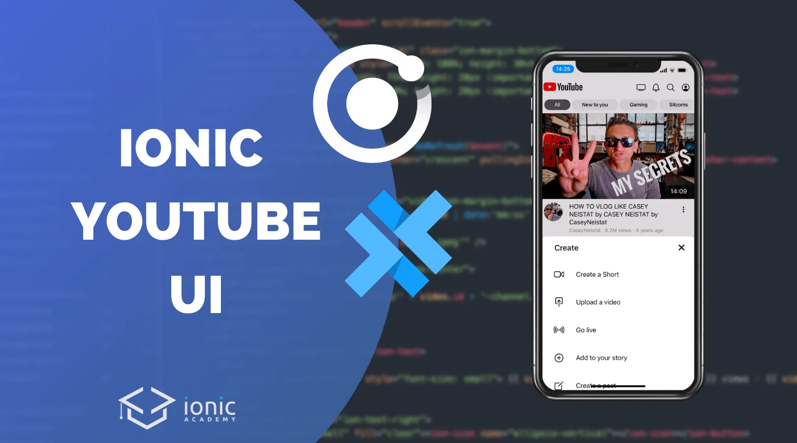
We are once again building a popular UI with Ionic, and this time it’s the YouTube home video feed!
You like to see popular apps built with Ionic? Check out my latest eBook Built with Ionic for even more real world app examples!
Get the Code 🔐
Receive all the files of the tutorial right to your inbox and subscribe to my weekly no BS newsletter!
Today we will focus only on the the tab bar setup and the home page of the YouTube app - leave a comment if you would like to see an example of the video details page as well!
Additionally we need to create a directive that scrolls our header out or in while also moving the content, so we got quite a challenge today!
Starting the YouTube App with Ionic
To get started we generate a new Ionic app using the tabs layout and generate a few additional pages that we will need. On top of that we generate a module and directive which we will need for our header animation in the end!
ionic start youtube tabs --type=angular

ionic g page tab4
ionic g page sheet

ionic g module directives/sharedDirectives --flat
ionic g directive directives/hideHeader
Additionally I created some mock data that you can download from Github and place inside the assets folder of your new app!
Because we want to load some local JSON data with Angular, we need to add two properties to our tsconfig.json:
"compilerOptions": {
    "resolveJsonModule": true,
    "allowSyntheticDefaultImports": true
    ...
}
To apply the Ionic typical styling for the application we can also change the defaul colors inside the src/theme/variables.scss now:
:root {
  --ion-color-primary: #000000;
  --ion-color-primary-rgb: 0, 0, 0;
  --ion-color-primary-contrast: #ffffff;
  --ion-color-primary-contrast-rgb: 255, 255, 255;
  --ion-color-primary-shade: #000000;
  --ion-color-primary-tint: #1a1a1a;

  --ion-color-secondary: #ff0000;
  --ion-color-secondary-rgb: 255, 0, 0;
  --ion-color-secondary-contrast: #ffffff;
  --ion-color-secondary-contrast-rgb: 255, 255, 255;
  --ion-color-secondary-shade: #e00000;
  --ion-color-secondary-tint: #ff1a1a;

  --ion-color-tertiary: #5260ff;
  --ion-color-tertiary-rgb: 82, 96, 255;
  --ion-color-tertiary-contrast: #ffffff;
  --ion-color-tertiary-contrast-rgb: 255, 255, 255;
  --ion-color-tertiary-shade: #4854e0;
  --ion-color-tertiary-tint: #6370ff;

  --ion-color-success: #2dd36f;
  --ion-color-success-rgb: 45, 211, 111;
  --ion-color-success-contrast: #000000;
  --ion-color-success-contrast-rgb: 0, 0, 0;
  --ion-color-success-shade: #28ba62;
  --ion-color-success-tint: #42d77d;

  --ion-color-warning: #ffc409;
  --ion-color-warning-rgb: 255, 196, 9;
  --ion-color-warning-contrast: #000000;
  --ion-color-warning-contrast-rgb: 0, 0, 0;
  --ion-color-warning-shade: #e0ac08;
  --ion-color-warning-tint: #ffca22;

  --ion-color-danger: #eb445a;
  --ion-color-danger-rgb: 235, 68, 90;
  --ion-color-danger-contrast: #ffffff;
  --ion-color-danger-contrast-rgb: 255, 255, 255;
  --ion-color-danger-shade: #cf3c4f;
  --ion-color-danger-tint: #ed576b;

  --ion-color-medium: #92949c;
  --ion-color-medium-rgb: 146, 148, 156;
  --ion-color-medium-contrast: #000000;
  --ion-color-medium-contrast-rgb: 0, 0, 0;
  --ion-color-medium-shade: #808289;
  --ion-color-medium-tint: #9d9fa6;

  --ion-color-light: #ffffff;
  --ion-color-light-rgb: 255, 255, 255;
  --ion-color-light-contrast: #000000;
  --ion-color-light-contrast-rgb: 0, 0, 0;
  --ion-color-light-shade: #e0e0e0;
  --ion-color-light-tint: #ffffff;
}
We got the basics in place - let’s get started with the custom tab bar!
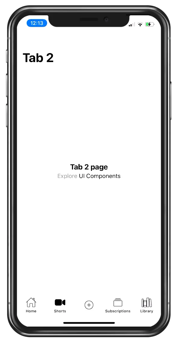
Building the Tab Bar
The YouTube app comes with a slightly different tab bar as. we have 5 buttons, of which 4 lead to a different tab and the button in the center calls a different function.
We can move in that direction by first of all integrating the tab we generated into the src/app/tabs/tabs-routing.module.ts like this:
const routes: Routes = [
  {
    path: 'tabs',
    component: TabsPage,
    children: [
      {
        path: 'tab1',
        loadChildren: () =>
          import('../tab1/tab1.module').then((m) => m.Tab1PageModule),
      },
      {
        path: 'tab2',
        loadChildren: () =>
          import('../tab2/tab2.module').then((m) => m.Tab2PageModule),
      },
      {
        path: 'tab3',
        loadChildren: () =>
          import('../tab3/tab3.module').then((m) => m.Tab3PageModule),
      },
      {
        path: 'tab4',
        loadChildren: () =>
          import('../tab4/tab4.module').then((m) => m.Tab4PageModule),
      },
      {
        path: '',
        redirectTo: '/tabs/tab1',
        pathMatch: 'full',
      },
    ],
  },
  {
    path: '',
    redirectTo: '/tabs/tab1',
    pathMatch: 'full',
  },
];
Now we can add two new buttons to the tab bar setup, and the button in the center won’t be linked to a tab but instead simply come with a click handler to trigger the bottom sheet later!
Besides that we are adding a template reference to every tab, and then use the selected property of a button to conditionally show different icons.
You will notice that in many apps the icons change from outline to a filled style when selected, and that’s what we are replicating here.
Go ahead now and change the src/app/tabs/tabs.page.html to:
<ion-tabs>
	<ion-tab-bar slot="bottom">
		<ion-tab-button tab="tab1" #tab1>
			<ion-icon [name]="tab1.selected ? 'home' : 'home-outline'"></ion-icon>
			<ion-label>Home</ion-label>
		</ion-tab-button>

		<ion-tab-button tab="tab2" #tab2>
			<ion-icon [name]="tab2.selected ? 'videocam' : 'videocam-outline'"></ion-icon>
			<ion-label>Shorts</ion-label>
		</ion-tab-button>

		<ion-tab-button (click)="add()">
			<ion-icon name="add-circle-outline"></ion-icon>
		</ion-tab-button>

		<ion-tab-button tab="tab3" #tab3>
			<ion-icon [name]="tab3.selected ? 'albums' : 'albums-outline'"></ion-icon>
			<ion-label>Subscriptions</ion-label>
		</ion-tab-button>

		<ion-tab-button tab="tab4" #tab4>
			<ion-icon [name]="tab4.selected ? 'library' : 'library-outline'"></ion-icon>
			<ion-label>Library</ion-label>
		</ion-tab-button>
	</ion-tab-bar>
</ion-tabs>
The bar should also come with a white background, and we can even fine tune the color of the icons and the stroke width of an Ionicon by changing these things within our src/app/tabs/tabs.page.scss like this:
ion-tab-bar {
  --background: #fff;
}

ion-tab-button {
  --color: var(--ion-color-primary);
  ion-icon {
    --ionicon-stroke-width: 16px;
  }
}
To open the modal in a bottom sheet way we just need to pass in the breakpoints and initialBreakpoint properties and Ionic will do the magic, so let’s display the modal on click within our src/app/tabs/tabs.page.ts:
import { Component } from '@angular/core';
import { ModalController } from '@ionic/angular';
import { SheetPage } from '../sheet/sheet.page';

@Component({
	selector: 'app-tabs',
	templateUrl: 'tabs.page.html',
	styleUrls: ['tabs.page.scss']
})
export class TabsPage {
	constructor(private modalCtrl: ModalController) {}

	async add() {
		const modal = await this.modalCtrl.create({
			component: SheetPage,
			breakpoints: [0.5],
			initialBreakpoint: 0.5,
			handle: false
		});

		await modal.present();
	}
}
Now within that sheet we just want to display a few items with icon, but to make the life inside the template easier we can define those different items simply as an array inside our modal page at src/app/sheet/sheet.page.ts:
import { Component, OnInit } from '@angular/core';
import { ModalController } from '@ionic/angular';

@Component({
	selector: 'app-sheet',
	templateUrl: './sheet.page.html',
	styleUrls: ['./sheet.page.scss']
})
export class SheetPage implements OnInit {
	items = [
		{
			text: 'Create a Short',
			icon: 'videocam-outline'
		},
		{
			text: 'Upload a video',
			icon: 'push-outline'
		},
		{
			text: 'Go live',
			icon: 'radio-outline'
		},
		{
			text: 'Add to your story',
			icon: 'add-circle-outline'
		},
		{
			text: 'Create a post',
			icon: 'create-outline'
		}
	];

	constructor(private modalCtrl: ModalController) {}

	ngOnInit() {}

	dismiss() {
		this.modalCtrl.dismiss();
	}
}
The modal page itself comes with some custom styling so the header doesn’t look to much like a header and more like a title. We achieve a left hand position by simply setting the mode of the title to md because the title is always on the left on Android!
Besides that we just got the iteration of items, so let’s change the src/app/sheet/sheet.page.html to:
<ion-header class="ion-no-border">
	<ion-toolbar color="light">
		<ion-title mode="md">Create</ion-title>
		<ion-buttons slot="end">
			<ion-button (click)="dismiss()" fill="clear">
				<ion-icon name="close" slot="icon-only"></ion-icon>
			</ion-button>
		</ion-buttons>
	</ion-toolbar>
</ion-header>

<ion-content>
	<ion-item *ngFor="let item of items" lines="none">
		<ion-icon [name]="item.icon" slot="start"></ion-icon>
		<ion-label> {{ item.text }} </ion-label>
	</ion-item>
</ion-content>
Finally those items need more room to breath - therefore we add some more padding and margin and apply a nice round background to our icons inside the src/app/sheet/sheet.page.scss:
ion-item {
  margin-top: 10px;
  margin-bottom: 10px;
  ion-icon {
    background: #f2f2f2;
    padding: 10px;
    border-radius: 50%;
    --ionicon-stroke-width: 16px;
  }
}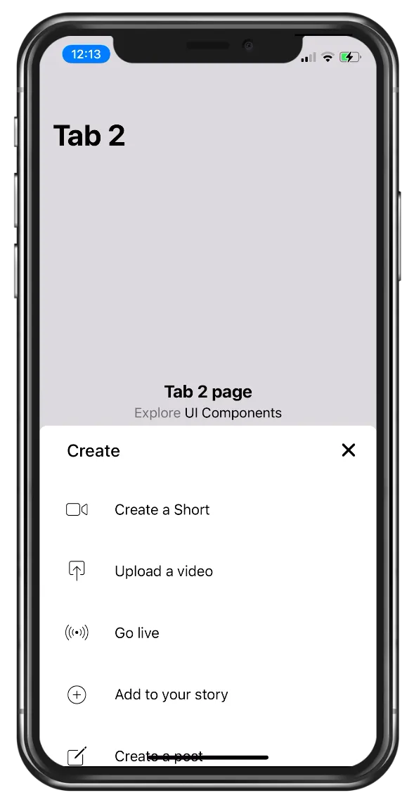
And with that our YouTube tab bar setup including custom button to trigger a bottom drawer component is already done!
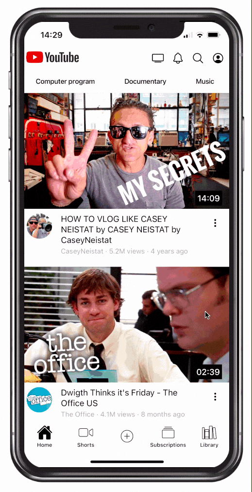
Basic Home Screen
Now we can focus on the home screen, for which we want to achieve a few different things:
- Create the header with buttons and additional scrollable segments row
- Show skeleton views while the (fake) data is loading
- Build the video feed list
First of all we can setup some data for the segments and the video items, which we create right here or import from our dummy JSON data. On top of that we can add functionality that will only set this data after 1.5 seconds so we can actually see our loading skeletons - in a normal app you would make an API call and display them while you are loading of course!
Additionally we can add a function to select on segment from our items, and a fake function to complete an Ionic refresher event after a second.
Now bring up the src/app/tab1/tab1.page.ts and change it to:
import { Component } from '@angular/core';
import { RefresherCustomEvent } from '@ionic/angular';
import homeData from '../../assets/data/home.json';

@Component({
	selector: 'app-tab1',
	templateUrl: 'tab1.page.html',
	styleUrls: ['tab1.page.scss']
})
export class Tab1Page {
	videos = [];
	segments: any[] = [];

	constructor() {
		this.segments = [
			'All',
			'New to you',
			'Gaming',
			'Sitcoms',
			'Computer program',
			'Documentary',
			'Music'
		].map((val) => ({
			title: val,
			selected: false
		}));
		setTimeout(() => {
			this.selectSegment(0);
			this.videos = homeData;
		}, 1000);
	}

	doRefresh(event: RefresherCustomEvent) {
		setTimeout(() => {
			event.target.complete();
		}, 1500);
	}

	selectSegment(i) {
		this.segments.map((item) => (item.selected = false));
		this.segments[i].selected = true;
	}
}
Now we can start with the template and craft the header by simply using two ion-toolbar elements inside the header below each other!
The first holds the logo and some small buttons, while the second toolbar holds our custom segment. We create it like this because customising the Ionic segment would take mostly the same time if not longer, and it’s quite easy to create a horizontal scrollable segment view.
Those segment buttons get a conditional class based on the selected property and trigger the function we created before.
Therefore continue with the src/app/tab1/tab1.page.html and change the header area to:
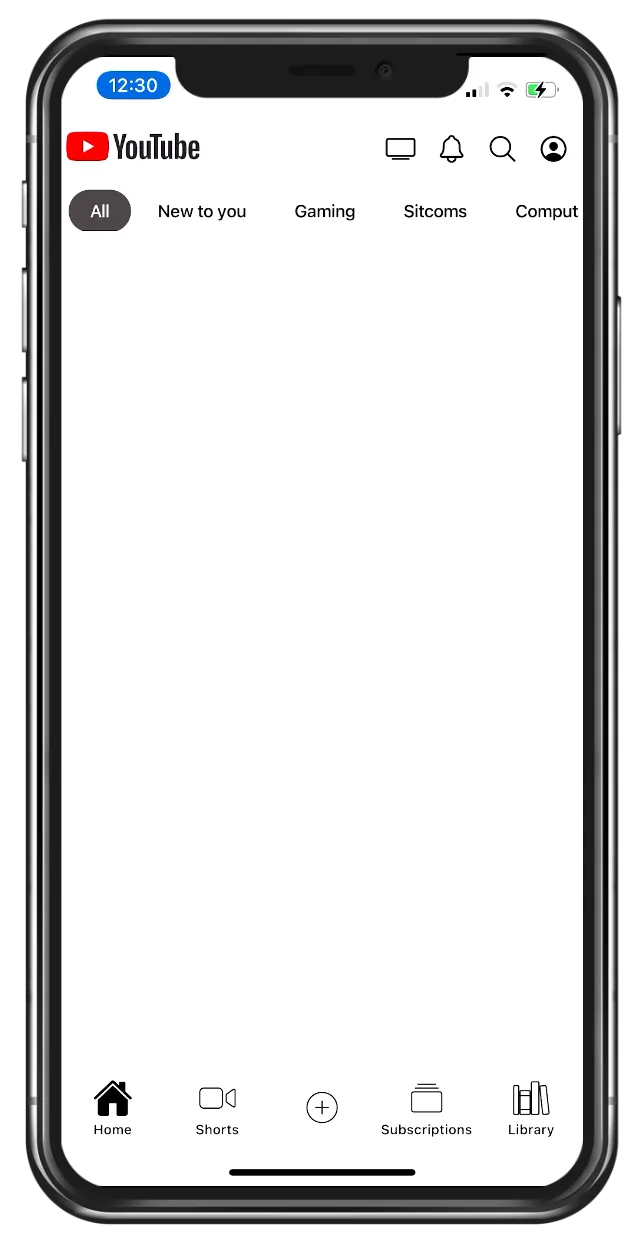
<ion-header>
	<ion-toolbar color="light">
		<img src="./assets/data/logo.webp" width="100px" />

		<ion-buttons slot="end">
			<ion-button size="small"> <ion-icon name="tv-outline"></ion-icon> </ion-button>
			<ion-button size="small"> <ion-icon name="notifications-outline"></ion-icon> </ion-button>
			<ion-button size="small"> <ion-icon name="search-outline"></ion-icon> </ion-button>
			<ion-button size="small"> <ion-icon name="person-circle-outline"></ion-icon> </ion-button>
		</ion-buttons>
	</ion-toolbar>
	<ion-toolbar color="light">
		<div class="button-bar">
			<ion-button
				size="small"
				shape="round"
				*ngFor="let seg of segments; let i = index;"
				[ngClass]="{'activated': seg.selected, 'inactive': !seg.selected}"
				(click)="selectSegment(i)"
			>
				{{ seg.title }}
			</ion-button>
		</div>
	</ion-toolbar>
</ion-header>
Add this point it’s not a horizontal list, but we can make it a flex layout and scrollable quite fast by adding the following to our src/app/tab1/tab1.page.scss:
.button-bar {
	display: flex;
	overflow-x: scroll;
}

::-webkit-scrollbar {
	display: none;
}

.activated {
	--background: #606060;
	--color: #fff;
}

.inactive {
	--background: #edefef;
	--color: var(--ion-color-primary);
}
Additionally this hides the scrollbar which you can see in the preview normally!
Now the official YouTube app displays some placeholder images while its loading data, and we can mimic the same behaviour using the ion-skeleton-text element like this when we don’t have any video data in our array yet:
<ion-content>
	<div *ngIf="!videos.length">
		<div *ngFor="let i of [].constructor(4)" class="ion-margin-bottom">
			<ion-skeleton-text animated style="width: 100%; height: 30vh !important"></ion-skeleton-text>
			<ion-skeleton-text
				style="width: 75%; height: 20px !important; margin: 10px"
			></ion-skeleton-text>
			<ion-skeleton-text
				style="width: 40%; height: 20px !important; margin: 10px"
			></ion-skeleton-text>
		</div>
	</div>
</ion-content>
This will now show for a second because we used setTimeout() but I recommend you remove that delay while working on the video list for now.
Our next step is the list of video elements for which we need:
- The preview image
- The channel image
- The title and author name
- The duration floating above the video
On top of that we can add a simple refresher that calls the function we added before when we pull it!
Now we can generate those video items and use the Ionic grid layout to setup a row and different columns for the video information below the actual poster image.
The duration is on top of all those things, but we will have to reposition it with CSS to make it appear above the image in the next step.
For now you can add the following below the previous skeleton list:
<ion-refresher slot="fixed" (ionRefresh)="doRefresh($event)">
	<ion-refresher-content
		refreshingSpinner="crescent"
		pullingIcon="refresh-outline"
	></ion-refresher-content>
</ion-refresher>

<div *ngFor="let video of videos" class="video ion-margin-bottom">
	<div class="duration">{{ video.duration * 1000 | date:'mm:ss' }}</div>

	<img [src]="'./assets/data/' + video.id + '.jpeg'" />
	<ion-row>
		<ion-col size="2" class="ion-align-items-center">
			<ion-avatar>
				<ion-img [src]="'./assets/data/' + video.id + '-channel.jpeg'"></ion-img>
			</ion-avatar>
		</ion-col>
		<ion-col size="8">
			<ion-text>{{ video.title }}</ion-text>
			<div>
				<ion-text color="medium" style="font-size: small">
					{{ video.author }} · {{ video.views }} views · {{ video.ago }} ago
				</ion-text>
			</div>
		</ion-col>
		<ion-col size="2" class="ion-text-right">
			<ion-button size="small" fill="clear"
				><ion-icon name="ellipsis-vertical"></ion-icon
			></ion-button>
		</ion-col>
	</ion-row>
</div>
In reality those images will actually start playing, something I have implemented inside the Netflix app of the Built with Ionic book!
If we simply give the duration an absolute position, all duration elements would be stacked in one place as they use the position relative to the whole view.
To overcome this, we can set the position of the parent .video element to relative instead, which will make the duration start their position calculation based on the actual border of the parent element.
This is a really simple yet powerful construct to understand in order to position items correctly.
With that information go ahead and add the following to the src/app/tab1/tab1.page.scss:
.video {
	position: relative;
}

.duration {
	position: absolute;
	right: 15px;
	top: 175px;
	color: #fff;
	font-weight: 500;
	background: #000;
	padding: 4px;
}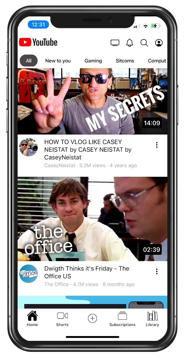
And now we already got a fully functional home feed with videos and the right layout for all elements. including the previous header area we created.
Animated Header Bar
The one more thing of this tutorial is to implement the functionality to hide the header on scroll, and bring it back in when the user scrolls in the opposite direction again.
For this we will borrow some code from my previous Ionic Gmail clone and extend the code as we need even more functionality.
The idea is actually simple:
- We listen to the scroll events of our content
- We change the position of our header to move it out or in while scrolling
Additionally we also need to take care of the ion-content element as we need to reposition it as well. The best way to see how all of this comes together is actually watching the video (at least the important part) that’s linked at the bottom of this tutorial!
But let’s begin easy by adding the generated directive from the beginning to the src/app/directives/shared-directives.module.ts and making sure it is exported:
import { NgModule } from '@angular/core';
import { CommonModule } from '@angular/common';
import { HideHeaderDirective } from './hide-header.directive';

@NgModule({
	declarations: [HideHeaderDirective],
	imports: [CommonModule],
	exports: [HideHeaderDirective]
})
export class SharedDirectivesModule {}
To use our directive we also need to import this now in our src/app/tab1/tab1.module.ts like this:
import { IonicModule } from '@ionic/angular';
import { NgModule } from '@angular/core';
import { CommonModule } from '@angular/common';
import { FormsModule } from '@angular/forms';
import { Tab1Page } from './tab1.page';
import { ExploreContainerComponentModule } from '../explore-container/explore-container.module';

import { Tab1PageRoutingModule } from './tab1-routing.module';
import { SharedDirectivesModule } from '../directives/shared-directives.module';

@NgModule({
	imports: [
		IonicModule,
		CommonModule,
		FormsModule,
		ExploreContainerComponentModule,
		Tab1PageRoutingModule,
		SharedDirectivesModule
	],
	declarations: [Tab1Page]
})
export class Tab1PageModule {}
Although we haven’t created the directive yet you can already apply it within the src/app/tab1/tab1.page.html and add a template reference to the header so we get access to that element later as well:
<ion-header #header> </ion-header>

<ion-content [appHideHeader]="header" scrollEvents="true"> </ion-content>
The logic is based on some calculations and ideas:
- We need to store the last Y position within
saveYto notice in which direction we scroll - When we notice that we changed directions, we store that exact position inside
previousYso we can use it for our calculation - We will change the top and opacity properties of our search bar
- The
scrollDistanceis the value at which the element will be gone completely, which is different for iOS and Android../li>
On top of that we need to calculate the safe area at the top, because otherwise our component would still be slightly visible sometimes.
To achieve this, we can get the value of a CSS variable inside the ngAfterViewInit() by accessing the document and using getComputedStyle().
At that point we also set the ion-content to an absolute position with the right distance from top, as we can then later reposition it easily inside the logic that calculates the new value for the header and content element when we scroll.
I tried my best to add comments in all places to understand correctly what is calculated, so go ahead and change your src/app/directives/hide-header.directive.ts to this:
import { DOCUMENT } from '@angular/common';
import {
	AfterViewInit,
	Directive,
	ElementRef,
	HostListener,
	Inject,
	Input,
	Renderer2
} from '@angular/core';
import { DomController, isPlatform } from '@ionic/angular';

enum Direction {
	downup = 1,
	down = 0
}
@Directive({
	selector: '[appHideHeader]'
})
export class HideHeaderDirective implements AfterViewInit {
	@Input('appHideHeader') header: any;
	content: any;

	scrollDistance = isPlatform('ios') ? 88 : 112;
	previousY = 0;
	direction: Direction = Direction.down;
	saveY = 0;

	constructor(
		private renderer: Renderer2,
		private domCtrl: DomController,
		private elRef: ElementRef,
		@Inject(DOCUMENT) private document: Document
	) {}

	@HostListener('ionScroll', ['$event']) onContentScroll($event: any) {
		// Skip some events that create ugly glitches
		if ($event.detail.currentY <= 0 || $event.detail.currentY === this.saveY) {
			return;
		}

		const scrollTop: number = $event.detail.scrollTop;
		let newDirection = Direction.down;

		// Calculate the distance from top based on the previousY
		// which is set when we change directions
		let newPosition = -scrollTop + this.previousY;

		// We are scrolling downup the page
		// In this case we need to reduce the position first
		// to prevent it jumping from -50 to 0
		if (this.saveY > $event.detail.currentY) {
			newDirection = Direction.downup;
			newPosition -= this.scrollDistance;
		}

		// Make our maximum scroll distance the end of the range
		if (newPosition < -this.scrollDistance) {
			newPosition = -this.scrollDistance;
		}

		const contentPosition = this.scrollDistance + newPosition;

		// Move and set the opacity of our element
		this.domCtrl.write(() => {
			this.renderer.setStyle(this.header, 'top', Math.min(0, newPosition) + 'px');

			this.renderer.setStyle(
				this.content,
				'top',
				Math.min(this.scrollDistance, contentPosition) + 'px'
			);
		});

		// Store the current Y value to see in which direction we scroll
		this.saveY = $event.detail.currentY;

		// If the direction changed, store the point of change for calculation
		if (newDirection !== this.direction) {
			this.direction = newDirection;
			this.previousY = scrollTop;
		}
	}

	ngAfterViewInit(): void {
		this.header = this.header.el;
		this.content = this.elRef.nativeElement;

		this.renderer.setStyle(this.content, 'position', `absolute`);
		this.renderer.setStyle(this.content, 'top', `${this.scrollDistance}px`);

		// Add the safe area top to completely fade out the header
		const safeArea = getComputedStyle(this.document.documentElement).getPropertyValue(
			'--ion-safe-area-top'
		);

		const safeAreaValue = +safeArea.split('px')[0];
		this.scrollDistance = this.scrollDistance + safeAreaValue;
	}
}
All this results in a smooth hide and appear whenever we scroll our apps view - and you can easily reuse this directive in your own app as you just need to pass in the reference to the header element and the component will do the rest!
Teardown
We’ve done it and cloned another popular UI, but we haven’t finished the details page. If you are also interested in that UI and the gestures around the video player, leave a comment below.
And of course if you got a request for a future tutorial in the Built with Ionic series just let me know!