Building the Spotify UI with Ionic Last update: 2021-02-09
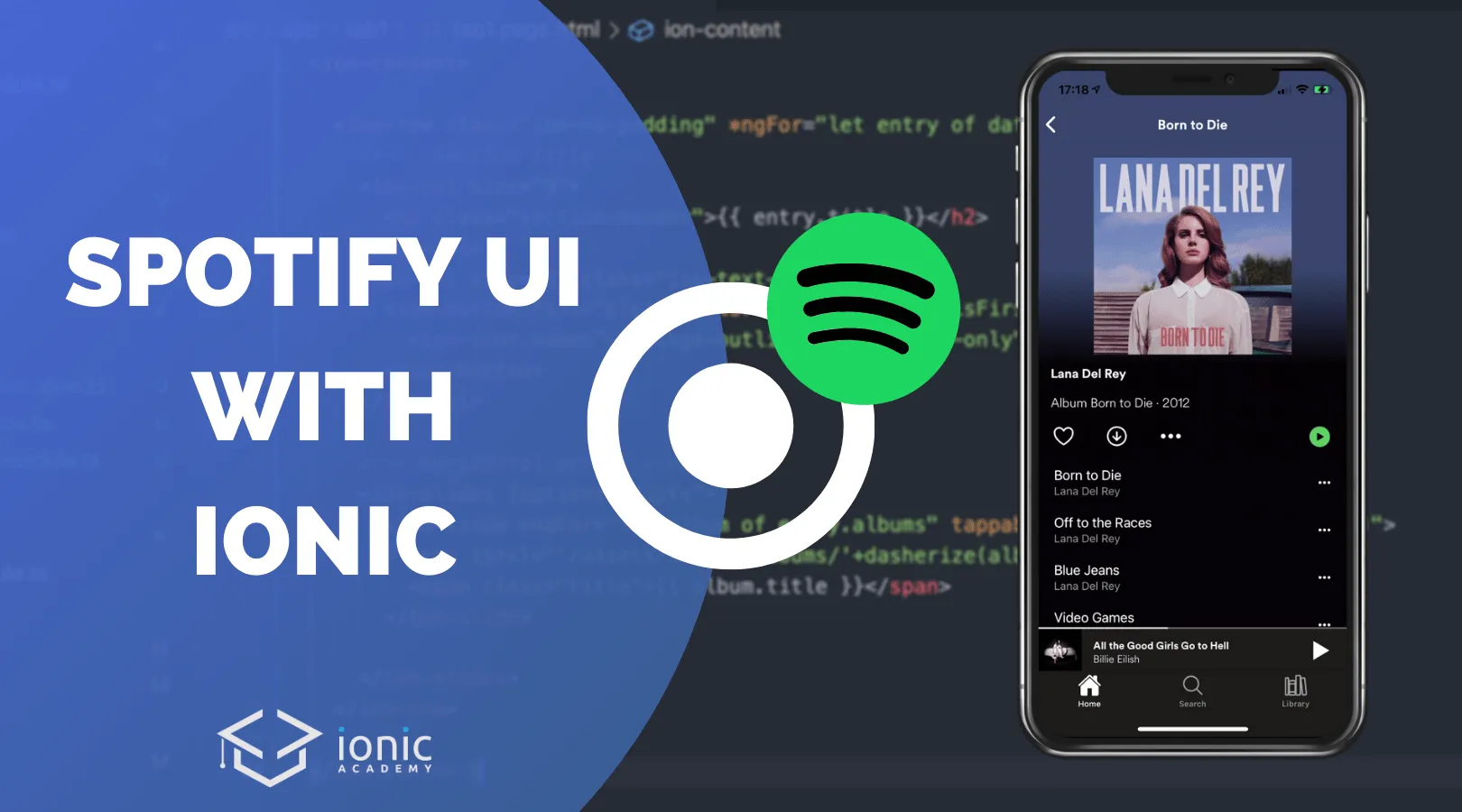
Building more complex Ionic interfaces isn’t always easy, so today we will take a look at another popular app and learn to build the Spotify Ui with Ionic!
You like to see popular apps built with Ionic? Check out my latest eBook Built with Ionic for even more real world app examples!
In the previous tutorial in the Built with Ionic series we have already implemented the Twitter timeline with Ionic, and now we will take on the Spotify player. More specific, we will build the overview with horizontal scrollable views for albums and the details view for an album or playlist that contains some cool animation to fade and scale an image while scrolling.
I’ve taken some assets from this great Github project where Caleb Nance has built something similar with React, but I’ll share another link to a repository for this tutorial as I’ve slightly changed the names of some assets files to make everything work!
Starting the Spotify App
To get started, we create an Ionic app based on the tabs template to save some time. Additionally we can generate another page for the details of an album and a new module with a directive for the animation we gonna implement in the end:
ionic start devdacticSpotify tabs --type=angular --capacitor
cd ./devdacticSpotify

# Additional details page
ionic g page album

# Directive for a fade animation
ionic g module directives/sharedDirectives --flat
ionic g directive directives/imageFade
Once your project is ready, you can copy over the whole asset folder from the code I hosted here on Github into your app (or also run that app, it’s the finished code).
Because we want to load some local JSON data with Angular, we need to add two properties to our tsconfig.json:
"compilerOptions": {
    "resolveJsonModule": true,
    "allowSyntheticDefaultImports": true
    ...
}
This will make loading local files a breeze!
Custom Ionic Style & Fonts
Of course the default color theme of Ionic won’t fit the Spotify branding, so I extracted some colors from a screenshot and generated new colors using the Ionic color generator.
The output of the generator now goes straight to the src/theme/variables.scss like this:
/** Ionic CSS Variables **/
:root {
  --ion-color-primary: #57b660;
  --ion-color-primary-rgb: 87,182,96;
  --ion-color-primary-contrast: #000000;
  --ion-color-primary-contrast-rgb: 0,0,0;
  --ion-color-primary-shade: #4da054;
  --ion-color-primary-tint: #68bd70;

  --ion-color-secondary: #3dc2ff;
  --ion-color-secondary-rgb: 61,194,255;
  --ion-color-secondary-contrast: #ffffff;
  --ion-color-secondary-contrast-rgb: 255,255,255;
  --ion-color-secondary-shade: #36abe0;
  --ion-color-secondary-tint: #50c8ff;

  --ion-color-tertiary: #5260ff;
  --ion-color-tertiary-rgb: 82,96,255;
  --ion-color-tertiary-contrast: #ffffff;
  --ion-color-tertiary-contrast-rgb: 255,255,255;
  --ion-color-tertiary-shade: #4854e0;
  --ion-color-tertiary-tint: #6370ff;

  --ion-color-success: #2dd36f;
  --ion-color-success-rgb: 45,211,111;
  --ion-color-success-contrast: #ffffff;
  --ion-color-success-contrast-rgb: 255,255,255;
  --ion-color-success-shade: #28ba62;
  --ion-color-success-tint: #42d77d;

  --ion-color-warning: #ffc409;
  --ion-color-warning-rgb: 255,196,9;
  --ion-color-warning-contrast: #000000;
  --ion-color-warning-contrast-rgb: 0,0,0;
  --ion-color-warning-shade: #e0ac08;
  --ion-color-warning-tint: #ffca22;

  --ion-color-danger: #eb445a;
  --ion-color-danger-rgb: 235,68,90;
  --ion-color-danger-contrast: #ffffff;
  --ion-color-danger-contrast-rgb: 255,255,255;
  --ion-color-danger-shade: #cf3c4f;
  --ion-color-danger-tint: #ed576b;

  --ion-color-dark: #121212;
  --ion-color-dark-rgb: 18,18,18;
  --ion-color-dark-contrast: #ffffff;
  --ion-color-dark-contrast-rgb: 255,255,255;
  --ion-color-dark-shade: #101010;
  --ion-color-dark-tint: #2a2a2a;

  --ion-color-medium: #282822;
  --ion-color-medium-rgb: 40,40,34;
  --ion-color-medium-contrast: #ffffff;
  --ion-color-medium-contrast-rgb: 255,255,255;
  --ion-color-medium-shade: #23231e;
  --ion-color-medium-tint: #3e3e38;

  --ion-color-light: #ffffff;
  --ion-color-light-rgb: 255,255,255;
  --ion-color-light-contrast: #000000;
  --ion-color-light-contrast-rgb: 0,0,0;
  --ion-color-light-shade: #e0e0e0;
  --ion-color-light-tint: #ffffff;
}
Additionally we can inject the Spotify font into our app. Whenever you want to use a custom font, you have to define the different variants inside your src/global.scss to make them available for later use:
ion-content {
  --background: var(--ion-color-dark);
}

@font-face {
  font-family: 'Spotify';
  font-style: normal;
  font-weight: normal;
  src: url('/assets/fonts/spotify-regular.ttf');
}

@font-face {
  font-family: 'Spotify';
  font-weight: bold;
  src: url('/assets/fonts/spotify-bold.ttf');
}

@font-face {
  font-family: 'Spotify';
  font-weight: lighter;
  src: url('/assets/fonts/spotify-light.ttf');
}
We’ve now also changed the general background of our app to the --ion-color-dark color that comes from the variables we defined before. We’re ready to put all of that into action!
Ionic Tab Bar with Stacked Player
The first area to focus on is the tab bar. Because we generated a details page and want to display it from one of our tabs, we have to include the albums page in our src/app/tabs/tabs-routing.module.ts now:
import { NgModule } from '@angular/core';
import { RouterModule, Routes } from '@angular/router';
import { TabsPage } from './tabs.page';

const routes: Routes = [
  {
    path: 'tabs',
    component: TabsPage,
    children: [
      {
        path: 'tab1',
        loadChildren: () => import('../tab1/tab1.module').then(m => m.Tab1PageModule)
      },
      {
        path: 'tab2',
        loadChildren: () => import('../tab2/tab2.module').then(m => m.Tab2PageModule)
      },
      {
        path: 'tab3',
        loadChildren: () => import('../tab3/tab3.module').then(m => m.Tab3PageModule)
      },
      {
        path: 'tab1/:title',
        loadChildren: () => import('../album/album.module').then( m => m.AlbumPageModule)
      },
      {
        path: '',
        redirectTo: '/tabs/tab1',
        pathMatch: 'full'
      }
    ]
  },
  {
    path: '',
    redirectTo: '/tabs/tab1',
    pathMatch: 'full'
  }
];

@NgModule({
  imports: [RouterModule.forChild(routes)],
  exports: [RouterModule]
})
export class TabsPageRoutingModule {}
If we would keep it in the app routing module (where it was automatically generated, you can remove that entry) we could still navigate to the page, but we would leave the tabs interface since the page wouldn’t be a child of the tabs page.
In some apps you will see that not only the color of the active icon changes, but the icon itself changes. That’s what we see in the Spotify app as well, where basically only the weight of the icon changes.
To achieve a switch of icons, we can listen to the ionTabsDidChange method and manually keep track of the active tab name.
With that value stored in the selected variable, we can easily check for each tab if it’s active and display a different icon!
On top of that the Spotify app displays the currently played music at the bottom, and by adding the custom player element in here we can easily control it from one place and keep it visible at all times.
Go ahead and start changing the src/app/tabs/tabs.page.html to:
<ion-tabs (ionTabsDidChange)="setSelectedTab()">

  <!-- The dummy player stacked above the tabs -->
  <div class="player">
    <div class="progress-bar">
      <div class="progress" [style.width]="progress + '%'"></div>
    </div>
    <ion-row class="ion-no-padding">
      <ion-col size="2" class="ion-no-padding">
        <img src="/assets/images/albums/when-we-all-fall-asleep.jpg">
      </ion-col>
      <ion-col size="8" class="ion-align-self-center">
        <b>All the Good Girls Go to Hell</b><br>
        <span>Billie Eilish</span>
      </ion-col>
      <ion-col size="2" class="ion-text-center ion-no-padding ion-align-self-center">
        <ion-icon name="play-sharp" color="light" size="large"></ion-icon>
      </ion-col>
    </ion-row>
  </div>

  <!-- The Ionic tab bar -->
  <ion-tab-bar slot="bottom">
    <ion-tab-button tab="tab1">
      <ion-icon [name]="selected == 'tab1' ? 'home' : 'home-outline'"></ion-icon>
      <ion-label>Home</ion-label>
    </ion-tab-button>

    <ion-tab-button tab="tab2">
      <ion-icon [name]="selected == 'tab2' ? 'search' : 'search-outline'"></ion-icon>
      <ion-label>Search</ion-label>
    </ion-tab-button>

    <ion-tab-button tab="tab3">
      <ion-icon [name]="selected == 'tab3' ? 'library' : 'library-outline'"></ion-icon>
      <ion-label>Library</ion-label>
    </ion-tab-button>
  </ion-tab-bar>
</ion-tabs>
In the player we also have a dynamic styling for the progress bar, which will simply use a value and set the width according to that value. We keep the rest static as the app won’t play music anyway, but it would be easy to control it with an injected service from here on.
Now we also need to implement the function that gets the change event of the tabs so we can set our selected tab to the current value of the tabs bar, which can easily be accessed as a Viewchild inside our class.
Continue with the src/app/tabs/tabs.page.ts and change it to:
import { Component, ViewChild } from '@angular/core';
import { IonTabs } from '@ionic/angular';

@Component({
  selector: 'app-tabs',
  templateUrl: 'tabs.page.html',
  styleUrls: ['tabs.page.scss']
})
export class TabsPage {
  @ViewChild() tabs: IonTabs;
  selected = '';
  progress = 42;

  constructor() {}

  setSelectedTab() {
    this.selected = this.tabs.getSelected();
  }
}
Right now it still wouldn’t look that good since we haven’t applied the right color to the tab bar. We can do this by setting the according CSS variables of the tab bar and of the ion-tab-button.
For the player, we can simply come up with our own fixed values while applying the Spotify font as well. Go ahead and edit the src/app/tabs/tabs.page.scss now:
ion-tab-bar {
    --background: var(--ion-color-medium);
}

ion-tab-button {
    --color-selected: #fff;
}

.player {
    height: 55px;
    background: var(--ion-color-medium);
    img {
        height: 55px;
    }
    font-family: 'Spotify';
    color: #fff;
    font-size: small;

    .progress-bar {
        height: 2px;
        width: 100%;
        background: #707070;

        .progress {
            background: #fff;
            height: 100%;
        }
    }
}
Now we’ve got the first piece of the Spotify UI with Ionic in place, so let’s head over to the home page.
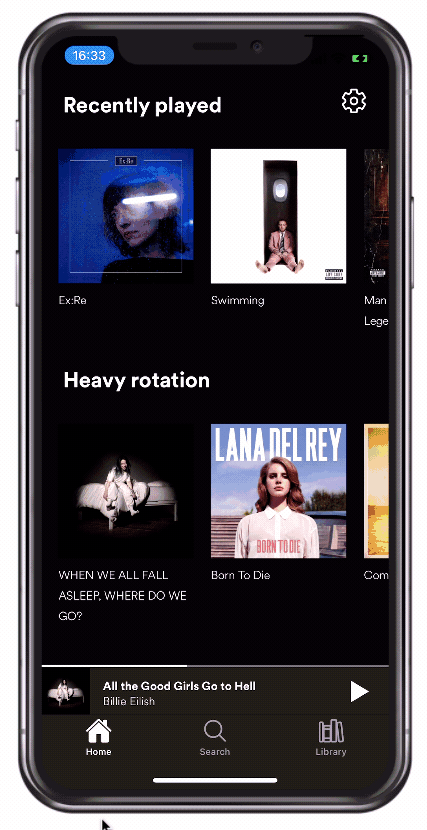
Ionic Horizontal Scroll with Images
We will now integrate the dummy data that you’ve hopefully added to your assets folder. And since we added the changes to our TS config, we can directly import those files and use them now!
Additionally we define some options for the Ionic slides that I will once again use for making a horizontal scroll view with Ionic. This time we also set it to freeMode which means you can naturally swipe through it instead of making it snap.
For opening an album and getting to the details page we just pass the title of the album as the dummy data wasn’t clear on the IDs. Make sure you call encodeURIComponent() on a string if you want to use it inside a URL!
Finally we are adding a dasherize() function as a helper, since the dummy images are stored with dashes and I couldn’t find an Angular pipe (besides inside the Angular schematics) to directly call a dasherize function.
Now go ahead and change the src/app/tab1/tab1.page.ts to this:
import { Component } from '@angular/core';
import { Router } from '@angular/router';

import recentlyPlayed from '../../assets/mockdata/recentlyPlayed.json';
import heavyRotation from '../../assets/mockdata/heavyRotation.json';
import jumpBackIn from '../../assets/mockdata/jumpBackIn.json';

@Component({
  selector: 'app-tab1',
  templateUrl: 'tab1.page.html',
  styleUrls: ['tab1.page.scss']
})
export class Tab1Page {

  data = [
    {
      title: 'Recently played',
      albums: recentlyPlayed
    },
    {
      title: 'Heavy rotation',
      albums: heavyRotation
    },
    {
      title: 'Jump back in',
      albums: jumpBackIn
    }
  ];

  opts = {
    slidesPerView: 2.4,
    slidesOffsetBefore: 20,
    spaceBetween: 20,
    freeMode: true
  };

  constructor(private router: Router) {

  }

  openAlbum(album) {
    const titleEscaped = encodeURIComponent(album.title);
    this.router.navigateByUrl(`/tabs/tab1/${titleEscaped}`);
  }

  // Helper function for image names
  dasherize(string) {
    return string.replace(/[A-Z]/g, function(char, index) {
      return (index !== 0 ? '-' : '') + char.toLowerCase();
    });
  };
}
We now have an array of data containing the title of a section and the albums that should be displayed inside, which we loaded directly from the JSON dummy data.
For reference, the recently played list data looks like this:
[
  { "id": 1, "image": "exRe", "title": "Ex:Re" },
  { "id": 2, "image": "swimming", "title": "Swimming" },
  {
    "id": 3,
    "image": "theLegendOfMrRager",
    "title": "Man On The Moon II: The Legend of Mr. Rager"
  },
  { "id": 4, "image": "seaOfCowards", "title": "Sea Of Cowards" },
  { "id": 5, "image": "wishYouWereHere", "title": "Wish You Were Here" },
  { "id": 6, "image": "extraMachine", "title": "Extraordinary Machine" },
  { "id": 7, "image": "theCreekDrank", "title": "The Creek Drank The Cradle" }
]
Based on that information we craft our view and display a settings button on the first iteration of our ngFor using the first boolean. There’s a lot more like last, odd/even or index that you can use within ngFor so always keep that in mind before creating your own complex logic!
The horizontal scroll areas are now simply Ionic slides to which we pass our custom options. Each of the slides is tappable and calls our function which routes us to the details page, and to get the right image name we use the dasherize helper function right in the path.
With that being said, go ahead and change the src/app/tab1/tab1.page.html to:
<ion-content>

  <ion-row class="ion-no-padding" *ngFor="let entry of data; let isFirst = first">
    <!--  Section Title -->
    <ion-col size="9">
      <h2 class="section-header">{{ entry.title }}</h2>
    </ion-col>
    <ion-col size="3" class="ion-text-end">
      <ion-button fill="clear" color="light" *ngIf="isFirst">
        <ion-icon name="settings-outline" slot="icon-only"></ion-icon>
      </ion-button>
    </ion-col>

    <!-- Horizontal scroll view -->
    <ion-slides [options]="opts">
      <ion-slide *ngFor="let album of entry.albums" tappable (click)="openAlbum(album)">
        <img [src]="'/assets/images/albums/'+dasherize(album.image)+'.jpg'">
        <span class="title">{{ album.title }}</span>
      </ion-slide>

    </ion-slides>
  </ion-row>

</ion-content>
Since we don’t have a toolbar in this view, we need to take care of moving the overall content a bit down by setting the --padding-top variable of our content.
Additional styling adds a bit of margin and padding here and there to make everything feel like in the original app, and to display the title of albums below them correctly inside our slides.
Open the src/app/tab1/tab1.page.scss and insert the styling like this:
ion-content {
    --padding-top: 40px;
}

.section-header {
    color: #fff;
    font-family: 'Spotify';
    font-weight: bold;
    margin-left: 20px;
    margin-bottom: 30px;
}

.title {
    color: #fff;
    font-family: 'Spotify';
    font-size: small;
}

ion-slide {
    display: block;
    text-align: left;
}

ion-slides {
    margin-bottom: 20px;
}
That looks good - we’ve got the first real page finished and can now focus on the details page.
Details View with Gradients
This page looked easy upfront, but there’s so much more to a page sometimes that you don’t immediately get.
The biggest issue with the details page is:
- It should have a dynamic gradient background color
- It should fade and scale the album image while scrolling behind the content
When you got several requirements for a page you really need to think about position the items in the right place: Which belongs to ion-content and which should be above it? Which element/text is above which part? Where do I need to have the colors set?
But before we get to all of that, let’s start with the easy part. First of all we can retrieve the information from the route and decode it into the original title again.
Now we can directly access the albums object and get the value from there, plus we add the dasherize function in here again (yes, we could create a service for that and inject it everywhere.. not DRY today.).
Start with the src/app/album/album.page.ts now and change it to:
import { Component, OnInit } from '@angular/core';
import { ActivatedRoute } from '@angular/router';
import albums from '../../assets/mockdata/albums';

@Component({
  selector: 'app-album',
  templateUrl: './album.page.html',
  styleUrls: ['./album.page.scss'],
})
export class AlbumPage implements OnInit {
  data = null;

  constructor(private activatedRoute: ActivatedRoute) { }

  ngOnInit() {
    const title = this.activatedRoute.snapshot.paramMap.get('title');
    const decodedTitle = decodeURIComponent(title);
    this.data = albums[decodedTitle];
  }

    // Helper function for image names
    dasherize(string) {
      return string.replace(/[A-Z]/g, function(char, index) {
        return (index !== 0 ? '-' : '') + char.toLowerCase();
      });
    };
}
The information we get about one album now looks like this:
{
  "artist": "Billie Eilish",
  "backgroundColor": "#363230",
  "image": "whenWeAllFallAsleep",
  "released": 2019,
  "title": "WHEN WE ALL FALL ASLEEP, WHERE DO WE GO?",
  "tracks": [
    { "title": "!!!!!!!", "seconds": 161 },
    { "title": "Bad Guy", "seconds": 245 },
    { "title": "Xanny", "seconds": 288 },
    { "title": "You Should See Me in a Crown", "seconds": 215 },
    { "title": "All the Good Girls Go to Hell", "seconds": 345 },
    { "title": "Wish You Were Gay", "seconds": 250 },
    { "title": "When the Party's Over", "seconds": 287 },
    { "title": "8", "seconds": 271 },
    { "title": "My Strange Addiction", "seconds": 210 },
    { "title": "Bury a Friend", "seconds": 237 },
    { "title": "Ilomilo", "seconds": 345 },
    { "title": "Listen Before I Go", "seconds": 347 },
    { "title": "I Love You", "seconds": 312 },
    { "title": "Goodbye", "seconds": 271 }
  ]
}
With that information we can create an interesting view, which has different areas that will receive a specific index within the CSS later:
- The content needs a background color to prevent glitches when scrolling above the edges on iOS (check out the video to see this effect)
- The image should be sticky at the top when scrolling
- The main content should start after the image and can be scrolled above it
- The main content has a gradient that’s behind everything
This is a challenging piece and requires a lot of different pieces.
First of all, we can dynamically set the background color of the Ionic toolbar by using the value from our data and passing it to the according CSS variable - yes, this works directly from your template!
On our content, we define a --custombg CSS variable on our own that we will use in the styling later to create a stunning gradient color as the background.
The image is outside of the main element so we can keep it sticky in place and handle the rest differently.
The information inside that main element is basically retrieved from the data and uses the Ionic grid setup with different Ionic CSS utilities so we don’t have to create all those little CSS changes additionally.
The list of tracks is also just a simple list which we will style from CSS in the next step.
For now, go ahead and change the src/app/album/album.page.html to:
<ion-header>
  <ion-toolbar [style.--background]="data.backgroundColor">
    <ion-buttons slot="start">
      <ion-back-button text="" color="light" defaultHref="/tabs/tab1"></ion-back-button>
    </ion-buttons>
    <ion-title color="light">{{ data?.title }}</ion-title>
  </ion-toolbar>
</ion-header>

<ion-content *ngIf="data" [style.--custombg]="data.backgroundColor">

  <!-- Image of the album -->
  <div class="ion-text-center image-box">
    <img [src]="'/assets/images/albums/'+dasherize(data.image)+'.jpg'" *ngIf="data">
  </div>

  <!-- Rest of the page content -->
  <div class="main">

    <!-- General information -->
    <ion-row>
      <ion-col size="12" class="album-info">
        <p>{{ data.artist }}</p>
        <span>Album {{ data.title }} · {{ data.released }}</span>
      </ion-col>
      <ion-col size="8" class="ion-text-left ion-no-padding">
        <ion-button fill="clear" class="ion-no-margin">
          <ion-icon name="heart-outline" color="light" slot="icon-only"></ion-icon>
        </ion-button>
        <ion-button fill="clear">
          <ion-icon name="arrow-down-circle-outline" color="light" slot="icon-only"></ion-icon>
        </ion-button>
        <ion-button fill="clear">
          <ion-icon name="ellipsis-horizontal" color="light" slot="icon-only"></ion-icon>
        </ion-button>
      </ion-col>
      <ion-col size="4" class="ion-text-right ion-no-padding">
        <ion-button fill="clear">
          <ion-icon name="play-circle" size="large" color="primary" slot="icon-only"></ion-icon>
        </ion-button>
      </ion-col>
    </ion-row>

    <!-- List of tracks -->
    <ion-list>
      <ion-item *ngFor="let t of data.tracks" lines="none">
        <ion-label>{{ t.title }}
          <p>{{ data.artist }}</p>
        </ion-label>
        <ion-icon slot="end" size="small" name="ellipsis-horizontal" color="light"></ion-icon>
      </ion-item>
    </ion-list>
  </div>

</ion-content>
To make sure the page uses the general background color we can make the items background transparent and style our other fields with the custom font or a different color.
It get’s interesting when we reach the image-box since this area should be fixed in our view, and it needs to be behind the rest of the content.
Since now the image isn’t considered for the height in the ion-content, we need to add some padding to our ion-row to make it start below the image area manually.
The main box (which still feels the whole view, only the inside padding for the row changed) uses our custom --custombg CSS variable to create a cool gradient, and the same gradient with a sharp edge is applied to the whole content so we don’t see any edges when pulling further on iOS (again, check out the video at the bottom!).
It looks easy, but figuring out the different order of elements and making everything look natural was the hard part!
Go ahead and add the following to the src/app/album/album.page.scss:
ion-item {
    --ion-item-background: transparent;
    color: #fff;

    p {
        color: #949494;
    }
}

ion-list {
    --ion-background-color: var(--ion-color-dark);
}

ion-title, ion-content {
    font-family: 'Spotify';
}

.album-info {
    color: #fff;
    margin-left: 11px;
    p {
        font-weight: bold;
    }
}

.image-box {
    position: fixed;
    z-index: 0;
    padding-left: 15%;
    padding-right: 15%;
    padding-top: 5%;
}

ion-row {
    padding-top: 40vh;
}

ion-content {
    --background: linear-gradient(var(--custombg) 400px, var(--ion-color-dark) 400px);
}

.main {
    z-index: 2;
    background: linear-gradient(var(--custombg) 20%, var(--ion-color-dark) 30%);
}
The page now has a dynamic gradient background color, the image is sticky and we can scroll the content above the image. There’s only one thing missing…
Custom Image Fade Directive
The last step is a directive that changes the appearance of the image box inside our details view. To get started, we need to make sure our directive is declared and exported correctly in the module we generated in the beginning, so open the src/app/directives/shared-directives.module.ts and add the missing line:
import { NgModule } from '@angular/core';
import { CommonModule } from '@angular/common';
import { ImageFadeDirective } from './image-fade.directive';

@NgModule({
  declarations: [ImageFadeDirective],
  imports: [
    CommonModule
  ],
  exports: [ImageFadeDirective]
})
export class SharedDirectivesModule { }
We want to fade out the image while we scroll, and just like the custom directive in our Twitter UI with Ionic tutorial, we will react to the scroll event of the ion-content.
Additionally the image element will be passed to the @Input() of our directive so we can change both the opacity and padding on the side to make it appear as it gets smaller.
You can play around with the calculation to achieve your desired result, but the following works pretty well inside the src/app/directives/image-fade.directive.ts:
import { Directive, HostListener, Input, Renderer2 } from '@angular/core';
import { DomController } from '@ionic/angular';

@Directive({
  selector: '[appImageFade]'
})
export class ImageFadeDirective {
  @Input('appImageFade') cover: any;

  constructor(
    private renderer: Renderer2,
    private domCtrl: DomController
  ) { }

  @HostListener('ionScroll', ['$event']) onContentScroll($event: any) {
    const scrollTop: number = $event.detail.scrollTop;
    let newOpacity = Math.max(100 - (scrollTop/3), 0)

    let newPadding = 15 + (scrollTop/25);
    if (newPadding > 100) {
      newPadding = 100;
    }

    this.domCtrl.write(() => {
      this.renderer.setStyle(this.cover, 'opacity', `${newOpacity}%`);
      this.renderer.setStyle(this.cover, 'padding-left', `${newPadding}%`);
      this.renderer.setStyle(this.cover, 'padding-right', `${newPadding}%`);
    });
  }
}
Before we can use the directive we need to import the module in the page where we want to use it. In our case, open the src/app/album/album.module.ts and import it:
import { NgModule } from '@angular/core';
import { CommonModule } from '@angular/common';
import { FormsModule } from '@angular/forms';

import { IonicModule } from '@ionic/angular';

import { AlbumPageRoutingModule } from './album-routing.module';

import { AlbumPage } from './album.page';
import { SharedDirectivesModule } from '../directives/shared-directives.module';

@NgModule({
  imports: [
    CommonModule,
    FormsModule,
    IonicModule,
    AlbumPageRoutingModule,
    SharedDirectivesModule
  ],
  declarations: [AlbumPage]
})
export class AlbumPageModule {}
Now we simply need to apply the directive and pass the element we want to change to it. Therefore, we can give our image box element a template reference and pass this directly to our directive, which is added to the ion-content in order to listen to the scroll events.
Go ahead and apply the final changes to the src/app/album/album.page.html now:
<ion-content scrollEvents="true"  [fullscreen]="true" [appImageFade]="cover" *ngIf="data" [style.--custombg]="data.backgroundColor">
  <div class="ion-text-center image-box" #cover>
    <img [src]="'/assets/images/albums/'+dasherize(data.image)+'.jpg'" *ngIf="data">
  </div>
  ...
  ..
And with that last missing piece our Ionic Spotify UI is finished!
Conclusion
Creating complex UIs with Ionic isn’t always easy, but once you get better with the grid, CSS variables and directives, you feel the power of creating any user interface that you want. And having a good feeling about the tools and frameworks you use can have a huge impact on your productivity as well.
If you want to see more of the Built with Ionic tutorials, leave a comment with some UI that I should replicate with Ionic!
You can also find a video version of this tutorial below. https://youtu.be/sdrw15el3_w