Ionic Responsive Design and Navigation for All Screens Last update: 2021-04-06
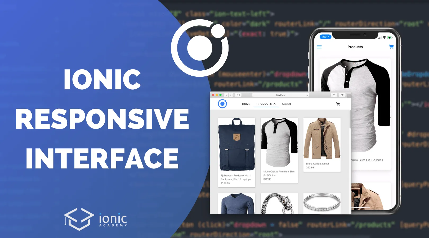
You already know that you can create web and mobile apps from one codebase with Ionic, but having a responsive design that looks good on all platforms is sometimes challenging.
By default Ionic apps look on the web not like class web apps, and more like mobile apps on bigger screens.
In this tutorial we will take the necessary steps to build upon a general menu routing but use a more traditional navigation bar on bigger screens.
To achieve this we will use a custom component that can be used easily everywhere in our app, we’ll use media queries to define custom CSS and work with the ion-grid for more responsive internal pages!
Setting up our Responsive Ionic App
To get started, bring up a new Ionic app and add a few pages for our routing. On top of that we need a module for our custom header component that we will create:
ionic start devdacticWebsite blank --type=angular --capacitor
cd ./devdacticWebsite

ionic g page pages/menu
ionic g page pages/home
ionic g page pages/products
ionic g page pages/about

ionic g module components/sharedComponents --flat
ionic g component components/header
Our menu routing will happen inside a different file, so we need to clean up the src/app/app-routing.module.ts to just hold a reference to that file now:
import { NgModule } from '@angular/core';
import { PreloadAllModules, RouterModule, Routes } from '@angular/router';

const routes: Routes = [
  {
    path: '',
    loadChildren: () => import('./pages/menu/menu.module').then(m => m.MenuPageModule)
  }
];

@NgModule({
  imports: [
    RouterModule.forRoot(routes, { preloadingStrategy: PreloadAllModules })
  ],
  exports: [RouterModule]
})
export class AppRoutingModule { }
Because we will make a simple HTTP call to show some dummy data we also need to include the HttpClientModule in our src/app/app.module.ts:
import { NgModule } from '@angular/core';
import { BrowserModule } from '@angular/platform-browser';
import { RouteReuseStrategy } from '@angular/router';

import { IonicModule, IonicRouteStrategy } from '@ionic/angular';

import { AppComponent } from './app.component';
import { AppRoutingModule } from './app-routing.module';

import { HttpClientModule } from '@angular/common/http';

@NgModule({
  declarations: [AppComponent],
  entryComponents: [],
  imports: [BrowserModule, IonicModule.forRoot(), AppRoutingModule,
    HttpClientModule],
  providers: [{ provide: RouteReuseStrategy, useClass: IonicRouteStrategy }],
  bootstrap: [AppComponent]
})
export class AppModule { }
Finally we gonna add a background to our content pages to distinguish it a bit better from our header, so open the src/global.scss and add:
ion-content {
    --background: #e9e9e9;
}
Now we are ready to build out our app!
Building a Global Header Component
First step is to create the header component, and because we used a custom module we now need to declare and export it inside the src/app/components/shared-components.module.ts:
import { NgModule } from '@angular/core';
import { CommonModule } from '@angular/common';
import { HeaderComponent } from './header/header.component';
import { IonicModule } from '@ionic/angular';
import { RouterModule } from '@angular/router';

@NgModule({
  declarations: [HeaderComponent],
  imports: [
    CommonModule,
    IonicModule,
    RouterModule
  ],
  exports: [HeaderComponent]
})
export class SharedComponentsModule { }
The purpose of this component depends on the screen size:
- Small screens: Show the default Ionic toolbar with menu button and dynamic title
- Big screens: Present a custom navigation bar with links and dropdown box
The first part is achieved quite easily, as it looks like the default in Ionic apps. We will handle the hide/show with a media query from CSS later, but we could also use an *ngIf to completely disable that area or use an approach we used to Create a Horizontal Navigation for Ionic Desktop Views in the past.
The navigation bar for bigger screens can be accomplished by using the grid component (or use whatever you prefer like flexbox). Inside we will use the routes to our pages which we will set up inside the menu in the next step, and since we got a few properties let’s take a look at them:
- routerDirection: Affects how new pages appear, but for menu routing root is most of the time the best
- routerLinkActive: A CSS class that is added to an element when this is the active route
- routerLinkActiveOptions: Used to make sure that the empty path ”/” is not activated as well and only exact matches count
For the dropdown, we could either use a simple hover from CSS but I felt like the approach with manual control and reacting to mouseenter and mouseleave work better in this case, since we basically leave the button hover area when we go into the dropdown list with a cursor.
The items in the dropdown itself are pretty boring and follow the usual routing, I just added a query param as an example (the Angular way!).
Now go ahead and change the src/app/components/header/header.component.html to:
<ion-header class="mobile-header">
  <ion-toolbar>
    <ion-buttons slot="start">
      <ion-menu-button menu="myMenu"></ion-menu-button>
    </ion-buttons>
    <ion-title>{{ title }}</ion-title>
    <ion-buttons slot="end">
      <ion-button>
        <ion-icon slot="icon-only" name="cart"></ion-icon>
      </ion-button>
    </ion-buttons>
  </ion-toolbar>
</ion-header>

<ion-row class="header ion-align-items-center">
  <ion-col size="2" class="ion-align-items-center">
    <img src="https://ionicacademy.com/wp-content/uploads/2020/02/ionic-Logo.svg" width="50px">
  </ion-col>
  <ion-col size="8" class="ion-text-left">
    <ion-button fill="clear" color="dark" routerLink="/" routerDirection="root" routerLinkActive="active-item"
      [routerLinkActiveOptions]="{exact: true}">
      Home
    </ion-button>
    <!-- Button with dropdown -->
    <ion-button #productbtn (mouseenter)="dropdown=true" (mouseleave)="hideDropdown($event)" fill="clear" color="dark"
      routerLink="/products" routerDirection="root" routerLinkActive="active-item">
      Products
      <ion-icon slot="end" [name]="dropdown ? 'chevron-down' : 'chevron-up'"></ion-icon>
    </ion-button>
    <div *ngIf="dropdown" class="dropdown" (mouseleave)="dropdown = false" #dropdownbox>
      <ion-item (click)="dropdown = false" routerLink="/products" [queryParams]="{ category: 'popular'}" lines="none" routerDirection="root" >
        Popular
      </ion-item>
      <ion-item (click)="dropdown = false" button routerLink="/products" [queryParams]="{ category: 'cloth'}"
        lines="none" routerDirection="root" >
        Cloth
      </ion-item>
      <ion-item (click)="dropdown = false" button routerLink="/products" [queryParams]="{ category: 'gadgets'}"
        lines="none" routerDirection="root">
        Gadgets
      </ion-item>
    </div>
    <ion-button fill="clear" color="dark" routerLink="/about" routerDirection="root" routerLinkActive="active-item">
      About
    </ion-button>
  </ion-col>
  <ion-col size="2" class="ion-text-right">
    <ion-button fill="clear" color="dark">
      <ion-icon slot="icon-only" name="cart"></ion-icon>
    </ion-button>
  </ion-col>

</ion-row>
As said before, we can now manage when the dropdown should be hidden again from code. And here we can check if we left with the mouse event to the left boundary, to the right or to the top - leaving to the bottom is fine since that’s the place where the dropdown itself is displayed!
Besides that we define an Input so we can dynamically pass in the title on smaller screens and use it as the page title.
Continue by opening the src/app/components/header/header.component.ts and change it to:
import { Component, ElementRef, Input, OnInit, ViewChild } from '@angular/core';

@Component({
  selector: 'app-header',
  templateUrl: './header.component.html',
  styleUrls: ['./header.component.scss'],
})
export class HeaderComponent implements OnInit {

  @Input() title: string;
  dropdown = false;

  @ViewChild('productbtn', { read: ElementRef })productbtn: ElementRef;

  constructor() { }

  ngOnInit() { }

  hideDropdown(event) {
    const xTouch = event.clientX;
    const yTouch = event.clientY;

    const rect = this.productbtn.nativeElement.getBoundingClientRect();
    const topBoundary = rect.top+2;
    const leftBoundary = rect.left+2;
    const rightBoundary = rect.right-2;

    if (xTouch < leftBoundary || xTouch > rightBoundary || yTouch < topBoundary) {
      this.dropdown = false;
    }
  }
}
Note: I added a few pixels to the boundaries to make sure any hover event that goes just slightly over the edge triggers the disappearance.
The last step now is to add our media query to dynamically switch between our different navigation bar elements in our custom component, one of the elements discussed in our 10 Tips & Tricks for Building Websites with Ionic as well.
I’ve simply decided that 768px would be a good breakpoint - feel free to use anything that works better for you!
So now we can add the rules to our src/app/components/header/header.component.scss like this:
@media(min-width: 768px) {
  .mobile-header {
    display: none;
  }

  .header {
    display: flex;
    background: #fff;
    padding-left: 40px;
    padding-right: 40px;
  }
}

@media(max-width: 768px) {
  .mobile-header {
    display: block;
  }

  .header {
    display: none;
  }
}

.active-item {
  border-bottom: 2px solid var(--ion-color-primary);
}

.dropdown {
    width: 136px;
    height: 150px;
    background: #fff;
    position: absolute;
    top: 40px;
    left: 87px;
    z-index: 1;
    ion-item:hover {
        --ion-item-color: var(--ion-color-primary);
    }
}
For the dropdown we use some fixed values to position it correctly, and we also applied a hover to the items within the dropdown.
Now we got the component but it’s not yet visible - let’s change that!
Creating the Menu
First of all we need to include the module of our component in order to use the cool header component we created.
Therefore, open the src/app/pages/menu/menu.module.ts and insert it like this:
import { NgModule } from '@angular/core';
import { CommonModule } from '@angular/common';
import { FormsModule } from '@angular/forms';

import { IonicModule } from '@ionic/angular';

import { MenuPageRoutingModule } from './menu-routing.module';

import { MenuPage } from './menu.page';
import { SharedComponentsModule } from '../../components/shared-components.module';

@NgModule({
  imports: [
    CommonModule,
    FormsModule,
    IonicModule,
    MenuPageRoutingModule,
    SharedComponentsModule
  ],
  declarations: [MenuPage]
})
export class MenuPageModule {}
Now we can also define our routing with the 3 pages we generated in the beginning. For this, open the src/app/pages/menu/menu-routing.module.ts and add these pages inside the children array of our parent menu page:
import { NgModule } from '@angular/core';
import { Routes, RouterModule } from '@angular/router';

import { MenuPage } from './menu.page';

const routes: Routes = [
  {
    path: '',
    component: MenuPage,
    children: [
      {
        path: '',
        loadChildren: () => import('../home/home.module').then( m => m.HomePageModule)
      },
      {
        path: 'products',
        loadChildren: () => import('../products/products.module').then( m => m.ProductsPageModule)
      },
      {
        path: 'about',
        loadChildren: () => import('../about/about.module').then( m => m.AboutPageModule)
      }
    ]
  }
];

@NgModule({
  imports: [RouterModule.forChild(routes)],
  exports: [RouterModule],
})
export class MenuPageRoutingModule {}
The menu page now holds a list for our navigation, and we will define an additional HostListener so we can disable the menu. The reason is simple, the menu while not visible through a button could still be pulled in from the side on bigger screens.
Therefore, we check the width in the beginning and then handle it through our listener using the breakpoint of our app later.
Go ahead and change the src/app/pages/menu/menu.page.ts to:
import { Component, HostListener, OnInit } from '@angular/core';
import { MenuController, Platform } from '@ionic/angular';

@Component({
  selector: 'app-menu',
  templateUrl: './menu.page.html',
  styleUrls: ['./menu.page.scss'],
})
export class MenuPage implements OnInit {

  menuItems = [
    {
      title: 'Home',
      icon: 'home',
      path: '/'
    },
    {
      title: 'Products',
      icon: 'list',
      path: '/products'
    },
    {
      title: 'About',
      icon: 'information',
      path: '/about'
    }
  ];

  title = 'Home';

  constructor(private menuCtrl: MenuController, private plt: Platform) { }

  ngOnInit() {
    const width = this.plt.width();
    this.toggleMenu(width);
  }

  @HostListener('window:resize', ['$event'])
  private onResize(event) {
    const newWidth = event.target.innerWidth;
    this.toggleMenu(newWidth);
  }

  toggleMenu(width) {
    if (width > 768) {
      this.menuCtrl.enable(false, 'myMenu');
    } else {
      this.menuCtrl.enable(true, 'myMenu');
    }
  }

  setTitle(title) {
    this.title = title
  }

}
The template for our menu follows the standard markup and displays the menu elements based on the information of our array.
The important part is now adding our custom header component: We add it above the router outlet, which means it’s always visible and won’t reload all the time while navigating!
The content of the pages will be rendered inside the router outlet as usual, and we need to add a bit of margin to move that down in the next step.
For now, open the src/app/pages/menu/menu.page.html and change it to:
<ion-menu contentId="main" menuId="myMenu" side="start">
  <ion-header>
    <ion-toolbar>
      <ion-title>Menu</ion-title>
    </ion-toolbar>
  </ion-header>
  <ion-content>
    <ion-menu-toggle *ngFor="let item of menuItems">
      <ion-item button (click)="setTitle(item.title)" [routerLink]="item.path" routerDirection="root"
        routerLinkActive="active-item" [routerLinkActiveOptions]="{exact: true}">
        <ion-icon [name]="item.icon" slot="start"></ion-icon>
        {{ item.title }}
      </ion-item>
    </ion-menu-toggle>
  </ion-content>
</ion-menu>

<!-- Global App Header -->
<app-header [title]="title"></app-header>

<ion-router-outlet id="main"></ion-router-outlet>
Because the outlet would usually cover the whole screen and would overlay our header, we now move it down a bit on the different screen sizes. You might have to tweak the margin a bit depending on the size of your navigation bar and elements within, but you can get started for now by changing the src/app/pages/menu/menu.page.scss to:
@media(min-width: 768px) {
  ion-router-outlet {
    margin-top: 63px;
  }
}

@media(max-width: 768px) {
    ion-router-outlet {
        margin-top: 56px;
      }
}

.active-item {
    color: var(--ion-color-primary);
    font-weight: 500;
    ion-icon {
        color: var(--ion-color-primary);
    }
}
We now got the whole navigation and global header in place, but if you haven’t touched the additional pages you will still see their headers. Let’s change all of them to display some more responsive elements!
Building Responsive Pages with Grid
One example would be adding a little hero background image to the starting page, and we can do this right inside of our src/app/pages/home/home.page.html:
<ion-content>
  <div class="hero"></div>
</ion-content>
Yes, we really don’t need the header anymore now - we have our global header already anyway!
For the CSS you could now define a little background image like this inside the src/app/pages/home/home.page.scss:
.hero {
    background-image: url('https://images.unsplash.com/photo-1472851294608-062f824d29cc');
    background-repeat: no-repeat;
    background-position: center;
    background-size: cover;
    height: 30vh;
    width: 100%;
}
If you want to make your views responsive when using the grid, you can define how much space it used on different screen sizes.
An example could look like this inside the src/app/pages/about/about.page.html:
<ion-content>
  <ion-grid>
    <ion-row class="ion-justify-content-center">
      <ion-col size="12" size-md="10" size-lg="8" size-xl="6">
        Lorem ipsum dolor sit amet, consectetur adipiscing elit....
      </ion-col>
    </ion-row>
  </ion-grid>
</ion-content>
Simply add a bit more of text inside and see how it changes when making the window bigger or smaller. The trick is that we only have one column, but by using ion-justify-content-center it we automatically get the nice effect of not filling out the whole screen.
On top of that we wanted to create a little product showcase for which we will pull in some data inside the src/app/pages/products/products.page.ts:
import { HttpClient } from '@angular/common/http';
import { Component, OnInit } from '@angular/core';
import { Observable } from 'rxjs';
@Component({
selector: 'app-products',
templateUrl: './products.page.html',
styleUrls: ['./products.page.scss'],
})
export class ProductsPage implements OnInit {
products: Observable<any>;
constructor(private http: HttpClient) { }
ngOnInit() {
this.products = this.http.get('https://fakestoreapi.com/products');
}
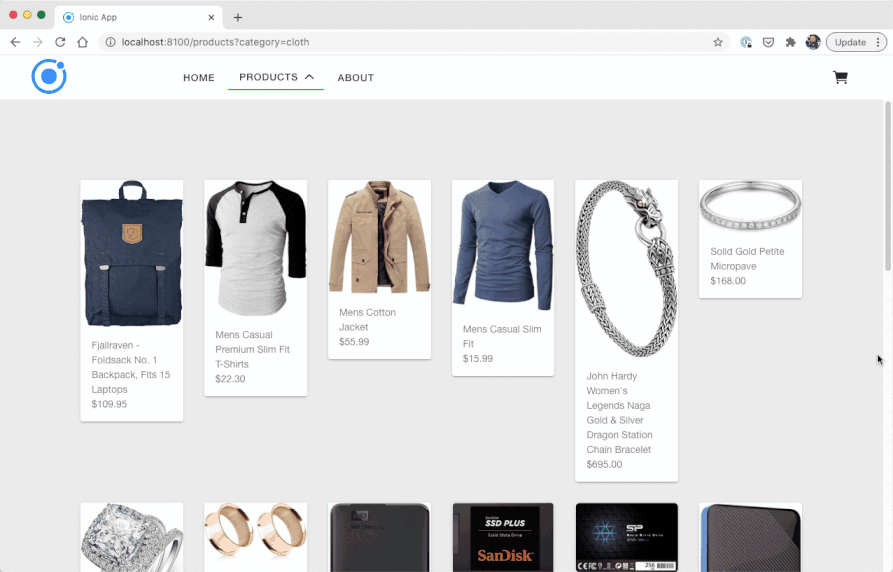
}With the async pipe we can now iterate the values and again define different sizes so we see either 1, 2, 3 or 6 elements within our row at the same time, depending on the defined size for each column by breakpoint.
Finish our app by changing the src/app/pages/products/products.page.html to this now:
<ion-content>
  <ion-grid>
    <ion-row class="ion-justify-content-center">
      <ion-col size="12" size-sm="6" size-md="4" size-lg="3" size-xl="2" *ngFor="let p of products | async">
        <ion-card>
          <img [src]="p.image">
          <ion-card-content>
            <ion-label>
              {{ p.title}}
              <p>{{ p.price | currency:'USD' }}</p>
            </ion-label>
          </ion-card-content>
        </ion-card>
      </ion-col>
    </ion-row>
  </ion-grid>
</ion-content>
If you also want to apply more overall padding to the grid on different screen sizes, you could now easily tweak that by setting the according CSS variable inside the src/app/pages/products/products.page.scss:
ion-grid {
    --ion-grid-padding-sm: 20px;
    --ion-grid-padding-md: 30px;
    --ion-grid-padding-lg: 40px;
    --ion-grid-padding-xl: 100px;
}
And we are done with our responsive Ionic app that looks amazing on both mobile and the web!
Conclusion
By default the UI for Ionic apps doesn’t look like a website, but with a few tricks you can achieve a great result that works across all devices and works from one codebase.
If you got any question or want to see more about building websites with Ionic, simply leave a comment below!
You can also find a video version of this tutorial below.