How to Create a Horizontal Navigation for Ionic Desktop Views Last update: 2020-01-28
When you want to use your Ionic app as a website it’s not just enough to fill the available space - some UI element should simply be different.
A good example is the horizontal navigation bar you have on most pages, that you don’t really have inside a mobile application. Today, we wanna build a dynamic view that shows a tab bar on small screens but a cool navigation bar on a bigger desktop screen!
To achieve this result, we will listen to all changes to the size of our window and react accordingly so we only show what’s currently the best UI for the user!
Preparing our App
To get started, we can use the tabs template and simply generate an additional service that we will use for all size change events, so go ahead and run:
ionic start responsiveApp tabs --type=angular
cd ./responsiveApp
ionic g service services/screensize
The general approach of this article should also work for apps with a side menu, however, with a side menu you also have the ability to use the ion-split-pane which basically acts like an open menu on bigger screens. From there it’s just a bit of CSS to make it look like a side menu on any website!
Listening for our Screen size
First of all we now want to implement our service, which holds a BehaviorSubject so all other components that are interested in this can subscribe to it from everywhere inside our application.
We will simply emit whether the current screen size means we are on a mobile (small) device or a desktop screen, you could also make this even more granular by passing objects when a certain breakpoint was hit. However, the biggest change is normally between mobile/desktop so we only care about that information.
Our service will be called from outside to set the value of the Subject, and also to return the Subject. Also, when we return the Subject as an Observable we make us of distinctUntilChanged which only emits a new value to the Observable if it’s really a new value. This means, if the result of onResize is 5 times false in a row, everyone subscribed to the Observable will only get false once, and only when the value changes to true receive the new value!
Now here’s the code for our app/services/screensize.service.ts:
import { Injectable } from '@angular/core';
import { Observable, BehaviorSubject } from 'rxjs';
import { distinctUntilChanged } from 'rxjs/operators';

@Injectable({
  providedIn: 'root'
})
export class ScreensizeService {

  private isDesktop = new BehaviorSubject<boolean>(false);

  constructor() { }

  onResize(size) {
    if (size < 568) {
      this.isDesktop.next(false);
    } else {
      this.isDesktop.next(true);
    }
  }

  isDesktopView(): Observable<boolean> {
    return this.isDesktop.asObservable().pipe(distinctUntilChanged());
  }
}
To make this a useful service we need to let it know about the change of size, and the best place to listen for those changes is at the top of our app.
Therefore, we listen to the window:resize event in our app/app.component.ts and call the function of our service with the new width of the screen:
import { Component, HostListener } from '@angular/core';

import { Platform } from '@ionic/angular';
import { SplashScreen } from '@ionic-native/splash-screen/ngx';
import { StatusBar } from '@ionic-native/status-bar/ngx';
import { ScreensizeService } from './services/screensize.service';

@Component({
  selector: 'app-root',
  templateUrl: 'app.component.html',
  styleUrls: ['app.component.scss']
})
export class AppComponent {
  constructor(
    private platform: Platform,
    private splashScreen: SplashScreen,
    private statusBar: StatusBar,
    private screensizeService: ScreensizeService
  ) {
    this.initializeApp();
  }

  initializeApp() {
    this.platform.ready().then(() => {
      this.statusBar.styleDefault();
      this.splashScreen.hide();
      this.screensizeService.onResize(this.platform.width());
    });
  }

  @HostListener('window:resize', ['$event'])
  private onResize(event) {
    this.screensizeService.onResize(event.target.innerWidth);
  }
}
This will call the service quite often if you resize the window, that’s why we added the distinctUntilChanged operator.
Also, we will call the service initially when the platform is ready to set the starting value so the right UI gets displayed immediately.
Implementing the Desktop View
Now we know when the view has the size of a small device or a desktop, and we can use that information in our view. First of all we need to subscribe to the Observable and set a local value in our class which will be used in the view in the next step.
Go ahead and change the app/tabs/tabs.page.ts so we make use of our service:
import { Component } from '@angular/core';
import { ScreensizeService } from '../services/screensize.service';

@Component({
  selector: 'app-tabs',
  templateUrl: 'tabs.page.html',
  styleUrls: ['tabs.page.scss']
})
export class TabsPage {
  isDesktop: boolean;

  constructor(private screensizeService: ScreensizeService) {
    this.screensizeService.isDesktopView().subscribe(isDesktop => {
      if (this.isDesktop && !isDesktop) {
        // Reload because our routing is out of place
        window.location.reload();
      }

      this.isDesktop = isDesktop;
    });
  }
}
Nothing fancy, but one disclaimer here: Moving from mobile to desktop size works very well as you will see later, but moving back doesn’t. The reason is the internal routing of our tabs, which is messed up after we come back from a bigger screen and the routes of the tabs are somehow broken.
The fix you see in the code above is to reload the whole page if we move back from desktop to mobile. Not really seamless responsive I know.
I couldn’t find a solution for this problem, if you happen to find a solution or if you’re a member of the Ionic team please leave a comment on how to fix this!
Anyway, most users will use either screen size and not change the size of their browser all the time (like we developers do), so this is something I can personally live with because of the upsides of this approach.
Now we get to the interesting part - building a view for desktop.
The idea is to hide the whole tabs stuff when we are on desktop and use a completely different markup while still maintaining routing and pages as they are.
Our desktop view consists of a header in which we will have a logo to the left and some buttons centered. The buttons have the same links to the three tabs like our tab bar, so we don’t need any other changes and all routes stay the same (hooray!).
The interesting part follows after the header and before the dummy footer: A new ion-router-outlet!
This basically means whatever the Angular router things is the right information for the URL will be displayed in there. We also use this in the side menu, and if you create other layouts with pure Angular you might have used router outlets before as well.
Now go ahead and change the app/tabs/tabs.page.html to:
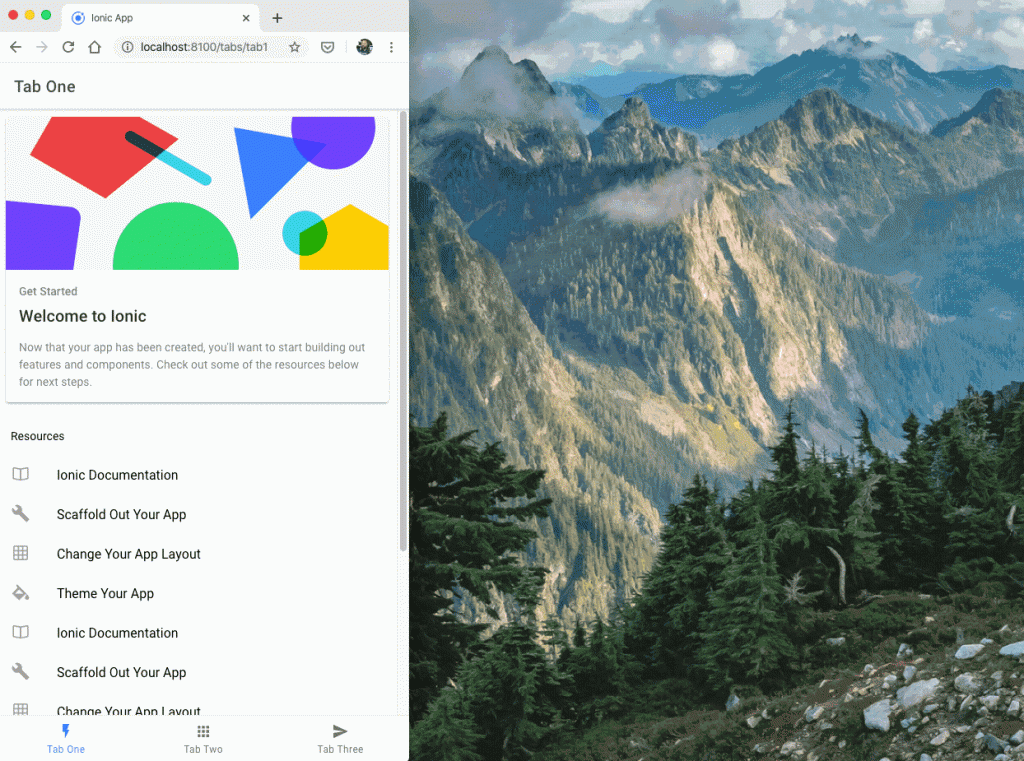
<ion-tabs *ngIf="!isDesktop">
  <ion-tab-bar slot="bottom">
    <ion-tab-button tab="tab1">
      <ion-icon name="flash"></ion-icon>
      <ion-label>Tab One</ion-label>
    </ion-tab-button>

    <ion-tab-button tab="tab2">
      <ion-icon name="apps"></ion-icon>
      <ion-label>Tab Two</ion-label>
    </ion-tab-button>

    <ion-tab-button tab="tab3">
      <ion-icon name="send"></ion-icon>
      <ion-label>Tab Three</ion-label>
    </ion-tab-button>
  </ion-tab-bar>
</ion-tabs>

<div *ngIf="isDesktop" class="desktop">
  <ion-header mode="ios">
    <ion-toolbar>
      <ion-row class="ion-align-items-center">
        <ion-col size="2">
          <img src="./assets/logo.webp" class="logo ion-text-left">
        </ion-col>
        <ion-col size="10">
          <div class="navbar" class="ion-text-center">
            <ion-button fill="clear" routerLink="/tabs/tab1" routerDirection="root" routerLinkActive="active-link"
              class="link">
              Tab 1
            </ion-button>
            <ion-button fill="clear" routerLink="/tabs/tab2" routerDirection="root" routerLinkActive="active-link"
              class="link">
              Tab 2
            </ion-button>
            <ion-button fill="clear" routerLink="/tabs/tab3" routerDirection="root" routerLinkActive="active-link"
              class="link">
              Tab 3
            </ion-button>
          </div>
        </ion-col>
      </ion-row>
    </ion-toolbar>
  </ion-header>

  <ion-router-outlet class="desktop-wrapper"></ion-router-outlet>

  <div class="footer">
    <span>Ionic Academy 2019</span>
  </div>

</div>
All of this means: On a bigger screen, our different markup will be shown with our custom header bar, and we added the router outlet to define where in that layout the actual information of a page should be displayed!
This works by now already pretty fine, but with some additional CSS we can make it even more awesome.
Applying custom Desktop Styling
To make the navigation bar really stand out and make use of the active link class, we need to add a few CSS rules in our app/tabs/tabs.page.scss:
.desktop {
  ion-router-outlet {
    margin-top: 56px;
    margin-bottom: 56px;
  }

  .logo {
    max-height: 40px;
  }

  ion-toolbar {
    --background: #374168;
  }

  .link {
    --color: var(--ion-color-light);
  }

  .active-link {
    --color: var(--ion-color-primary);
  }
}

.footer {
  width: 100%;
  color: #fff;
  font-weight: bold;
  background: #374168;
  height: 56px;
  line-height: 56px;
  text-align: center;
  position: fixed;
  bottom: 0px;
}
This also defines our footer and adds margin for the content that is displayed in the ion-router-outlet, since otherwise the content would be covered by our additional custom navigation bar and footer.
If you also want to globally add some styling to all pages, you can do it with the desktop-wrapper rule we added to the outlet. This means, everything we put in here affects the pages that are displayed in our layout.
You could for example make the title of each page aligned in the center and remove the shadow of the element like this in your src/global.scss (after all the imports, don’t delete them!):
.desktop-wrapper {
  ion-toolbar {
    text-align: center;
  }

  ion-header {
    &.header-md:after {
      background: none;
    }
  }
}
Conclusion
Desktop websites with Ionic are a challenging topic, and hopefully we see more on this in the future from the Ionic team. There are already great responsive components like the grid or CSS utilities based on breakpoints, but sometimes a completely different UI pattern is needed for a website!
You can also find a video version of this tutorial below.