How To Build Ionic Tinder Cards Using Angular 2 Swing Last update: 2016-09-15

The Ionic tinder card swipe feature is a highly request UI behaviour and my previous post about the use of it with Ionic 1 was very popular. For Ionic there is not yet an official component from the Ionic team, but with some help from a different library we can achieve almost the same results.
This Tutorial was updated for Ionic 3.2!
Follow along this post to get your own Ionic 2+ tinder cards or swipeable cards for your next app using the Angular 2 swing package from Kapil Sachdeva. This package is based on the Swing library, a swiepable cards interface.
Prerequisite
Learning Ionic can become overwhelming, I know that feeling. Is learning from tutorials and videos sometimes not enough for you? Then I got something for you.
If you want to learn Ionic with step-by-step video courses, hands-on training projects and a helpful community who has your back, then take a look at the Ionic Academy.
Starting our app
We begin, as always, with a blank new Ionic project. We additionally install the before mentioned Angular 2 Swing library with NPM, so go ahead and run:
ionic start devdactic-swipe blank
cd devdactic-swipe
npm install angular2-swing --save
To make HTTP calls and load the component correctly we also have to add some stuff to our module, so open your src/app/app.module.ts and insert:
import { BrowserModule } from '@angular/platform-browser';
import { ErrorHandler, NgModule } from '@angular/core';
import { IonicApp, IonicErrorHandler, IonicModule } from 'ionic-angular';
import { SplashScreen } from '@ionic-native/splash-screen';
import { StatusBar } from '@ionic-native/status-bar';

import { MyApp } from './app.component';
import { HomePage } from '../pages/home/home';
import { HttpModule } from '@angular/http';
import { SwingModule } from 'angular2-swing';

@NgModule({
  declarations: [
    MyApp,
    HomePage
  ],
  imports: [
    BrowserModule,
    HttpModule,
    SwingModule,
    IonicModule.forRoot(MyApp)
  ],
  bootstrap: [IonicApp],
  entryComponents: [
    MyApp,
    HomePage
  ],
  providers: [
    StatusBar,
    SplashScreen,
    {provide: ErrorHandler, useClass: IonicErrorHandler}
  ]
})
export class AppModule {}
For now this is everything we need, so let’s continue with the swipe feature! By the way, our result will look like in this gif:

Building the controller for Tinder Card style swipe
Inside the app/pages/home/home.ts we need to import some components from the angular2-swing library. Additional we need to query some element from our HTML that’s why we import stuff like ViewChild.
In general the interface consists of a stack and an array of cards. You can configure the stack using different parameters like the distance of the thrown out cards, or when a card should be finally thrown out. You can find all of the configuration options here.
We also specify our own function for transform because we want to apply a little red/green background whenever we drag the swipeable card to a side. You could obviously do whatever you want, like fading in a “like” label or something that works for your cards.
After the view is initialized we also subscribe to the throwin event which is called whenever the card is thrown back onto the stack. In that case we go back to our previous white background. We could subscribe to this event either here from the code or directly on the HTML object, it’s up to you
The current code for our page looks like this:
import { Component, ViewChild, ViewChildren, QueryList } from '@angular/core';
import { NavController } from 'ionic-angular';
import { Http } from '@angular/http';
import 'rxjs/Rx';

import {
  StackConfig,
  Stack,
  Card,
  ThrowEvent,
  DragEvent,
  SwingStackComponent,
  SwingCardComponent} from 'angular2-swing';

  @Component({
    templateUrl: 'build/pages/home/home.html'
  })

export class HomePage {
  @ViewChild('myswing1') swingStack: SwingStackComponent;
  @ViewChildren('mycards1') swingCards: QueryList<SwingCardComponent>;

  cards: Array<any>;
  stackConfig: StackConfig;
  recentCard: string = '';

  constructor(private http: Http) {
    this.stackConfig = {
      throwOutConfidence: (offsetX, offsetY, element) => {
        return Math.min(Math.abs(offsetX) / (element.offsetWidth/2), 1);
      },
      transform: (element, x, y, r) => {
        this.onItemMove(element, x, y, r);
      },
      throwOutDistance: (d) => {
        return 800;
      }
    };
  }

  ngAfterViewInit() {
    // Either subscribe in controller or set in HTML
    this.swingStack.throwin.subscribe((event: DragEvent) => {
      event.target.style.background = '#ffffff';
    });

    this.cards = [{email: ''}];
    this.addNewCards(1);
  }
}
Our stack also currently has one dummy card. On top of that dummy cards we put our real cards, using data from the Randomuser API.
The first function we add is the one that is called after every move. Here we calculate whether the item is moved to the left or right and based on that decision add a slight green or red background. We also rotate the item a bit to improve the swipe effect of the card.
The next function voteUp is connected through HTML, you will see the connection later. This is simply called whenever a card was thrown out to a side. Based on the boolean we can define whether it’s a like or dislike and display that information below our card stack. Also we need to pop the card and get a new object from the API.
Apparently whenever we add a card to the stack, the card will be added on top. It’s a problem with the Swing library and already discussed here. Maybe this post inspires someone to come up with a solution for this problem to make the swipe card package even better!
Add these functions to your already existing controller now:
// Called whenever we drag an element
onItemMove(element, x, y, r) {
  var color = '';
  var abs = Math.abs(x);
  let min = Math.trunc(Math.min(16*16 - abs, 16*16));
  let hexCode = this.decimalToHex(min, 2);

  if (x < 0) {
    color = '#FF' + hexCode + hexCode;
  } else {
    color = '#' + hexCode + 'FF' + hexCode;
  }

  element.style.background = color;
  element.style['transform'] = `translate3d(0, 0, 0) translate(${x}px, ${y}px) rotate(${r}deg)`;
}

// Connected through HTML
voteUp(like: boolean) {
  let removedCard = this.cards.pop();
  this.addNewCards(1);
  if (like) {
    this.recentCard = 'You liked: ' + removedCard.email;
  } else {
    this.recentCard = 'You disliked: ' + removedCard.email;
  }
}

// Add new cards to our array
addNewCards(count: number) {
  this.http.get('https://randomuser.me/api/?results=' + count)
  .map(data => data.json().results)
  .subscribe(result => {
    for (let val of result) {
      this.cards.push(val);
    }
  })
}

// http://stackoverflow.com/questions/57803/how-to-convert-decimal-to-hex-in-javascript
decimalToHex(d, padding) {
  var hex = Number(d).toString(16);
  padding = typeof (padding) === "undefined" || padding === null ? padding = 2 : padding;

  while (hex.length < padding) {
    hex = "0" + hex;
  }

  return hex;
}
I skipped the last two functions because the one is a simple HTTP request and the other transforms a decimal to a hex to achieve the color effect, nothing special. What’s still missing is the HTML view, so let’s continue with that.
The UI for our Tinder Card Style
Our view consists of the 2 elements stack and cards for the Swing component. Our stack will be a surrounding div, which also has the stackConfig assigned and connects the throwout methods with our class.
The card is a simple iteration of Ionic cards over our array, displaying a bit of information from the userobject.
Additional we have a button for like or dislike in case people don’t want to swipe, or just to show that you could call those vents manually if you like to. Now go ahead an open your app/pages/home/home.html and insert:
<ion-header>
  <ion-navbar>
    <ion-title>
      Ionic Blank
    </ion-title>
  </ion-navbar>
</ion-header>

<ion-content padding>
<div swing-stack #myswing1 [stackConfig]="stackConfig" (throwoutleft)="voteUp(true)" (throwoutright)="voteUp(false)" id="card-stack">
    <ion-card #mycards1 swing-card *ngFor="let c of cards">
      <ion-item *ngIf="c.picture">
        <ion-avatar item-left>
          <img *ngIf="c.picture"[src]="c.picture.medium">
        </ion-avatar>
        <h2>{{ c.name.first }} {{ c.name.last}}</h2>
        <p>{{ c.email }}</p>
      </ion-item>

      <ion-card-content *ngIf="c.location">
        From: {{ c.location.city }}, {{ c.location.postcode }}<br>
        Phone: {{ c.phone }}
      </ion-card-content>

      <ion-row *ngIf="c.name">
        <ion-col>
          <button ion-button clear small icon-left color="primary" (click)="voteUp(true)">
            <ion-icon name="thumbs-up"></ion-icon>
            Yes
          </button>
        </ion-col>
        <ion-col>
          <button ion-button clear small icon-left color="primary" (click)="voteUp(false)">
            <ion-icon name="thumbs-down"></ion-icon>
            No
          </button>
        </ion-col>
      </ion-row>
    </ion-card>
  </div>
  <p style="text-align: center; width: 100%;">{{ recentCard }}</p>
</ion-content>
The last missing part is a cool UI, because currently the view is not really stacked but more like a list. Therefore, go to your app/pages/home/home.css and insert:
page-home {
  #card-stack {
    width: 90%;
    height: 200px;
    background: #047915;
    border: 10px solid #4cb338;
    margin: 100px auto 0;
    position: relative;
  }

  #card-stack ion-card {
    border-radius: 5px;
    position: absolute;
    text-align: center;
    top: 3%;
    height: 90%;
  }
}
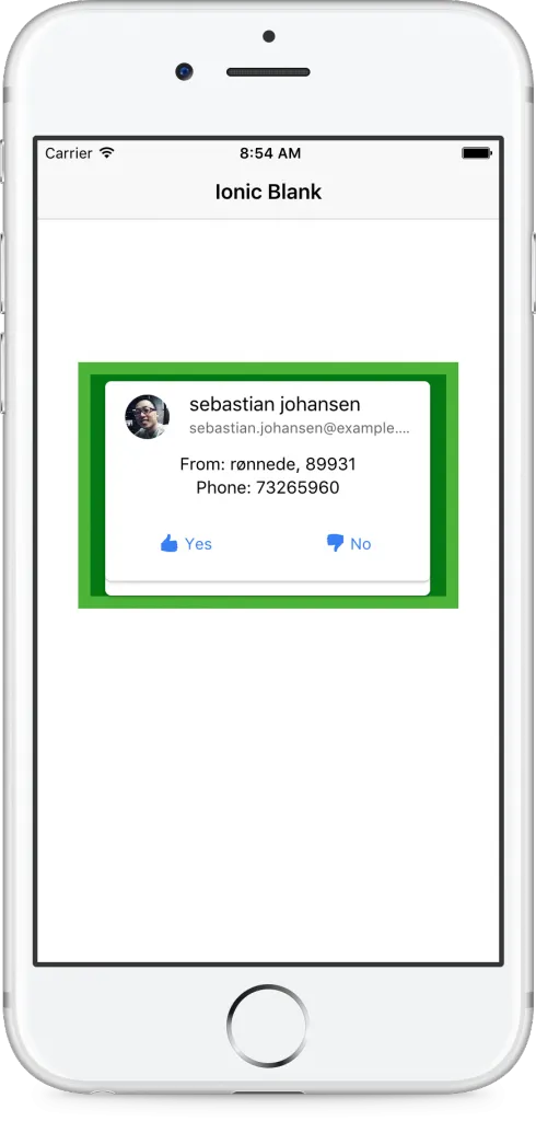
This is the final piece, your result should now look somewhat like this:

If you run this tutorial on iOS, make sure to add the NSAppTransportSecurity to the plist of your project like described on Stack overflow.
Conclusion
Using the Angular 2 Swing library with Ionic to achieve Tinder cards is quite easy, thanks again to Kapil who reacted very fast to a request from my side and added more features to the library!
Maybe this post inspires the Ionic team to revive their old Tinder cards component, which good a lot of positive feedback from people back than. Until we got an official Ionic tinder card component, this approach is a good alternative and quite easy to customise for your needs!
Happy Coding, Simon
