Building a Deliveroo Food Ordering UI with Ionic Last update: 2021-05-04
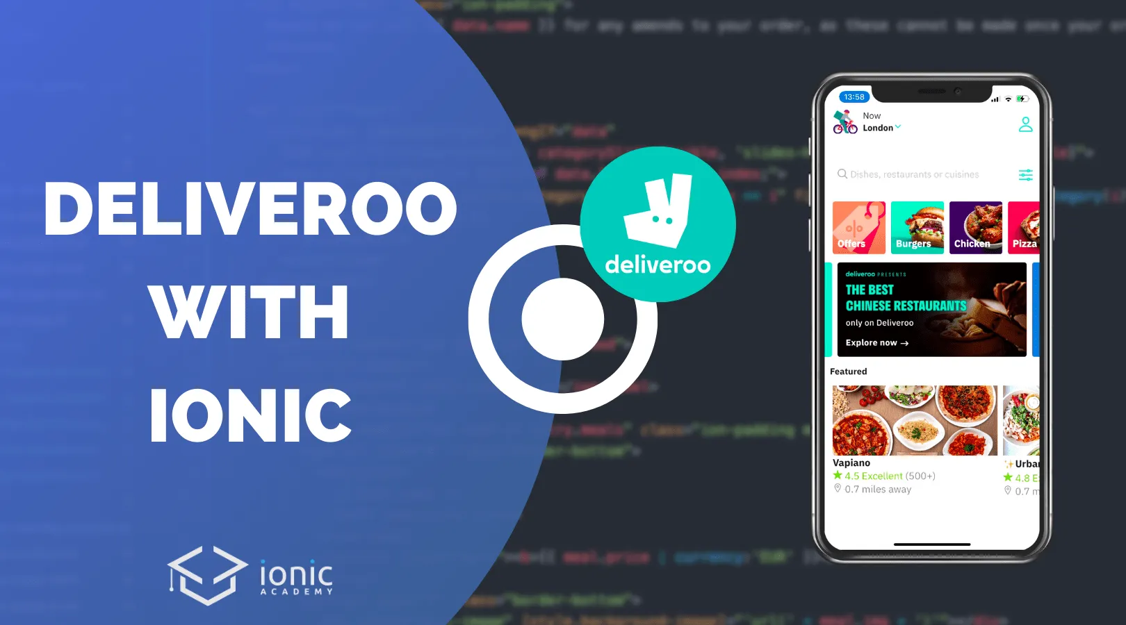
Building complex UIs with Ionic can be challenging, so today we will tackle another big app and build an epic food ordering application design with Ionic Angular together!
You like to see popular apps built with Ionic? Check out my latest eBook Built with Ionic for even more real world app examples!
Get the Code 🔐
Receive all the files of the tutorial right to your inbox and subscribe to my weekly no BS newsletter!
There are several apps like these, but I picked the Deliveroo app as it contains some cool animations and transitions between different components.
We will replicated the initial home screen with different slides and custom header animation plus the details screen with parallax image and a cool functionality to automatically track our position inside the page to update a sticky slides component.
Starting our Ionic App
We actually don’t need a lot today, just a blank app with one additional page and two directives that will be added to their own respective module:
ionic start foodUi blank --type=angular --capacitor
cd ./foodUi

ionic g page details

ionic g module directives/sharedDirectives --flat
ionic g directive directives/parallax
ionic g directive directives/hideHeader
Since we will load some dummy JSON data we also add the HttpClient to our src/app/app.module.ts
import { NgModule } from '@angular/core';
import { BrowserModule } from '@angular/platform-browser';
import { RouteReuseStrategy } from '@angular/router';

import { IonicModule, IonicRouteStrategy } from '@ionic/angular';

import { AppComponent } from './app.component';
import { AppRoutingModule } from './app-routing.module';

import { HttpClientModule } from '@angular/common/http';

@NgModule({
	declarations: [AppComponent],
	entryComponents: [],
	imports: [BrowserModule, IonicModule.forRoot(), AppRoutingModule, HttpClientModule],
	providers: [{ provide: RouteReuseStrategy, useClass: IonicRouteStrategy }],
	bootstrap: [AppComponent]
})
export class AppModule {}
Just to make sure your routing for the two pages is correct, also quickly check your src/app/app-routing.module.ts and make it look like this:
import { NgModule } from '@angular/core';
import { PreloadAllModules, RouterModule, Routes } from '@angular/router';

const routes: Routes = [
	{
		path: 'home',
		loadChildren: () => import('./home/home.module').then((m) => m.HomePageModule)
	},
	{
		path: 'details',
		loadChildren: () => import('./details/details.module').then((m) => m.DetailsPageModule)
	},
	{
		path: '',
		redirectTo: 'home',
		pathMatch: 'full'
	}
];

@NgModule({
	imports: [RouterModule.forRoot(routes, { preloadingStrategy: PreloadAllModules })],
	exports: [RouterModule]
})
export class AppRoutingModule {}
As a preparation we can also already declare and export our directives so we can’t forget about it later. To do so, bring up the src/app/directives/shared-directives.module.ts and change it to:
import { NgModule } from '@angular/core';
import { CommonModule } from '@angular/common';
import { ParallaxDirective } from './parallax.directive';
import { HideHeaderDirective } from './hide-header.directive';

@NgModule({
	declarations: [ParallaxDirective, HideHeaderDirective],
	imports: [CommonModule],
	exports: [ParallaxDirective, HideHeaderDirective]
})
export class SharedDirectivesModule {}
As both of our pages will need access to the directives, we can already include this new module in both the src/app/home/home.module.tssrc/app/details/details.module.ts like this:
import { NgModule } from '@angular/core';
import { CommonModule } from '@angular/common';
import { IonicModule } from '@ionic/angular';
import { FormsModule } from '@angular/forms';
import { HomePage } from './home.page';

import { HomePageRoutingModule } from './home-routing.module';
import { SharedDirectivesModule } from '../directives/shared-directives.module';

@NgModule({
	imports: [CommonModule, FormsModule, IonicModule, HomePageRoutingModule, SharedDirectivesModule],
	declarations: [HomePage]
})
export class HomePageModule {}
That’s all for the structural setup, let’s get the party started!
Dummy Data
For this tutorial I’ve faked some data and content and you can find the two JSON files here:
- https://devdactic.fra1.digitaloceanspaces.com/foodui/1.json
- https://devdactic.fra1.digitaloceanspaces.com/foodui/home.json
You can use them from there or simply store them inside your application and change the two places where we call it to a local path so you don’t need any further connection while testing.
Custom Ionic Theme and Font
I’ve picked some colors from the official application and went to the Ionic color generator to create a new theme for our app. You can copy the result below and directly overwrite the part within your src/theme/variables.scss:
:root {
	/** primary **/
	--ion-color-primary: #02ccbc;
	--ion-color-primary-rgb: 2, 204, 188;
	--ion-color-primary-contrast: #000000;
	--ion-color-primary-contrast-rgb: 0, 0, 0;
	--ion-color-primary-shade: #02b4a5;
	--ion-color-primary-tint: #1bd1c3;

	--ion-color-secondary: #77bf2a;
	--ion-color-secondary-rgb: 119, 191, 42;
	--ion-color-secondary-contrast: #000000;
	--ion-color-secondary-contrast-rgb: 0, 0, 0;
	--ion-color-secondary-shade: #69a825;
	--ion-color-secondary-tint: #85c53f;

	/** tertiary **/
	--ion-color-tertiary: #5260ff;
	--ion-color-tertiary-rgb: 82, 96, 255;
	--ion-color-tertiary-contrast: #ffffff;
	--ion-color-tertiary-contrast-rgb: 255, 255, 255;
	--ion-color-tertiary-shade: #4854e0;
	--ion-color-tertiary-tint: #6370ff;

	/** success **/
	--ion-color-success: #2dd36f;
	--ion-color-success-rgb: 45, 211, 111;
	--ion-color-success-contrast: #ffffff;
	--ion-color-success-contrast-rgb: 255, 255, 255;
	--ion-color-success-shade: #28ba62;
	--ion-color-success-tint: #42d77d;

	/** warning **/
	--ion-color-warning: #ffc409;
	--ion-color-warning-rgb: 255, 196, 9;
	--ion-color-warning-contrast: #000000;
	--ion-color-warning-contrast-rgb: 0, 0, 0;
	--ion-color-warning-shade: #e0ac08;
	--ion-color-warning-tint: #ffca22;

	/** danger **/
	--ion-color-danger: #eb445a;
	--ion-color-danger-rgb: 235, 68, 90;
	--ion-color-danger-contrast: #ffffff;
	--ion-color-danger-contrast-rgb: 255, 255, 255;
	--ion-color-danger-shade: #cf3c4f;
	--ion-color-danger-tint: #ed576b;

	/** dark **/
	--ion-color-dark: #222428;
	--ion-color-dark-rgb: 34, 36, 40;
	--ion-color-dark-contrast: #ffffff;
	--ion-color-dark-contrast-rgb: 255, 255, 255;
	--ion-color-dark-shade: #1e2023;
	--ion-color-dark-tint: #383a3e;

	/** medium **/
	--ion-color-medium: #92949c;
	--ion-color-medium-rgb: 146, 148, 156;
	--ion-color-medium-contrast: #ffffff;
	--ion-color-medium-contrast-rgb: 255, 255, 255;
	--ion-color-medium-shade: #808289;
	--ion-color-medium-tint: #9d9fa6;

	/** light **/
	--ion-color-light: #ffffff;
	--ion-color-light-rgb: 255, 255, 255;
	--ion-color-light-contrast: #000000;
	--ion-color-light-contrast-rgb: 0, 0, 0;
	--ion-color-light-shade: #e0e0e0;
	--ion-color-light-tint: #ffffff;
}
Besides that I also added a custom font that looked similar which is free and called Plex. You can download it and put the files into your assets/fonts folder, then we simply need to define them and set them as the default font for our Ionic application in our src/global.scss like this:
@font-face {
	font-family: 'Plex';
	font-style: normal;
	font-weight: normal;
	src: url('/assets/fonts/IBMPlexSans-Regular.ttf');
}

@font-face {
	font-family: 'Plex';
	font-weight: bold;
	src: url('/assets/fonts/IBMPlexSans-Bold.ttf');
}

:root {
	--ion-text-color: #828585;
	--ion-font-family: 'Plex';
}
Already now we are really done with all the setup and can head over to UI!
Ionic Slides in Detail
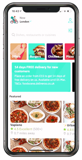
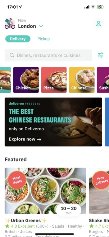
We begin with the home view which mostly contains different slide elements and a header area that we will focus on later as it’s gonna be more challenging. The original app looks like below.
We can start this page by making our HTTP call to get the dummy data and put the different results into three arrays. We also define some slide options for each of our slides:
- First slide should show multiple slides at once and have a free mode
- Second slides should snap and stay centered, show a part of the other cards and run in a loop
- Third slide is mostly like the first
If you are unsure about the sliding options, simply take a look at the documentation for the underlying Swiper!
Now get started by changing the src/app/home/home.page.ts to:
import { HttpClient } from '@angular/common/http';
import { Component, OnInit } from '@angular/core';

@Component({
	selector: 'app-home',
	templateUrl: 'home.page.html',
	styleUrls: ['home.page.scss']
})
export class HomePage implements OnInit {
	categories = [];
	highlights = [];
	featured = [];

	catSlideOpts = {
		slidesPerView: 3.5,
		spaceBetween: 10,
		slidesOffsetBefore: 11,
		freeMode: true
	};

	highlightSlideOpts = {
		slidesPerView: 1.05,
		spaceBetween: 10,
		centeredSlides: true,
		loop: true
	};

	featuredSlideOpts = {
		slidesPerView: 1.2,
		spaceBetween: 10,
		freeMode: true
	};

	showLocationDetail = false;

	constructor(private http: HttpClient) {}

	ngOnInit() {
		this.http
			.get('https://devdactic.fra1.digitaloceanspaces.com/foodui/home.json')
			.subscribe((res: any) => {
				this.categories = res.categories;
				this.highlights = res.highlights;
				this.featured = res.featured;
			});
	}

	// Dummy refresher function
	doRefresh(event) {
		setTimeout(() => {
			event.target.complete();
		}, 2000);
	}

	// show or hide a location string later
	onScroll(ev) {
		const offset = ev.detail.scrollTop;
		this.showLocationDetail = offset > 40;
	}
}
With our dummy data being loaded we can create the view with our different slide elements and the according options.
Most of this is just basic stuff and using the data of our JSON, so continue with the src/app/home/home.page.html and change it to:
<ion-content>
	<ion-slides [options]="catSlideOpts">
		<ion-slide *ngFor="let cat of categories">
			<img [src]="cat.img" />
		</ion-slide>
	</ion-slides>

	<ion-slides [options]="highlightSlideOpts">
		<ion-slide *ngFor="let h of highlights">
			<img [src]="h.img" />
		</ion-slide>
	</ion-slides>

	<ion-text color="dark"><b style="padding-left: 10px;">Featured</b></ion-text>

	<ion-slides [options]="featuredSlideOpts">
		<ion-slide *ngFor="let f of featured" class="featured-slide" routerLink="/details">
			<img [src]="f.img" />
			<div class="info">
				<ion-text color="dark"><b>{{f.name }}</b></ion-text>
				<span>
					<ion-icon name="star" color="secondary"></ion-icon>
					<ion-text color="secondary"> {{ f.rating }} </ion-text>{{ f.ratings }}
				</span>
				<span> <ion-icon name="location-outline"></ion-icon> {{ f.distance }} </span>
			</div>
		</ion-slide>
	</ion-slides>
</ion-content>
This will already look a lot better since the first two slides have only images, but we can make this a lot better by adding some margin/padding around all slides. Also, the text within the third slide is not showing in the right place so we change the display for those slides to flex to make sure the items are aligned nicely under each other.
Apply the following styling inside the src/app/home/home.page.scss now:
ion-slides {
	padding-left: 15px;
	padding-right: 15px;
	margin-top: 15px;
	margin-bottom: 15px;
}

.featured-slide {
	display: flex;
	flex-direction: column;
	align-items: flex-start;

	.info {
		display: flex;
		flex-direction: column;
		align-items: flex-start;
	}
}
That’s it for the first part of the home page! We will continue with the more complicated header component in the end, for now we head over to the details.
Details Page with Dynamic Header
Inside our details page we also need some dummy data, so we simply retrieve the JSON data and already define some slide options that we will need later. Go ahead and change the src/app/details/details.page.ts to this now:
import { DOCUMENT } from '@angular/common';
import { HttpClient } from '@angular/common/http';
import {
	AfterViewInit,
	Component,
	ElementRef,
	Inject,
	OnInit,
	QueryList,
	ViewChild,
	ViewChildren
} from '@angular/core';
import { IonContent, IonList, IonSlides, isPlatform } from '@ionic/angular';

@Component({
	selector: 'app-details',
	templateUrl: './details.page.html',
	styleUrls: ['./details.page.scss']
})
export class DetailsPage implements OnInit, AfterViewInit {
	data = null;

	opts = {
		freeMode: true,
		slidesPerView: 2.6,
		slidesOffsetBefore: 30,
		slidesOffsetAfter: 100
	};

	constructor(private http: HttpClient) {}

	ngOnInit() {
		this.http
			.get('https://devdactic.fra1.digitaloceanspaces.com/foodui/1.json')
			.subscribe((res: any) => {
				this.data = res;
			});
	}

	ngAfterViewInit() {}
}
Don’t mind all the imports, I just left them in since we will need them later, but feel free to remove them for the moment as well.
If we take a look at the official app we can see that the header (name of the restaurant) is below the image and while we scroll, it moves into the header which becomes solid at that point.
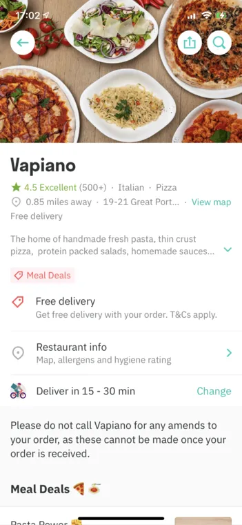
Turns out, this is a default behaviour Ionic has implemented for iOS by now!
The only thing we need to do is have another ion-header in our content with collapse set to condense. This will make the header disappear when we scroll and shows it inside our toolbar instead. Pretty neat, isn’t it?
Besides that we will display our image of the restaurant as a background image within a div since this will make the parallax directive we will add later easier.
The rest is just a basic setup of rows and cols to align all items correctly on the page. Only interesting thing might be the slice pipe, which helps to only use a specific amount of items from an array inside a ngFor iteration!
Now open the src/app/details/details.page.html and change it to:
<ion-header>
<ion-toolbar color="light">
<ion-buttons slot="start">
<ion-button fill="solid" shape="round" color="light" routerLink="/home">
<ion-icon slot="icon-only" name="arrow-back" color="primary"></ion-icon>
</ion-button>
</ion-buttons>
<ion-title>{{ data?.name }}</ion-title>
<ion-buttons slot="end">
<ion-button fill="solid" shape="round" color="light">
<ion-icon slot="icon-only" name="share-outline" color="primary"></ion-icon>
</ion-button>
<ion-button fill="solid" shape="round" color="light">
<ion-icon slot="icon-only" name="search-outline" color="primary"></ion-icon>
</ion-button>
</ion-buttons>
</ion-toolbar>
</ion-header>
<ion-content [fullscreen]="true" scrollEvents="true" (ionScroll)="onScroll($event)">
<div #img class="header-image" [style.background-image]="'url(' + data?.img + ')'"></div>
<ion-header collapse="condense" class="ion-no-border">
<ion-toolbar color="light">
<ion-title size="large">{{ data?.name }}</ion-title>
</ion-toolbar>
</ion-header>
<div *ngIf="data">
<ion-row>
<ion-col size="12" class="light-bg ion-padding-start">
<ion-icon name="star" color="primary"></ion-icon>
<ion-text color="primary"> {{ data.rating }}</ion-text>
<ion-text color="medium">
{{ data.ratings }}<span *ngFor="let tag of data.tags | slice:0:2"> · {{ tag }} </span>
</ion-text>
</ion-col>
<ion-col size="12" class="light-bg ion-padding-start">
<ion-icon name="location-outline" color="medium"></ion-icon>
<ion-text> {{ data.distance }} </ion-text>
</ion-col>
<ion-col size="12" class="light-bg ion-padding">
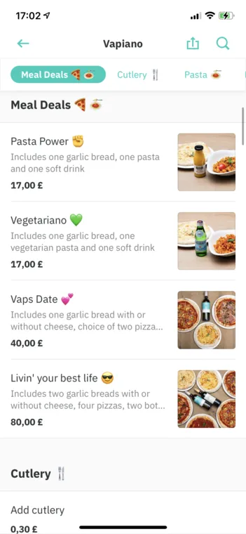
<ion-badge color="danger">
<ion-icon name="pricetag-outline"></ion-icon>
Meal Deals
</ion-badge>
</ion-col>
<ion-col size="12" class="ion-no-padding">
<ion-item lines="full">
<ion-label class="ion-text-wrap"> {{ data.about }} </ion-label>
</ion-item>
</ion-col>
<ion-col size="12" class="light-bg">
<ion-row class="ion-align-items-center">
<ion-col size="1">
<ion-icon color="medium" name="location-outline"></ion-icon>
</ion-col>
<ion-col size="10">
<ion-label
>Restaurant info
<p>Map, allergene ad hygiene rating</p>
</ion-label>
</ion-col>
<ion-col size="1">
<ion-icon color="primary" name="chevron-forward"></ion-icon>
</ion-col>
</ion-row>
</ion-col>
</ion-row>
</div>
<div *ngIf="data" class="ion-padding">
Please do not call {{ data.name }} for any amends to your order, as these cannot be made once
your order is received.
</div>
</ion-content>There are a few things not looking that good yet, especially the image isn’t displayed since we didn’t gave a specific size to the div. Besides that we will add a general background to our page and make sure it starts at the top without a toolbar, for which we can set absolute position.
Go ahead and make the page look better by adding the following to your src/app/details/details.page.scss:
ion-toolbar {
	ion-icon {
		font-size: 25px;
	}
}

ion-content {
	position: absolute;
	--background: #f1f1f1;
	--padding-bottom: 50px;
}

.light-bg {
	background: #ffffff;
	z-index: 10;
}

.header-image {
	background-repeat: no-repeat;
	background-position: center;
	background-size: cover;
	height: 30vh;
	will-change: transform;
}
Everything until here was pretty easy, now things get more challenging.
Ionic Scroll Events and Slides
If we scroll down a restaurant page, at some point we see a slides object appear at the top which automatically highlights the section you are currently scrolling through.
To do so, we need to perform different things:
- Display a slides component sticky to the top after a specific time when we scroll down
- Automatically mark the active section based on the visible elements in our viewport
- Scroll to a specific element if we click on a category in our slides component
First of all we will actually add the elements to our page based on the JSON data we already got. To make our slides component sticky to the top we can use the fixed slot of ion-content, which puts the element above everything else. We just need to add the right position and logic to show/hide it later, but that’s gonna be easy.
For the slides we will simply toggle it through a CSS class depending on the categorySlidesVisible variable.
We can also add a CSS class depending on the activeCategory value to mark the active item which we will then also update from code when we scroll through our page or click on a category.
The list for meals isn’t too hard and just iterates the different categories and according meals of our dummy data, so go ahead and add the following below the existing elements inside the src/app/details/details.page.html:
<div slot="fixed">
	<ion-slides
		[options]="opts"
		*ngIf="data"
		[ngClass]="{'slides-visible': categorySlidesVisible, 'slides-hidden': !categorySlidesVisible}"
	>
		<ion-slide *ngFor="let entry of data.food; let i = index;">
			<ion-button
				[class.active-category]="activeCategory == i"
				fill="clear"
				(click)="selectCategory(i)"
			>
				{{ entry.category }}
			</ion-button>
		</ion-slide>
	</ion-slides>
</div>

<ion-list *ngFor="let entry of data?.food">
	<ion-list-header>
		<ion-label>{{ entry.category}}</ion-label>
	</ion-list-header>
	<ion-row *ngFor="let meal of entry.meals" class="ion-padding meal-row">
		<ion-col size="8" class="border-bottom">
			<ion-label>
				{{ meal.name }}
				<p>{{ meal.info }}</p>
			</ion-label>
			<ion-text color="dark"><b>{{ meal.price | currency:'EUR' }}</b></ion-text>
		</ion-col>
		<ion-col size="4" class="border-bottom">
			<div class="meal-image" [style.background-image]="'url(' + meal.img + ')'"></div>
		</ion-col>
	</ion-row>
</ion-list>
To make the list of meals and headers stand out we need to play around with the background colors a bit, plus we need to make sure the image of the meal has a size as well. Let’s add the following to our src/app/details/details.page.scss for that:
ion-list-header {
	--background: #f1f1f1;
}

ion-list {
	--ion-background-color: #fff;
}

.meal-row {
	padding-bottom: 0px;
}

.meal-image {
	width: 100%;
	height: 100%;
	background-position: center;
	background-size: cover;
	background-repeat: no-repeat;
	border-radius: 5px;
}

.border-bottom {
	border-bottom: 1px solid var(--ion-color-step-150, rgba(0, 0, 0, 0.07));
}

ion-slides {
	background: #fff;
	padding-top: 5px;
	padding-bottom: 5px;
	ion-button {
		height: 2em;
	}

	top: var(--header-position);
	opacity: 0;
}

.slides-visible {
	opacity: 1;
	transition: 1s;
}

.slides-hidden {
	opacity: 0;
	transition: 1s;
}

.active-category {
	--background: var(--ion-color-primary);
	--color: #fff;
	--border-radius: 30px;
	font-weight: 600;
}
We now also got the different classes to show/hide the slides component with a small transition, plus the active category get’s a custom color to mark it with our primary color.
What’s most interesting here is the top position of our slides component (inside the fixed slot): We need to position it below the toolbar, which has a different height on iOS and Android. So we only set it to a custom CSS variable --header-position that we will inject from code later!
Now that we got the elements and styling we can focus on the logic to highlight and show the right elements, and we already added a ionScroll to our content which passes all scroll events to a function!
That means we now need to:
- Get a reference to all of our
ion-listby using the@ViewChildrendecorator - Scroll to one of those elements when we click a category
- Check during scroll if our offset passes a certain threshold to show the category slides, and at the same time check if any of our list children is visible in the viewport and set it as the active category
It’s actually not too hard once you make a plan for how the whole functionality could work.
Let’s start by setting our CSS variable for the height - we can simply check for the current platform and inject the variable by calling setProperty on the Angular Document service.
We also need to listen to the changes of our ViewChildren as otherwise the toArray() call returns an empty array right in the beginning.
Once we got them set, sliding to one of them is pretty easy and can even be done by using the ion-content component as a ViewChild and calling the scrollToPoint function!
Inside our onScroll() function we now check the offset which will show/hide the whole sticky category component, and we iterate through our children to check if any of them is currently visible in the viewport. If that’s the case, we change the activeCategory and also slide to the according index by using our IonSlides ViewChild!
Now open the src/app/details/details.page.ts and change it to:
import { DOCUMENT } from '@angular/common';
import { HttpClient } from '@angular/common/http';
import {
	AfterViewInit,
	Component,
	ElementRef,
	Inject,
	OnInit,
	QueryList,
	ViewChild,
	ViewChildren
} from '@angular/core';
import { IonContent, IonList, IonSlides, isPlatform } from '@ionic/angular';

@Component({
	selector: 'app-details',
	templateUrl: './details.page.html',
	styleUrls: ['./details.page.scss']
})
export class DetailsPage implements OnInit, AfterViewInit {
	data = null;

	opts = {
		freeMode: true,
		slidesPerView: 2.6,
		slidesOffsetBefore: 30,
		slidesOffsetAfter: 100
	};

	activeCategory = 0;
	@ViewChildren(IonList, { read: ElementRef }) lists: QueryList<ElementRef>;
	listElements = [];
	@ViewChild(IonSlides) slides: IonSlides;
	@ViewChild(IonContent) content: IonContent;
	categorySlidesVisible = false;

	constructor(private http: HttpClient, @Inject(DOCUMENT) private document: Document) {}

	ngOnInit() {
		this.http
			.get('https://devdactic.fra1.digitaloceanspaces.com/foodui/1.json')
			.subscribe((res: any) => {
				this.data = res;
			});

		// Set the header position for sticky slides
		const headerHeight = isPlatform('ios') ? 44 : 56;
		this.document.documentElement.style.setProperty(
			'--header-position',
			`calc(env(safe-area-inset-top) + ${headerHeight}px)`
		);
	}

	// Get all list viewchildren when ready
	ngAfterViewInit() {
		this.lists.changes.subscribe((_) => {
			this.listElements = this.lists.toArray();
		});
	}

	// Handle click on a button within slides
	// Automatically scroll to viewchild
	selectCategory(index) {
		const child = this.listElements[index].nativeElement;
		this.content.scrollToPoint(0, child.offsetTop - 120, 1000);
	}

	// Listen to ion-content scroll output
	// Set currently visible active section
	onScroll(ev) {
		const offset = ev.detail.scrollTop;
		this.categorySlidesVisible = offset > 500;

		for (let i = 0; i < this.listElements.length; i++) {
			const item = this.listElements[i].nativeElement;
			if (this.isElementInViewport(item)) {
				this.activeCategory = i;
				this.slides.slideTo(i);
				break;
			}
		}
	}

	isElementInViewport(el) {
		const rect = el.getBoundingClientRect();

		return (
			rect.top >= 0 && rect.bottom <= (window.innerHeight || document.documentElement.clientHeight)
		);
	}
}
We got everything in place for our automatically switching sticky slides (is there a better word for this?) and can continue with the next challenge.
Parallax Image Directive
The details page image has a sweet parallax animation, and we’ve seen how that works in the past already in the according Quick Win inside the Ionic Academy.
I don’t want to get into the details for this too much at this point, so we directly start by adding the directive we created in the beginning to the content element in our src/app/details/details.page.html like this:
<ion-content
	[fullscreen]="true"
	scrollEvents="true"
	(ionScroll)="onScroll($event)"
	[appParallax]="img"
></ion-content>
That means we pass the template reference of our image div to the directive, and we are also able to listen to the scroll events of the content as we’ve set this to true before.
The parallax directive now simply listens to the scroll events of our content and moves the image a bit slower out of our view than the content. At the same time, we can also apply some scaling to the image if we drag the screen into the other direction which gives a nice zoom effect as well.
Go ahead and change the src/app/directives/parallax.directive.ts to:
import { Directive, HostListener, Input, Renderer2 } from '@angular/core';
import { DomController } from '@ionic/angular';

@Directive({
	selector: '[appParallax]'
})
export class ParallaxDirective {
	@Input('appParallax') imageEl: any;
	private moveImage: number;
	private scaleImage: number;

	constructor(private renderer: Renderer2, private domCtrl: DomController) {}

	@HostListener('ionScroll', ['$event']) onContentScroll($event: any) {
		const scrollTop = $event.detail.scrollTop;

		if (scrollTop > 0) {
			// Use higher values to move the image out faster
			// Use lower values to move it out slower
			this.moveImage = scrollTop / 1.6;
			this.scaleImage = 1;
		} else {
			// +1 at the end as the other part can become 0
			// and the image would disappear
			this.scaleImage = -scrollTop / 200 + 1;
			this.moveImage = scrollTop / 1.6;
		}

		this.domCtrl.write(() => {
			this.renderer.setStyle(
				this.imageEl,
				'webkitTransform',
				'translate3d(0,' +
					this.moveImage +
					'px,0) scale(' +
					this.scaleImage +
					',' +
					this.scaleImage +
					')'
			);
		});
	}
}
On every scroll we will then reposition the element and achieve the parallax for the image!
Header Fade Directive & Animation
To wrap up our app we move back to the first page in which we want to play around a bit with the header.
The header on this page consists of two elements: The place/location information and a row with a searchbar. The first of these leaves the view when scrolling, the searchbar moves a bit top and then sticks to the top while scrolling.
We could put the code into the header, but then we would have to move the header around as it’s usually static at the top so instead we simply create two ion-rows in our content and then apply a directive to the first one (the appHideHeader on our ion-content get’s the reference to it!) and the searchbar will be sticky through CSS later.
Therefore go ahead and add the following to the src/app/home/home.page.html in the right place (make sure you leave the rest in it as well):
<ion-content scrollEvents="true" [appHideHeader]="hideheader" (ionScroll)="onScroll($event)">
	<ion-refresher slot="fixed" (ionRefresh)="doRefresh($event)">
		<ion-refresher-content></ion-refresher-content>
	</ion-refresher>

	<ion-row class="info-row" #hideheader>
		<ion-col size="2" class="ion-padding-start">
			<img src="./assets/delivery.webp" />
		</ion-col>
		<ion-col size="8">
			<ion-text color="dark">
				<span>Now</span><br />
				<b>London</b>
				<ion-icon name="chevron-down-outline" color="primary"></ion-icon>
			</ion-text>
		</ion-col>
		<ion-col size="2">
			<ion-button fill="clear">
				<ion-icon name="person-outline" slot="icon-only"></ion-icon>
			</ion-button>
		</ion-col>
	</ion-row>

	<ion-row class="sticky-row">
		<ion-col size="10">
			<ion-text
				class="ion-padding-start"
				color="medium"
				[ngClass]="{'location-visible': showLocationDetail, 'location-hidden': !showLocationDetail}"
			>
				London</ion-text
			>
			<ion-searchbar placeholder="Dishes, restaurants or cuisines"></ion-searchbar>
		</ion-col>
		<ion-col size="2">
			<ion-button fill="clear">
				<ion-icon name="options-outline" slot="icon-only"></ion-icon>
			</ion-button>
		</ion-col> </ion-row
></ion-content>
To test our scroll behaviour I recommend to duplicate the slides code (or put in some dummy objects) so you can actually scroll the page.
Now we will make our search row sticky to the top and at the same time respect the safe-area-inset-top which we can grab from the env() so we are not displaying it in some crazy place.
Because we don’t have a standard header we also need to add some padding to our content and refresher above the two rows that we added. Finally the location row uses basically the same CSS classes like we used for the sticky slides to easily show/hide them with a shor transition.
Go ahead and finish the styling by adding this below the existing code in the src/app/home/home.page.scss:
ion-searchbar {
	--icon-color: var(--ion-color-medium);
}

ion-content {
	--padding-top: 40px;
}

.sticky-row {
	position: sticky;
	top: calc(env(safe-area-inset-top) - 30px);
	z-index: 2;
	background: #fff;
	box-shadow: 0px 9px 11px -15px rgba(0, 0, 0, 0.75);
	display: flex;
	flex-direction: row;
	align-items: flex-end;
}

.info-row {
	background: #fff;
	position: sticky;
	top: calc(env(safe-area-inset-top) - 40px);
	z-index: 2;
}

ion-refresher {
	padding-top: calc(env(safe-area-inset-top) + 50px);
}

.location-visible {
	opacity: 1;
	transition: 0.5s;
}

.location-hidden {
	opacity: 0;
	transition: 0.5s;
}
Since we also want to fade out the element in the first row while it scrolls out, we use another directive that we also used in the hide header Quick Win in the Ionic Academy.
This will scroll out the element and fade out its children at the same time, which gives some nice visuals during scrolling.
Finish our implementation by changing the src/app/directives/hide-header.directive.ts to:
import { AfterViewInit, Directive, HostListener, Input, Renderer2 } from '@angular/core';
import { isPlatform, DomController } from '@ionic/angular';

@Directive({
	selector: '[appHideHeader]'
})
export class HideHeaderDirective implements AfterViewInit {
	@Input('appHideHeader') header: any;
	private headerHeight = isPlatform('ios') ? 44 : 56;
	private children: any;

	constructor(private renderer: Renderer2, private domCtrl: DomController) {}

	ngAfterViewInit(): void {
		this.header = this.header.el;
		this.children = this.header.children;
	}

	@HostListener('ionScroll', ['$event']) onContentScroll($event: any) {
		const scrollTop: number = $event.detail.scrollTop;
		let newPosition = -scrollTop;

		if (newPosition < -this.headerHeight) {
			newPosition = -this.headerHeight;
		}
		let newOpacity = 1 - newPosition / -this.headerHeight;

		this.domCtrl.write(() => {
			this.renderer.setStyle(this.header, 'top', newPosition + 'px');
			for (let c of this.children) {
				this.renderer.setStyle(c, 'opacity', newOpacity);
			}
		});
	}
}
We’ve used the same @HostListener for the scroll events of the content like before, so you now get a really good feeling for how these custom header directives work in general.
And with that we are done with the whole UI for our food ordering app as well!
Conclusion
Building complex UIs with Ionic is possible - by taking one step at a time!
All animations and UI transitions can be broken down to certain elements and what needs to happen when at which place. It’s not always easy, and putting this together took quite some time. But the result is a pretty epic UI built with Ionic!