How to Create Custom Ionic 4 Animations & Transitions Last update: 2019-06-25

You might have heard that you can customise everything inside your Ionic app.. and this also counts for animations, especially how your components appear!
It’s a topic not many talk about because the basic animations provided from the Ionic team are already great for most apps. Besides that you can use additional animation packages if you want some other cool animations out of the box.
But you can actually also customise the appearance of your modals, toast alert and other components in your app as well!

We will therefore create a custom animation for an alert box and also take a quick look at Angular animations that can help to add some cool effects to the enter event (or other vents as well) of your pages.
Preparing our Animations App
Before we get started, go and setup a new testing app like:
ionic start devdacticAnimation blank
cd devdacticAnimation

ionic g page second
npm i @angular/animations
The additional page and animations package are only used for the second part of the tutorial, so if you just want to change your Ionic alert, toast (…) you don’t need them.
Customising Ionic Component Animations
There is already some information on how to customise the Ionic component animations and their events inside the official documentation, but we will use a bit different structure:
We’ll outsource the additonal code into a file that we can then also reuse in other places. You can take a look at how the standard animation looks by inspecting the code on Github, for example the iOS enter animation for an alert.
Now the syntax isn’t that cool and obvious, and also the Ionic Animations package doesn’t really have any documentation at the time writing this. Therefore, it’s a bit tricky but we can still do it.
Let’s create a new file at app/customAlertEnter.ts and insert a slightly different version of the enter animation:
import { Animation } from '@ionic/core'

export function customAlertEnter(AnimationC: Animation, baseEl: HTMLElement): Promise<Animation> {

    const baseAnimation = new AnimationC();

    const backdropAnimation = new AnimationC();
    backdropAnimation.addElement(baseEl.querySelector('ion-backdrop'));

    const wrapperAnimation = new AnimationC();
    const wrapperElem = baseEl.querySelector('.alert-wrapper') as HTMLElement;
    wrapperAnimation.addElement(wrapperElem);

    wrapperElem.style.top = '0';

    backdropAnimation.fromTo('opacity', 0.01, 0.3);

    wrapperAnimation.beforeStyles({ 'opacity': 1 });
    wrapperAnimation.fromTo('transform', `translateY(-${baseEl.clientHeight}px)`, 'translateY(0px)')

    return Promise.resolve(baseAnimation
      .addElement(baseEl)
      .easing('cubic-bezier(.36, .66, .3, .1, 1)')
      .duration(500)
      .add(wrapperAnimation)
      .add(backdropAnimation));
  }
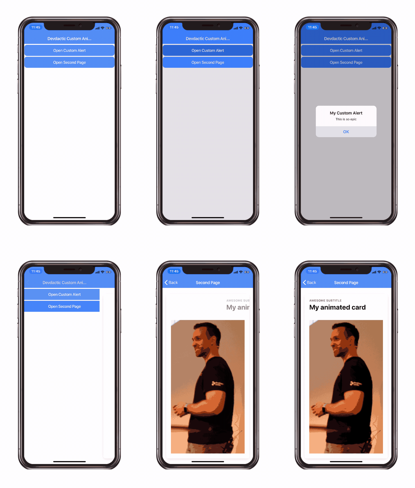
This code would now move the wrapperElem at the top of the view, which means the wrapperAnimation can later fly this box down the page to the right spot.
Along the way, the backdrop will also be animated to be visible with an opacity of 0.3, and finally all of this happens in a duration of 500ms with a some easing that slows down or speeds up the animation at different points.
Play around with these values later and see how your app reacts!
To se this just created function we now continue with our app/app.module.ts and use it for the right key alertEnter inside the configuration block of our Ionic Module like:
import { NgModule } from '@angular/core';
import { BrowserModule } from '@angular/platform-browser';
import { RouteReuseStrategy } from '@angular/router';

import { IonicModule, IonicRouteStrategy } from '@ionic/angular';
import { SplashScreen } from '@ionic-native/splash-screen/ngx';
import { StatusBar } from '@ionic-native/status-bar/ngx';

import { AppComponent } from './app.component';
import { AppRoutingModule } from './app-routing.module';

import { customAlertEnter } from './customAlertEnter';

@NgModule({
  declarations: [AppComponent],
  entryComponents: [],
  imports: [BrowserModule,
    IonicModule.forRoot({
    alertEnter: customAlertEnter
  }),
  AppRoutingModule],
  providers: [
    StatusBar,
    SplashScreen,
    { provide: RouteReuseStrategy, useClass: IonicRouteStrategy }
  ],
  bootstrap: [AppComponent]
})
export class AppModule {}
As you can see, the code is a bit cleaner than heaving everything immediately in there.
To call a simple alert, add some buttons to your home/home.page.html including a button for our second example already:
<ion-header>
  <ion-toolbar color="primary">
    <ion-title>
      Devdactic Custom Animations
    </ion-title>
  </ion-toolbar>
</ion-header>

<ion-content>
  <ion-button expand="block" (click)="showAlert()">
    Open Custom Alert
  </ion-button>

  <ion-button expand="block" routerLink="/second">
    Open Second Page
  </ion-button>
</ion-content>
Now you can call the alert from code like always, but I also added another key: enterAnimation.
This is not really needed because we already defined the enter animation in our module.
I just wanted to highlight that you could also only add the custom animation to some components and not at the root level to all of your components!
So go ahead and change your home/home.page.ts to:
import { Component } from '@angular/core';
import { AlertController } from '@ionic/angular';
import { customAlertEnter } from '../customAlertEnter';

@Component({
  selector: 'app-home',
  templateUrl: 'home.page.html',
  styleUrls: ['home.page.scss'],
})
export class HomePage {

  constructor(private alert: AlertController) { }

  async showAlert() {
    const alert = await this.alert.create({
      header: 'My Custom Alert',
      message: 'This is so epic',
      buttons: ['OK'],
      enterAnimation: customAlertEnter
    });

    alert.present();
  }
}
Now you can see your animation in action, and try to play around with values or different use cases to create different animations, like popping up from no size in the middle of the screen for example!
Custom Angular Animations
The second standard way to Animations are Angular Animations that you can write in your code. We’ve talked about this before, and the syntax for them is a bit complicated yet they are still a really powerful tool if you want to influence how the different elements of your page appear.
In order to use the animations, make sure you installed the @angular/animations package like described in the beginning and then also add the BrowserAnimationsModule to your app/app.module.ts imports:
import { NgModule } from '@angular/core';
import { BrowserModule } from '@angular/platform-browser';
import { RouteReuseStrategy } from '@angular/router';

import { IonicModule, IonicRouteStrategy } from '@ionic/angular';
import { SplashScreen } from '@ionic-native/splash-screen/ngx';
import { StatusBar } from '@ionic-native/status-bar/ngx';

import { AppComponent } from './app.component';
import { AppRoutingModule } from './app-routing.module';

import { BrowserAnimationsModule } from '@angular/platform-browser/animations';

@NgModule({
  declarations: [AppComponent],
  entryComponents: [],
  imports: [BrowserModule,
    IonicModule.forRoot(),
  AppRoutingModule,
  BrowserAnimationsModule],
  providers: [
    StatusBar,
    SplashScreen,
    { provide: RouteReuseStrategy, useClass: IonicRouteStrategy }
  ],
  bootstrap: [AppComponent]
})
export class AppModule {}
Now you can define your own animations for every page, so let’s say you want to fade in some part and also fly in some other elements.
The code for this could look like this in your second/second.page.ts:
import { Component, OnInit } from '@angular/core';
import {
  trigger,
  state,
  style,
  animate,
  transition
} from '@angular/animations';

@Component({
  selector: 'app-second',
  templateUrl: './second.page.html',
  styleUrls: ['./second.page.scss'],
  animations: [
    trigger('fadein', [
      state('void', style({ opacity: 0 })),
      transition('void => *', [
        style({ opacity: 0 }),
        animate('900ms ease-out', style({ opacity: 1 }))
      ])
    ]),
    trigger('slidelefttitle', [
      transition('void => *', [
        style({ opacity: 0, transform: 'translateX(150%)' }),
        animate('900ms 300ms ease-out', style({ transform: 'translateX(0%)', opacity: 1 }, ))
      ])
    ])
  ]
})
export class SecondPage implements OnInit {

  constructor() { }

  ngOnInit() {
  }

}
We’re not going into the details for all the parts that make up Angular Animations, but there’s also a course on this topic inside the Ionic Academy!
In general we define transitions from a state to another, in our case the initial void state to whatever else, the * wildcard state representing everything else.
The fadein animation starts immediately while the slidelefttitle has a tiny delay of 300ms and starts a bit later. Of course you define many more different animations here for everything you want to animate on your page.
To use the animations, simply apply their trigger to the component that you want to animate like this in your second/second.page.html:
<ion-header>
  <ion-toolbar color="primary">
    <ion-buttons slot="start">
      <ion-back-button defaultHref="/"></ion-back-button>
    </ion-buttons>
    <ion-title>Second Page</ion-title>
  </ion-toolbar>
</ion-header>

<ion-content>

  <ion-card>
    <ion-card-header>
      <ion-card-subtitle @slidelefttitle>Awesome Subtitle</ion-card-subtitle>
      <ion-card-title @slidelefttitle>My animated card</ion-card-title>
    </ion-card-header>
    <ion-card-content @fadein>
      <img src="/img/blog/wp-img/wp-content-uploads-2017-06-simon-dwx.webp">
    </ion-card-content>
  </ion-card>

</ion-content>
Now both title fields will fly in from one side while the image inside the cad will only fade in!
Conclusion
Animations inside Ionic apps are not discussed very often, but if you need to change them, be sure you can.
You can create custom animations for the appearance of all Ionic modals and use them for all or just specific elements, or you can use the standard Angular animations for other elements that you want to animate inside your pages.
You can also find a video version of this tutorial below.
