10 Tips & Tricks for Building Websites with Ionic 4 Last update: 2019-01-22
It’s nothing new that Ionic apps can easily be deployed as a website (which is very common these days given the popularity of PWAs) or desktop version wit Electron, but once you got so much space available it’s easy to just make your mobile design bigger.
In most cases, the result will be very unsatisfying but there are some tricks I learned just recently when creating the Ionic Jobs board which is available as a website and PWA!
Therefore, I compiled all my learnings into a list not only for you but also for myself as I’m 100% sure I’ll come back to this post (actually I look up a lot of old things on my own blog).
Here are my 10 tips for everyone getting started with a website first but still using Ionic!
1. Getting the Most out of Ionic Grid
The Ionic Grid is a great way to build dynamic and responsive layouts. But it’s not enough to simple use the general column setup, you need to tweak the columns and how your row looks using the common breakpoints.
Testing these breakpoints can be difficult if you are developing on an iMac where when the XL size looks like a quarter of your screen!
So when your design gets smaller you might want to give more space to specific rows and you can do this but setting the size for all breakpoints individually. Besides that you can also add a specific offset for a breakpoint if you want to allow more space (see also point 8).
<ion-grid>
<ion-row>
<ion-col
size="12"
size-lg="8"
offset-lg="2"
size-xl="6"
offset-xl="3"
style="background: var(--ion-color-primary);"
>
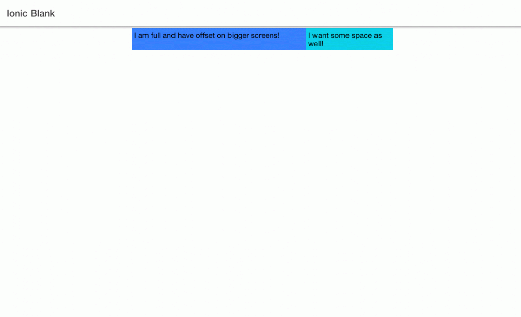
I am full and have offset on bigger screens!
</ion-col>
</ion-row>
</ion-grid>The result can bee seen in the following image. 
By applying different sizes and offsets you can make sure your design does not only fit each screen, but also make sure it’s not looking oversized!
2. Dynamically Hiding Grid Elements
Now the problem with the previous grid is that once you invest more time and thoughts into your design, you might want to leave out certain columns at a breakpoint.
If the screen get’s smaller, you might want to hide some not so important information, but simply setting the row size to zero is not going to work. You need a little help of CSS!
@media (max-width: 576px) {
	.hide-xs {
		display: none;
	}
}

@media (min-width: 576px) and (max-width: 768px) {
	.hide-sm {
		display: none;
	}
}
With a CSS like this in place you can make sure a certain column won’t even be painted on the screen once the media query applies:
<ion-row>
	<ion-col
		size="12"
		size-md="5"
		offset-md="2"
		size-lg="4"
		offset-lg="3"
		style="background: var(--ion-color-primary);"
	>
		I am full and have offset on bigger screens!
	</ion-col>
	<ion-col
		class="hide-xs hide-sm"
		size-md="3"
		size-lg="2"
		style="background: var(--ion-color-secondary);"
	>
		I want some space as well!
	</ion-col>
</ion-row>
Now the second column takes some of the space (I also changed the numbers for the first row, always make sure it sums up to 12) but once we hit the SM and later XS breakpoint the row will be hidden!
By combining the first grid setup and additional media queries through CSS you can craft your design super responsible and make it work as best as possible on every screen size!
3. Fixed Content Height
Ok enough of responsive designs (I feel like we’re talking about responsive and mobile-first since 10 years) and to something else that really bugged me and took hours to get at least rightish.
When you visit a website, every legit website has a footer. Now Ionic does have a footer component, but on a regular website you don’t want your footer to flow above the content all the time! You want that footer to be at the end of the page where a users expects it, even when there are only a few paragraphs of text.
One solution is to establish a bit hacky fixed element like this:
[ion-fixed] {
	min-height: calc(100% - 98px); // adjust to your footer height!
}
Now you can wrap all of your content into this element like:
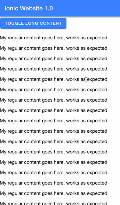
<ion-content>
	<ion-button (click)="toggle = !toggle">Toggle Long content</ion-button>

	<div ion-fixed>
		<div [hidden]="!toggle">
			<p *ngFor="let i of [].constructor(20)">
				My regular content goes here, works as expected<br />
			</p>
		</div>

		<div [hidden]="toggle">a page with short content</div>
	</div>

	<div style="background: var(--ion-color-medium)" text-center>
		And here is my footer at the bottom!<br />
		Legal Link<br />
		Whatever Link
	</div>
</ion-content>
I added a little button for the demo below, of course that’s not needed in general!
Of course it’s a bit hacky and yes, inside an app you might still want to have a regular footer bar but for websites this should give you the desired effect!
4. Global Header & Footer
Continuing with the idea of the last point - you of course don’t want to define all your footer stuff over and over again!
For that, simply use the CLI to create a new component like:
ionic g component footerInside of the footer add whatever code you need and then also make sure to create a shared module so you can import the footer component accordingly into your lazy loaded pages which all got their own module file!
To do so, generate a new module and declare/export all of your custom components. Also note that you will have to import the IonicModule inside this shared module file if you plan to use Ionic components in there.
# Generate the Module

ionic g module components/sharedComponents --spec=false --flat


# Change your Module File

import { NgModule } from '@angular/core';
import { CommonModule } from '@angular/common';
import { FooterComponent } from './footer/footer.component';
import { IonicModule } from '@ionic/angular';

@NgModule({
  declarations: [FooterComponent],
  imports: [
    CommonModule,
    IonicModule // <- Import this if you want to use ion-* stuff in your components!
  ],
  exports: [FooterComponent]
})
export class SharedComponentsModule { }
Now you can simply reuse this component all over the place, same if you want a custom header menu of course.
If you want to go even more crazy, you can create a layout page, add your routing in there and use another “in there.
This is a bit more tricky and requires some more changes so let me know if you are interested that as well. I used this behaviour on my recent project as then the header and footer stay the same and only the content area is replaced which results in less flickering on the page.
5. Standard Dropdown Select
Another area that is not a must is input forms, and here especially the select field. While I have used the ion-select in the past on websites, especially with the popover option, I think it’s not really looking like a website thing.
Maybe this is just my personal feeling, but for a website I still prefer the good old select. The difference is super small:
<ion-item>
  <ion-label position="stacked">Gender</ion-label>
  <ion-select placeholder="Select One">
    <ion-select-option value="f">Female</ion-select-option>
    <ion-select-option value="m">Male</ion-select-option>
  </ion-select>
</ion-item>

<!-- VS -->

<ion-item lines="none">
  <ion-label position="stacked">Gender</ion-label>
  <select>
    <option disabled selected>Select One</option>
    <option value="f">Female</option>
    <option value="m">Male</option>
  </select>
</ion-item>
With some CSS the select also looks good:
select {
    border: 1px solid #ededed;
    border-radius: 5px;
    background: #fbfbfb;
    width: 100%;
    height: 34px;
}
Now you can decide which one you enjoy more on a website!
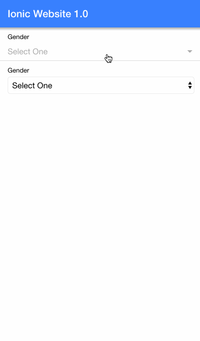
What’s your choice?
6. Skeleton Views
This one is so easy to implement but can go a long way in terms of perceived performance. Justin Willis has talked about it on the Ionic blog before, and I just wanted to bring some more attention to it again.
The idea is to show a skeleton of your view (hence the name ofc) while your app is loading some async data. This gives the user the impression he can start in a second and he’s not getting tired by an endless spinning wheel.
I actually think this comes from ages ago when internet was sometimes super slow and on websites you would first see some general structure (which meant you actually connected in some way!) and then seconds or minutes later the rest would load.
In order to implement this inside your app, you can either use the ngx-skeleton package or simply use the built in ion-skeleton-text:
<ion-item *ngFor="let fake of [{i: 250, j: 85}, {i:200, j:125}]">
	<ion-label text-wrap>
		<ion-skeleton-text [width]="fake.i + 'px'"></ion-skeleton-text>
		<ion-skeleton-text [width]="fake.j + 'px'"></ion-skeleton-text>
	</ion-label>
</ion-item>
For this example I added a little loop with values to make the skeletons more dynamic, you can also generate the numbers from your JS code and use the random function to generate a nice looking skeleton view!
7. Form Validation
Not really a hack or so but something I found very useful for validating forms and especially giving the user feedback.
Just recently I learned that you should not simply hide the submit button without giving a clue what’s missing (which should be common sense), but simply highlight the fields that are missing/wrong once the user has clicked the submit button and the form is not yet valid.
Reactive forms offer already a lot of opportunities to add classes to fields when they are wrong and touched and so on, but maybe a field was never even touched but is still not valid?
Somewhere I found a great function which iterates through all fields of a form and marks them as touched:
validateAllFormFields(formGroup: FormGroup) {
  Object.keys(formGroup.controls).forEach(field => {
    const control = formGroup.get(field);
    if (control instanceof FormControl) {
      control.markAsTouched({ onlySelf: true });
    } else if (control instanceof FormGroup) {
      this.validateAllFormFields(control);
    }
  });
}

isFieldInvalidTouched(field: any) {
  // myForm is your FormGroup variable
  return this.myForm.get(field).invalid && this.myForm.get(field).touched;
}
Now inside your view you can use the second function of that snippet to check if field was touched and is invalid and then add a class:
<ion-input formControlName="company_name" [class.invalid]="isFieldInvalidTouched('company_name')"></ion-input>This means, you simply need to check if your form is valid once the user hits the submit button, and if not call the function above to mark all fields as touched. Your view will be updated, and all fields that are invalid get the invalid class (for which you need to add some CSS) even if they were not touched before.
Now your users can fill out all the invalid fields and is happy about the information you provided!
8. More Space
I just wanted to add this one more time after talking about responsive design in the beginning of this Ionic website tutorial:
Please, please, give your design and elements room to breathe!
If your team got a designer he/she will most likely already insist on this, but if your are running a one man show (like I do) then there is nobody to blame besides you.
Make sure to use offset or enough margin/padding, don’t try to force 7 big columns into a tiny iPhone screen.
Show information in different places and find better ways to display bigger amounts of data.
Your users will be very thankful.
9. Production Builds & Console Logs
Raise your hand if you never forgot about a console.log() inside your production build!
I certainly did because I use it all the time and I’m sometimes just too lazy to clean up after myself. Good thing, there’s a tiny hack we can add so all these logs won’t log out a single line when they are running as a website.
And especially if you deploy your Ionic app as a website, it’s super easy for everyone to check the console logs.
So inside your app, open the src/main.ts and add a little block to the already existing production check:
if (environment.production) {
  enableProdMode();

  if(window){
    window.console.log=function(){};
  }
}
Now whenever you make a production build (which you should do for deployment) the log function will be replaced with an empty function.
10. Hosting
Please never tell anyone again you don’t know where to host a website - there are countless great free options and the one I like to pick is Firebase hosting.
The only thing you have to do is create a new Firebase project, and then run these 4 commands (and answer some prompts):
# Install the tools if you haven't
npm install -g firebase-tools

# Log in to your account
firebase login

' Init the services inside your Ionic project
firebase init

# Deploy the www folder to Firebase
firebase deploy
Once you are done you will get the URL to your project. But not enough, you can even add your own custom domain and get a free SSL certificate so it’s not only some free cheap hosting but a serious alternative for your Ionic website.
Conclusion
When writing up these points I had one famous quote from good old Steve on my mind the whole time:
Most people make the mistake of thinking design is what it looks like. People think it’s this veneer – that the designers are handed this box and told, “Make it look good!” That’s not what we think design is. It’s not just what it looks like and feels like. Design is how it works. - Steve Jobs
Keep this in mind all the time and both your websites and apps will be great!
PS: Would you like to know more about building a PWA with Ionic 4? Just leave a comment below!
You can also find a video version of this article below.