Getting Started with Angular Material in Ionic 4 Last update: 2019-06-11

When you have built websites with Material design before you might have already used the Angular Material components, but have you thought about using them with Ionic?
Normally the Ionic styling of components and material design items looks pretty good out of the box, but with the Angular Material package we can add many more truly Material Design components including some that don’t even exist within Ionic like this!
That’s why we will today dive into the usage of the Angular Material package in order to understand how we can use these components inside our Ionic 4 application.
Adding Angular Material with the Angular CLI
First of all we start with a blank app so you can follow every step of the integration. Go ahead by running the below commands:
ionic start devdacticMaterial blank
cd devdacticMaterial
ng add @angular/material
The interesting part here is that we are not simply installing an npm package - we are using the Angular CLI add command which does a lot more than simply installing a package.
From the log in your terminal you will see that many files are changed as well:
UPDATE src/main.ts (389 bytes)
UPDATE src/app/app.module.ts (868 bytes)
UPDATE angular.json (5767 bytes)
UPDATE src/index.html (865 bytes)
That’s the really cool thing about add: It runs scripts for a specific package that will help you to easily integrate the package into your Angular app.
In our case, it will write something to our module, load scripts inside the index.html and also update the information for the Angular build process.
You can see the change for example in your app/app.module.ts:
import { NgModule } from '@angular/core';
import { BrowserModule } from '@angular/platform-browser';
import { RouteReuseStrategy } from '@angular/router';

import { IonicModule, IonicRouteStrategy } from '@ionic/angular';
import { SplashScreen } from '@ionic-native/splash-screen/ngx';
import { StatusBar } from '@ionic-native/status-bar/ngx';

import { AppComponent } from './app.component';
import { AppRoutingModule } from './app-routing.module';
import { BrowserAnimationsModule } from '@angular/platform-browser/animations';

@NgModule({
  declarations: [AppComponent],
  entryComponents: [],
  imports: [BrowserModule, IonicModule.forRoot(), AppRoutingModule, BrowserAnimationsModule],
  providers: [
    StatusBar,
    SplashScreen,
    { provide: RouteReuseStrategy, useClass: IonicRouteStrategy }
  ],
  bootstrap: [AppComponent]
})
export class AppModule {}
The BrowserAnimationsModule was automatically added right there!
Importing all Modules
In order to use the Material components we need to import them into our pages, but actually this can get out of hand if you are using many components.
A better solution (as you can also find in their docs) is to generate an additional module which you can by running:
ionic g module material --flatIn this module file we can then add all the imports we need from Angular Material, and later we only need to include this module file in our pages to get all the imports!
Go ahead and change the just created app/material.module.ts to:
import { NgModule } from "@angular/core";
import {
  MatTableModule,
  MatStepperModule,
  MatButtonModule,
  MatFormFieldModule,
  MatInputModule,
  MatOptionModule,
  MatSelectModule,
  MatIconModule,
  MatPaginatorModule,
  MatSortModule
} from "@angular/material";

@NgModule({
  exports: [
    MatTableModule,
    MatStepperModule,
    MatButtonModule,
    MatFormFieldModule,
    MatInputModule,
    MatIconModule,
    MatOptionModule,
    MatSelectModule,
    MatPaginatorModule,
    MatSortModule
  ]
})
export class MaterialModule {}
Of course this step is optional, but I still recommend it.
To wrap things up, prepare our app/home/home.module.ts so we can use the components in the next step (and also reactive forms):
import { NgModule } from '@angular/core';
import { CommonModule } from '@angular/common';
import { IonicModule } from '@ionic/angular';
import { FormsModule, ReactiveFormsModule } from '@angular/forms';
import { RouterModule } from '@angular/router';

import { HomePage } from './home.page';
import { MaterialModule } from '../material.module';

@NgModule({
  imports: [
    CommonModule,
    FormsModule,
    IonicModule,
    RouterModule.forChild([
      {
        path: '',
        component: HomePage
      }
    ]),
    MaterialModule,
    ReactiveFormsModule
  ],
  declarations: [HomePage]
})
export class HomePageModule {}
That’s it for the installation and preparation - actually a very comfortable way for such a big package!
Adding a Simple Material Select Dropdown
To get started let’s pick a very simple component for which we don’t really need any additional logic - a material select!
For most of the components you can look up their markup which might otherwise not be clear upfront as it includes new tags and directives - but of course it might get better once you use it for a longer time!
For now, let’s change the app/home/home.page.html to:
<ion-header>
  <ion-toolbar color="primary">
    <ion-title>
      Devdactic Material
    </ion-title>
  </ion-toolbar>
</ion-header>

<ion-content>

  <mat-form-field>
      <mat-label>Ionites</mat-label>
      <mat-select [(ngModel)]="ionite" name="ionite">
        <mat-option value="Simon">Simon</mat-option>
        <mat-option value="Max">Max</mat-option>
        <mat-option value="Ben">Ben</mat-option>
      </mat-select>
    </mat-form-field>

</ion-content>
This will create a cool component like you can see below!
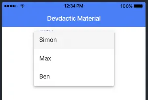
Of course there is also the standard Ionic select, but if you enjoy this type of Material Design components you can see that it’s super easy to integrate. And this was just the start!
Creating an Angular Material Table
We’ve used the nxg-datatable in a previous post (which is now to some degree outdated for Ionic 4) so the Angular Material table component is a great and simple alternative.
To display data in our table we of course need some data upfront. We could keep the data inside a regular array but if we define it with the MatTableDataSource type we can add additional functionality.
For us this means we can add stuff like pagination and sorting to our data source for which we also need to access the ViewChild (which we will implement in our view in a second).
Right now change your app/home/home.page.ts to:
import { Component, OnInit, ViewChild } from "@angular/core";
import { MatPaginator, MatTableDataSource, MatSort } from '@angular/material';

@Component({
  selector: "app-home",
  templateUrl: "home.page.html",
  styleUrls: ["home.page.scss"]
})
export class HomePage implements OnInit {
  displayedColumns: string[] = ['first_name', 'last_name', 'twitter'];
  dataSource = new MatTableDataSource<any>([
    {
      first_name: 'Max',
      last_name: 'Lynch',
      twitter: 'maxlynch'
    },
    {
      first_name: 'Matt',
      last_name: 'Netkow',
      twitter: 'dotNetkow'
    },
    {
      first_name: 'Ben',
      last_name: 'Sperry',
      twitter: 'benjsperry'
    }
  ]);

  @ViewChild(MatPaginator) paginator: MatPaginator;
  @ViewChild(MatSort) sort: MatSort;

  ngOnInit() {
    this.dataSource.paginator = this.paginator;
    this.dataSource.sort = this.sort;
  }
}
The setup for the table is now a bit more complex than our previous example. So here’s what we are using:
- mat-table: General directive for the table at the top level
- matSort: Enables sorting for our table
- ng-container matColumnDef: Defines how one column looks inlcuding the name displayed in the header row and the actual data
- mat-sort-header: Add sorting to this column
- mat-header-row: The definition about the column order, which is actually gathered from our class variable and not how we arrange the ng-template parts before!
- mat-paginator: Display the Paginator component below the table
This might be a lot in the beginning, just try to understand the basic version first before you dive into more complex topics!
Try to add the below code again to your app/home/home.page.html:
<table mat-table [dataSource]="dataSource" class="mat-elevation-z8" matSort>

    <ng-container matColumnDef="first_name">
      <th mat-header-cell *matHeaderCellDef> First Name </th>
      <td mat-cell *matCellDef="let user"> {{user.first_name}} </td>
    </ng-container>

    <ng-container matColumnDef="last_name">
      <th mat-header-cell *matHeaderCellDef> Last Name </th>
      <td mat-cell *matCellDef="let user"> {{user.last_name}} </td>
    </ng-container>

    <ng-container matColumnDef="twitter">
      <th mat-header-cell *matHeaderCellDef mat-sort-header> Twitter </th>
      <td mat-cell *matCellDef="let user"> {{user.twitter}} </td>
    </ng-container>

    <tr mat-header-row *matHeaderRowDef="displayedColumns"></tr>
    <tr mat-row *matRowDef="let row; columns: displayedColumns;"></tr>

</table>

<mat-paginator [pageSizeOptions]="[1, 2, 5]" showFirstLastButtons></mat-paginator>
This results in a basic version of a table which might not yet cover the screen, therefore simply add some CSS like:
table {
  width: 100%;
}
Now your result should be a nice table view!
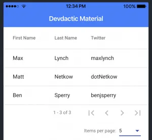
Compared to the ngx-datatable this component might not offer as many features as we had back then, but for basic tables with sort, filtering and pagination the component should definitely work great!
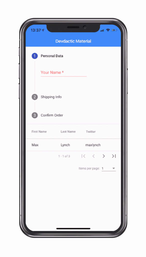
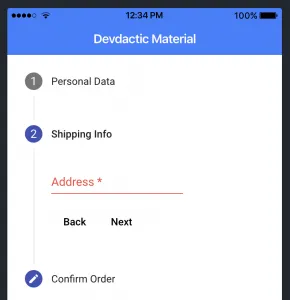
Building a Material Wizard with Steps
Finally a component I found by chance but immediately enjoyed the UI - the Stepper.
With this component you can create wizard like flows for signup, orders or whatever form data you need to capture. It will immediately give everything a more professional touch! Before we add the steps, we also need a form to which we can bind so add the required elements to your app/home/home.page.ts:
import { Component, OnInit } from "@angular/core";
import { FormGroup, FormBuilder, Validators } from '@angular/forms';

@Component({
  selector: "app-home",
  templateUrl: "home.page.html",
  styleUrls: ["home.page.scss"]
})
export class HomePage implements OnInit {

  userForm: FormGroup;

  constructor(private fb: FormBuilder) { }

  ngOnInit() {
    this.userForm = this.fb.group({
      name: ['', Validators.required],
      address: ['', Validators.required]
    });
  }
}
Now we can add the stepper component which is built trough different steps in which you capture data. You can finetune how the different steps, labels and icons look though the latter is a bit more complex topic.
Also, this component (or the code below) uses many of the Angular Material components so it looks quite complex in the beginning.
Again, go through it one by one to truly understand what’s going on but it’s basically still just steps with elements, nothing more! And of course some logic to go back and forward between the steps using the right directives like matStepperPrevious or matStepperNext.
Now go ahead and add this somewhere to your app/home/home.page.html:
<mat-vertical-stepper linear="false" #stepper>

  <mat-step [stepControl]="userForm">
    <form [formGroup]="userForm">
      <ng-template matStepLabel>Personal Data</ng-template>
      <mat-form-field>
        <input matInput placeholder="Your Name" formControlName="name" required>
      </mat-form-field>
    </form>
  </mat-step>

  <mat-step [stepControl]="userForm" label="Shipping Info">
    <form [formGroup]="userForm">
      <mat-form-field>
        <input matInput placeholder="Address" formControlName="address" required>
      </mat-form-field>
      <div>
        <button mat-button matStepperPrevious>Back</button>
        <button mat-button matStepperNext>Next</button>
      </div>
    </form>
  </mat-step>

  <mat-step label="Confirm Order">
    By clicking finish you accept our Terms & Conditions.
    <div>
      <button mat-button matStepperPrevious>Back</button>
      <button mat-button (click)="stepper.reset()">Reset</button>
    </div>
  </mat-step>

</mat-vertical-stepper>
The result is a pretty cool separation of steps.
Of course you can also rebuild this behaviour using Ionic components and animations, but compared to this solution things will include more lines of code and additional logic!
What else?
Some of the components inside this package are already present in Ionic like cards, lists or the snackbar (which is called Toast with Ionic). Also, the navigation elements are great within Ionic and you should rely on them as well.
But besides the three here mentioned components there also more utilities that you might want to check out including:
- Autocomplete: Otherwise only available as additional packages
- Tree: A very interesting tree component yet problematic to use inside Ionic Apps, also to some degree possible as a simple accordion
- Progress bar: Can be achieved with a custom component or other packages as well but looks sleek with Angular material as well
- Tooltip: Not working for mobile apps but if you deploy your Ionic app as a website it might be nice to have
These are just a few of the packages that look interesting. There is also more we could do with the CDK like Drag & drop so if you want to see more on that just leave me a comment!
Conclusion
The Angular Material package is a great way to add material designed components to your Ionic app. Although you can cover most cases with the standard bundled stuff, things like a table or stepper component are not yet present.
The UI of ht elements in here is great and there are many more components to discover inside the Angular Material package so give it a try and let me know which of them you enjoyed as well!
You can also find a video version of this article below.