The Essential Ionic Image Zoom Guide (Modal & Cards) Last update: 2020-10-06

Adding Ionic image zoom is often a requirement in apps, but the implementation isn’t very well documented. In this tutorial we will implement a simple Ionic image zoom based on the Ionic slides!
For years the ion-slides element has been the best place to implement zoom, but of course that’s not really clear upfront when you are looking for a solution.
Therefore we will build a simple image gallery and add a modal overlay to present our images with zoom, both from touch events and from code.
On top of that we will implement an Instagram like zoom behaviour with images inside a feed, which is more challenging but the result is going to be epic!
All of this is based on standard Ionic components, so we don’t need any external package.
Starting the Ionic Image Zoom App
Let’s start a fresh app and enable Capacitor because by now you should really start new apps like this! It doesn’t matter for this tutorial, but I still recommend it.
The only additional thing we need is a page, which we can generate inside our project right after bootstrapping it:
ionic start imageGallery blank --type=angular --capacitor
cd ./imageGallery
ionic g page imageModal
Since we want to show images, take some of your and add them to the assets/img folder inside your Ionic project (you need to create the img folder). I have named the images like 1.webp, 2.webp for this tutorial, which you should do for now.
Preparing an Image Gallery
First of all we create a gallery to display images with horizontal scroll. To do so, we use the slides component and iterate over an array of numbers, which are used to get the path to each of our images.
Each image can be clicked to open the modal preview, so for now change the home/home.page.html to:
<ion-header>
  <ion-toolbar color="primary">
    <ion-title>
      Ionic Image Zoom
    </ion-title>
  </ion-toolbar>
</ion-header>

<ion-content>
  <ion-slides [options]="sliderOpts" class="preview-slides">
    <ion-slide *ngFor="let img of [1, 2, 3, 4]">
      <img src="assets/img/{{ img }}.webp" tappable (click)="openPreview(img)">
    </ion-slide>
  </ion-slides>
</ion-content>
This doesn’t look like a gallery out of the box, but we have already used one of the slider properties, in which we can pass a configuration for the underlying swiper!
By passing in a configuration you can customise the whole slides component, top show multiple elements on one page, center them or define padding..Basically everything!
So within our home/home.page.ts we define the options and add the function to open our modal:
import { Component, ChangeDetectorRef } from '@angular/core';
import { ImageModalPage } from '../image-modal/image-modal.page';
import { ModalController, IonSlides } from '@ionic/angular';

@Component({
  selector: 'app-home',
  templateUrl: 'home.page.html',
  styleUrls: ['home.page.scss']
})
export class HomePage {
  sliderOpts = {
    zoom: false,
    slidesPerView: 1.5,
    spaceBetween: 20,
    centeredSlides: true
  };

  constructor(private modalController: ModalController, private changeDetectorRef: ChangeDetectorRef) { }

  async openPreview(img) {
    const modal = await this.modalCtrl.create({
      component: ImageModalPage,
      cssClass: 'transparent-modal',
      componentProps: {
        img
      }
    });
    modal.present();
  }
}
When we open the modal page, we pass the image we clicked on through and also attach a custom class so we can make it transparent later on.
Additionally we can add a bit of styling for the slides of our page like this inside the home/home.page.scss:
.preview-slides {
  margin-top: 20%;
  background: #e6e6e6;

  img {
      padding-top: 20px;
      padding-bottom: 20px;
  }
}
The custom CSS class we added to the modal needs to be defined at the top of our application, so open the global.scss and add:
.transparent-modal {
    .modal-wrapper {
        --background: rgba(44, 39, 45, 0.2);
    }
}
The modal component exists above your Ionic application, therefore you can’t add this styling to the page where you create the modal!
Now you should be able to scroll through your images inside the gallery and open the modal. Time to implement the Ionic image zoom!
Creating an Ionic Image Zoom Modal
There is a section inside the Swiper API about image zoom, which is all we need!
To zoom images within the Ionic slides, we need to add another element with the class swiper-zoom-container - that’s basically everything.
We also need to pass in options for the slides again from which we will enable the zoom functionality in the next step. I’ve also added a few buttons inside the footer of the page so we can later try and zoom into our images from code and leave the modal.
For now go ahead and change the image-modal/image-modal.page.html to:
<ion-content>
  <ion-slides [options]="sliderOpts">
    <ion-slide>
      <div class="swiper-zoom-container">
        <img src="assets/img/{{ img }}.webp">
      </div>
    </ion-slide>
  </ion-slides>
</ion-content>

<ion-footer>
  <ion-row>
    <ion-col size="4" class="ion-text-center">
      <ion-button (click)="zoom(false)" fill="clear" color="light">
        <ion-icon name="remove" slot="start"></ion-icon>
        out
      </ion-button>
    </ion-col>
    <ion-col size="4" class="ion-text-center">
      <ion-button (click)="close()" fill="clear" color="light">
        <ion-icon name="close" slot="start"></ion-icon>
        close
      </ion-button>
    </ion-col>
    <ion-col size="4" class="ion-text-center">
      <ion-button (click)="zoom(true)" fill="clear" color="light">
        <ion-icon name="add" slot="start"></ion-icon>
        in
      </ion-button>
    </ion-col>
  </ion-row>
</ion-footer>
Again, almost same slider setup but this time with the additional container. Now we just need to enable zoom from the config, and implement the zoom from code.
To achieve this, we can directly access the Swiper element from our IonSlides with the getSwiper() function!
Because this call returns a Promise we need to handle it accordingly with async/await, but then we are able to access the zoom object inside the Swiper and call in() or out() depending on how we called our function.
Open the image-modal/image-modal.page.ts and change it to:
import { Component, OnInit, ViewChild, Input } from '@angular/core';
import { ModalController, IonSlides } from '@ionic/angular';

@Component({
  selector: 'app-image-modal',
  templateUrl: './image-modal.page.html',
  styleUrls: ['./image-modal.page.scss'],
})
export class ImageModalPage implements OnInit {
  @ViewChild(IonSlides) slides: IonSlides;
  @Input('img')img: any;

  sliderOpts = {
    zoom: true
  };

  constructor(private modalController: ModalController) { }

  ngOnInit() { }

  ionViewDidEnter(){
    this.slides.update();
  }

  async zoom(zoomIn: boolean) {
    const slider = await this.slides.getSwiper();
    const zoom = slider.zoom;
    zoomIn ? zoom.in() : zoom.out();
  }

  close() {
    this.modalController.dismiss();
  }

}
Because nothing looks awesome out of the box let’s quickly apply some styling inside the image-modal/image-modal.page.scss:
ion-content {
    --background: transparent;
}

ion-footer {
    margin-bottom: 10px;
}

ion-slides {
    height: 100%;
}
Now the modal looks perfectly transparent and we can zoom our image! Testing this works best on a device, I couldn’t really make zoom working inside a browser at this point.
Ionic Image Zoom with Advanced Styling
Now that we are Ionic image zoom novices, let’s take on another challenge: Simply zoom into any image inside a list/feed of cards!
This is a lot more tricky, because we need to perform different actions:
- Allow zoom for images inside a card
- Make the image pop out from the card by changing the overflow value
- Display a background overlay when zoom starts, dismiss when it ends
- Make the selected image appear above the backdrop
I recommend to check out the video below this tutorial if you want to see all the steps one by one to achieve this result!
First of all, we can implement a conditional backdrop that we will style later, and a card iteration with a slides element in front of the actual card content.
Since we need access to the card and the slides element, we also give them a template reference, which we use directly inside the functions touchstart and touchend on our zoom container!
These functions are actually the key to our whole image zoom functionality, because inside them we can change the styling of the element that we want to zoom in.
For now open the home/home.page.html and change the content area to:
<ion-content>
<!-- Background drop while zoom -->
<div *ngIf="zoomActive" class="backdrop" [style.opacity]="zoomScale"></div>
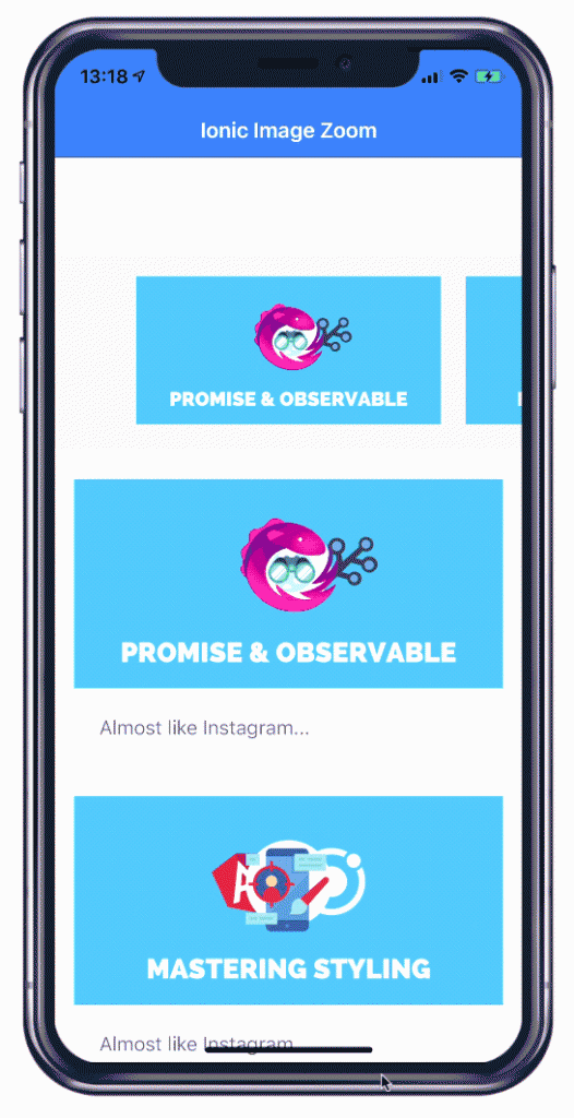
<ion-card *ngFor="let img of [1, 2, 3, 4]" class="image-card" #card>
<ion-slides class="image-slide" [options]="sliderZoomOpts" #zoomslides>
<ion-slide>
<div class="swiper-zoom-container" (touchstart)="touchStart(card)"
(touchend)="touchEnd(zoomslides, card)">
<img src="assets/img/{{ img }}.webp">
</div>
</ion-slide>
</ion-slides>
<ion-card-content>
Almost like Instagram
</ion-card-content>
</ion-card>
</ion-content>The opacity of our backdrop will also change while we zoom into an image, so the zoomScale will be a value between 0 and 1 in the end.
Now we need a bigger configuration object for our slides, because we want to disallow any classic slide prev/next behaviour. On top of that we can define a max ratio for the zoom, so we can later divide the scale of the image inside the zoomChange by this value for our backdrop opacity (by now you get why this was tricky, huh).
This functions is called whenever our slides are zoomed, and returns both the current scale and and elements that we don’t need for this example. But we can change our zoomActive at this point so the zoom basically starts.
Additionally we will set the z index to a slightly higher value when we start to touch the element, and return the index back when the touch ends. As a quick z index overview in this example:
- 9: All cards in normal mode
- 10: Backdrop, so it’s above cards
- 11: The card that we zoom, so it’s above the backdrop
Once the zoom ends (the touches end, there is no other zoom end callback apparently), we access the swiper like before and zoom out completely.
Now add this to your home/home.page.ts:
zoomActive = false;
zoomScale = 1;

sliderZoomOpts = {
  allowSlidePrev: false,
  allowSlideNext: false,
  zoom: {
    maxRatio: 5
  },
  on: {
    zoomChange: (scale, imageEl, slideEl) => {
      this.zoomActive = true;
      this.zoomScale = scale/5;
      this.changeDetectorRef.detectChanges();
    }
  }
}

async touchEnd(zoomslides: IonSlides, card) {
  // Zoom back to normal
  const slider = await zoomslides.getSwiper();
  const zoom = slider.zoom;
  zoom.out();

  // Card back to normal
  card.el.style['z-index'] = 9;

  this.zoomActive = false;
  this.changeDetectorRef.detectChanges();
}

touchStart(card) {
  // Make card appear above backdrop
  card.el.style['z-index'] = 11;
}
Finally, we need to add the according z-index to our elements and make sure the image can overflow the card. The backdrop has a full black background, but since we dynamically change the opacity this changes during zoom.
Add the following to your home/home.page.scss:
.image-slide,
.image-card {
    overflow: visible;
}

.image-card {
    z-index: 9;
}

.backdrop {
    height: 200%;
    width: 100%;
    background: black;
    position: absolute;
    z-index: 10;
}
There are only 2 minor issues:
First, the backdrop doesn’t really fill the whole content area. I’ve added a height of 200% in this example, but once your list becomes longer, you will notice it suddenly ends.
You might have to calculate the real content height and set this value as the height of the backdrop element instead.
Second, when we release the finger, the zoom goes back to deactivated and the backdrop is dismissed immediately. It’s a small detail, but you could try to add an Angular animation leave event and then hide the backdrop instead to make the whole process a bit more smooth.
Conclusion
It’s actually not too hard to implement Ionic image zoom by using the slides and the underlying Swiper implementation. Especially the second feed zoom shows how you can achieve functionality that you usually wouldn’t expect from Ionic, but with a bit of CSS and some small logic you can make almost everything work!
You can also find a video version of this tutorial below.