Building a Gmail Swipe to Delete Gesture & Animated FAB with Ionic Angular Last update: 2021-07-13

We have previously created a basic Gmail clone with Ionic, but there are certain UI and especially UX elements missing that make the original app look so amazing.
You like to see popular apps built with Ionic? Check out my latest eBook Built with Ionic for even more real world app examples!
Get the Code 🔐
Receive all the files of the tutorial right to your inbox and subscribe to my weekly no BS newsletter!
In this tutorial we will implement an animated fab button and a special behaviour to slide and delete items from an Ionic list.
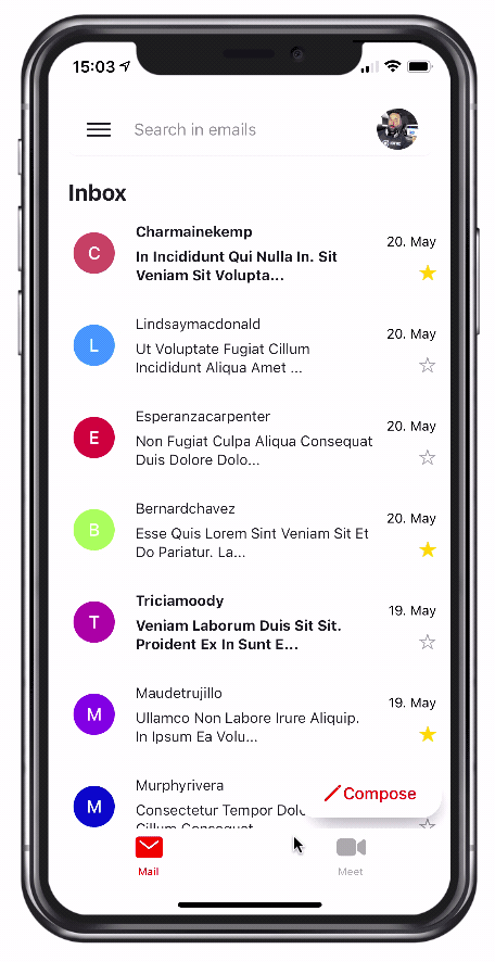
All of this will be possible through the usage of Ionic gestures and the Animation API, which are truly powerful as you will see.
Prerequisite: If you want to follow along exactly, please download the code for the previous tutorial from this Github repository!
Creating a FAB Animation while scrolling
The fist part will be a bit easier, we simply want to expand or shrink a fab button when we scroll up or down. To get started, generate a new directive:
ionic g directive directives/animatedFabIn order to use this directive we need to include it within the src/app/directives/shared-directives.module.ts:
import { NgModule } from '@angular/core';
import { CommonModule } from '@angular/common';
import { HideHeaderDirective } from './hide-header.directive';
import { AnimatedFabDirective } from './animated-fab.directive';

@NgModule({
	declarations: [HideHeaderDirective, AnimatedFabDirective],
	imports: [CommonModule],
	exports: [HideHeaderDirective, AnimatedFabDirective]
})
export class SharedDirectivesModule {}
Now we can add the directive to our main page as it will listen to scroll events just like a bunch of other directives we have set up in our Built with Ionic tutorials before.
The actual fab button code goes to the bottom of our page and can be referenced through the #fab template reference, which we pass to our appAnimatedFab directive.
Go ahead and change the src/app/pages/mail/mail.page.html in these places now:
<ion-content scrollEvents="true" [appHideHeader]="search" [appAnimatedFab]="fab">
	<!--- all the other code... -->

	<ion-fab vertical="bottom" horizontal="end" slot="fixed">
		<ion-fab-button color="light" #fab>
			<ion-icon name="pencil-outline" color="primary"></ion-icon>
			<span>Compose</span>
		</ion-fab-button>
	</ion-fab>
</ion-content>
The default Ionic fab is just a round button, but we need to make it expanded by default. To do this, we can manually define the width and height, change the border radius so it doesn’t look like an egg and apply a stronger shadow.
For this, open the src/app/pages/mail/mail.page.scss and add:
ion-fab-button {
  width: 140px;
  height: 48px;
  --border-radius: 20px;
  --box-shadow: 5px 12px 30px -8px rgba(0,0,0,0.53);

  ion-icon {
    font-size: 20px;
  }
}

ion-fab-button::part(native) {
  color: var(--ion-color-primary);
  font-weight: 500;
  font-size: 16px;
}
We are also using the shadow part of the fab button here to directly apply a styling to something inside the shadow component without CSS variables!
Now we can create the actual directive, which will get all the scroll events of our content. Basically we want to:
- Shrink the fab while scrolling down
- Fade and move out the text inside the
spanof the fab - Reverse this operation when we scroll up again.
And we can actually do all of this by defining two simple Ionic animations! These animate the according elements, and we can combine those two single animations inside one by passing an array of animations to the addAnimation() function of the Animation controller.
Inside of the scroll listener we will also check the direction of scroll and use the expanded variable to make sure we only run each animation once when the direction has changed.
Now open the src/app/directives/animated-fab.directive.ts and change it to:
import { AfterViewInit, Directive, HostListener, Input } from '@angular/core';
import { AnimationController, Animation } from '@ionic/angular';

@Directive({
	selector: '[appAnimatedFab]'
})
export class AnimatedFabDirective implements AfterViewInit {
	@Input('appAnimatedFab') fab: any;

	constructor(private animationCtrl: AnimationController) {}

	shrinkAnimation: Animation;
	expanded = true;

	ngAfterViewInit() {
		this.fab = this.fab.el;
		this.setupAnimation();
	}

	setupAnimation() {
		const textSpan = this.fab.querySelector('span');

		const shrink = this.animationCtrl
			.create('shrink')
			.addElement(this.fab)
			.duration(400)
			.fromTo('width', '140px', '50px');

		const fade = this.animationCtrl
			.create('fade')
			.addElement(textSpan)
			.duration(400)
			.fromTo('opacity', 1, 0)
			.fromTo('width', '70px', '0px');

		this.shrinkAnimation = this.animationCtrl
			.create('shrink-animation')
			.duration(400)
			.easing('ease-out')
			.addAnimation([shrink, fade]);
	}

	@HostListener('ionScroll', ['$event']) onContentScroll($event: any) {
		if ($event.detail.deltaY > 0 && this.expanded) {
			// Scrolling down
			this.expanded = false;
			this.shrinkFab();
		} else if ($event.detail.deltaY < 0 && !this.expanded) {
			// Scrolling up
			this.expanded = true;
			this.expandFab();
		}
	}

	expandFab() {
		this.shrinkAnimation.direction('reverse').play();
	}

	shrinkFab() {
		this.shrinkAnimation.direction('alternate').play();
	}
}
Initially I thought we need a complete reverse animation, but using direction('reverse') is completely enough to achieve exactly what we need!
Now you can scroll your page up and down, and the fab button will shrink/expand depending on your scroll direction.
Sliding Item to Archive and Delete
Now things will get more challenging but the reward is also bigger. We want to implement a slide to delete behaviour with custom animation and different background colors on both sides of our email, just like inside the Gmail application.
For this we need a custom component with a new module, and we can also install the Capacitor haptics package for some icing on the cake, so go ahead and run:
ionic g module components/sharedComponents --flat
ionic g component components/swipeItem

npm install @capacitor/haptics
First of all we need to declare and export our component in the new module, and also import all necessary other modules we might need.
Therefore go ahead and change the src/app/components/shared-components.module.ts to:
import { NgModule } from '@angular/core';
import { CommonModule } from '@angular/common';
import { SwipeItemComponent } from './swipe-item/swipe-item.component';
import { IonicModule } from '@ionic/angular';
import { RouterModule } from '@angular/router';

@NgModule({
	declarations: [SwipeItemComponent],
	imports: [CommonModule, IonicModule, RouterModule],
	exports: [SwipeItemComponent]
})
export class SharedComponentsModule {}
Now we can bring over most of the original template for displaying our Gmail styled icon, but we will put another wrapper div in front of it which will act as the background that can be revealed when we swipe the item.
Go ahead and change the src/app/components/swipe-item/swipe-item.component.html to this:
<div class="wrapper" #wrapper>
	<div class="column">
		<ion-icon name="trash-outline" color="light" class="ion-margin-start" #trash></ion-icon>
	</div>
	<div class="column" class="ion-text-right">
		<ion-icon name="archive-outline" color="light" class="ion-margin-end" #archive></ion-icon>
	</div>
</div>
<!-- The actual item -->
<ion-item class="email" lines="none">
	<ion-row class="ion-align-items-center">
		<ion-col size="2" (click)="openDetails(m.id)">
			<div class="email-circle" [style.background]="m.color">{{ m.from | slice:0:1 }}</div>
		</ion-col>
		<ion-col size="8" (click)="openDetails(m.id)">
			<ion-label
				color="dark"
				[style.font-weight]="!m.read ? 'bold' : ''"
				class="ion-text-capitalize ion-text-wrap"
			>
				{{ m.from.split('@')[0] }}
				<p class="excerpt">
					{{ (m.content.length>50)? (m.content | slice:0:50)+'...' : (m.content) }}
				</p>
			</ion-label>
		</ion-col>
		<ion-col size="2">
			<div class="ion-text-right" tappable (click)="m.star = !m.star;">
				<p class="date">{{ m.date | date:'dd. MMM' }}</p>
				<ion-icon [name]="m.star ? 'star' : 'star-outline'" [color]="m.star ? 'warning' : 'medium'">
				</ion-icon>
			</div>
		</ion-col>
	</ion-row>
</ion-item>
I’ve taken the markup for the item 99% from the mail page, and we can also bring over the original styling for the email. On top of that we make our wrapper class use the same fixed height as our item, and use a flex box layout to align the icons within in the center and make the columns divide that space evenly.
Open the src/app/components/swipe-item/swipe-item.component.scss now and change it to this:
.wrapper {
	background-color: red;
	display: flex;
	flex-direction: row;
	align-items: center;
	width: 100%;
	height: 89px;
	position: absolute;
}

.column {
	display: flex;
	flex-direction: column;
	flex-basis: 100%;
	flex: 1;
}

.rounded {
	border-radius: 10px;
	z-index: 2;
	box-shadow: 0px 6px 13px -5px rgb(0 0 0 / 28%);
}

ion-item {
	height: 89px;
	background: #fff;
	display: flex;
}

// Original styling from first part
// Copied from mail.page.scss
.email {
	.excerpt {
		padding-top: 4px;
	}

	.date {
		font-size: small;
	}
}

.email-circle {
	width: 40px;
	height: 40px;
	border-radius: 50%;
	display: flex;
	align-items: center;
	justify-content: center;
	color: #efefef;
	text-transform: capitalize;
	font-weight: 500;
}
I’ve also added a class rounded which will be added to an item once we start dragging, which will make the current item stand out with additional shadow.
Now it’s time for the logic, and this is a bit more complicated:
- We define an
ANIMATION_BREAKPOINTwhich is the distance after which an item can be released and will be delete. Until that value, the item will only snap back to it’s original place - We need a gesture and handle the move and end of our item
- On move, we check the direction and color the background of our wrapper red or green depending on the x direction
- On move, we transform the X coordinates according to the current delta to move the item left or right
- On move, we animate the trash/archive icon if we crossed the breakpoint and run a function to handle this
- On end, we check if we are above our breakpoint and slide the item out to the left/right and run a custom delete animation that we define upfront. This function animates the height, so the item flys out and the row collapses at the same time
- On end, when the animation has finished we emit this to the parent component using an
EventEmitter
All of this can be achieved with the Ionic gesture and animation controller, so go ahead and change the src/app/components/swipe-item/swipe-item.component.ts to:
import {
	Component,
	Input,
	ViewChild,
	ElementRef,
	AfterViewInit,
	Output,
	EventEmitter
} from '@angular/core';
import { Router } from '@angular/router';
import { Animation, AnimationController, GestureController, IonItem } from '@ionic/angular';
import { Haptics, ImpactStyle } from '@capacitor/haptics';

const ANIMATION_BREAKPOINT = 70;

@Component({
	selector: 'app-swipe-item',
	templateUrl: './swipe-item.component.html',
	styleUrls: ['./swipe-item.component.scss']
})
export class SwipeItemComponent implements AfterViewInit {
	@Input('email') m: any;
	@ViewChild(IonItem, { read: ElementRef }) item: ElementRef;
	@ViewChild('wrapper') wrapper: ElementRef;
	@ViewChild('trash', { read: ElementRef, static: false }) trashIcon: ElementRef;
	@ViewChild('archive', { read: ElementRef }) archiveIcon: ElementRef;

	@Output() delete: EventEmitter<any> = new EventEmitter();

	bigIcon = false;

	trashAnimation: Animation;
	archiveAnimation: Animation;
	deleteAnimation: Animation;

	constructor(
		private router: Router,
		private gestureCtrl: GestureController,
		private animationCtrl: AnimationController
	) {}

	ngAfterViewInit() {
		this.setupIconAnimations();

		const style = this.item.nativeElement.style;
		const windowWidth = window.innerWidth;

		this.deleteAnimation = this.animationCtrl
			.create('delete-animation')
			.addElement(this.item.nativeElement)
			.duration(300)
			.easing('ease-out')
			.fromTo('height', '89px', '0');

		const moveGesture = this.gestureCtrl.create({
			el: this.item.nativeElement,
			gestureName: 'move',
			threshold: 0,
			onStart: (ev) => {
				style.transition = '';
			},
			onMove: (ev) => {
				// Make the item stand out
				this.item.nativeElement.classList.add('rounded');

				if (ev.deltaX > 0) {
					this.wrapper.nativeElement.style['background-color'] = 'var(--ion-color-primary)';
					style.transform = `translate3d(${ev.deltaX}px, 0, 0)`;
				} else if (ev.deltaX < 0) {
					this.wrapper.nativeElement.style['background-color'] = 'green';
					style.transform = `translate3d(${ev.deltaX}px, 0, 0)`;
				}

				// Check if we need to animate trash icon
				if (ev.deltaX > ANIMATION_BREAKPOINT && !this.bigIcon) {
					this.animateTrash(true);
				} else if (ev.deltaX > 0 && ev.deltaX < ANIMATION_BREAKPOINT && this.bigIcon) {
					this.animateTrash(false);
				}

				// Check if we need to animate archive icon
				if (ev.deltaX < -ANIMATION_BREAKPOINT && !this.bigIcon) {
					this.animateArchive(true);
				} else if (ev.deltaX < 0 && ev.deltaX > -ANIMATION_BREAKPOINT && this.bigIcon) {
					this.animateArchive(false);
				}
			},
			onEnd: (ev) => {
				style.transition = '0.2s ease-out';
				this.item.nativeElement.classList.remove('rounded');

				// Check if we are past the delete or archive breakpoint
				if (ev.deltaX > ANIMATION_BREAKPOINT) {
					style.transform = `translate3d(${windowWidth}px, 0, 0)`;
					this.deleteAnimation.play();
					this.deleteAnimation.onFinish(() => {
						this.delete.emit(true);
					});
				} else if (ev.deltaX < -ANIMATION_BREAKPOINT) {
					style.transform = `translate3d(-${windowWidth}px, 0, 0)`;
					this.deleteAnimation.play();
					this.deleteAnimation.onFinish(() => {
						this.delete.emit(true);
					});
				} else {
					style.transform = '';
				}
			}
		});

		// Don't forget to enable!
		moveGesture.enable(true);
	}

	setupIconAnimations() {}

	animateTrash(zoomIn) {}

	animateArchive(zoomIn) {}

	openDetails(id) {}
}
It’s actually quite straight forward if you get the various if/else statements right!
Now we just need to define the functions for our icons, which will simply scale the icon when we crossed the breakpoint or reverse that animation otherwise.
At this point we can also use the haptics plugin for a real feedback about a change to the user - awesome UX from the Gmail application!
Go ahead and implement the missing functions like this now:
setupIconAnimations() {
  this.trashAnimation = this.animationCtrl.create('trash-animation')
    .addElement(this.trashIcon.nativeElement)
    .duration(300)
    .easing('ease-in')
    .fromTo('transform', 'scale(1)', 'scale(1.5)');

  this.archiveAnimation = this.animationCtrl.create('archive-animation')
    .addElement(this.archiveIcon.nativeElement)
    .duration(300)
    .easing('ease-in')
    .fromTo('transform', 'scale(1)', 'scale(1.5)')
}

animateTrash(zoomIn) {
  this.bigIcon = zoomIn;
  if (zoomIn) {
    this.trashAnimation.direction('alternate').play();
  } else {
    this.trashAnimation.direction('reverse').play();
  }
  Haptics.impact({ style: ImpactStyle.Light });
}

animateArchive(zoomIn) {
  this.bigIcon = zoomIn;
  if (zoomIn) {
    this.archiveAnimation.direction('alternate').play();
  } else {
    this.archiveAnimation.direction('reverse').play();
  }
  Haptics.impact({ style: ImpactStyle.Light });
}

openDetails(id) {
  this.router.navigate(['tabs', 'mail', id]);
}
Now we just need to use our new item instead of the original one in our app.
Using the Swipe Item
To put it to use, bring up the src/app/pages/mail/mail.module.ts and import our new components module:
import { NgModule } from '@angular/core';
import { CommonModule } from '@angular/common';
import { FormsModule } from '@angular/forms';

import { IonicModule } from '@ionic/angular';

import { MailPageRoutingModule } from './mail-routing.module';

import { MailPage } from './mail.page';
import { AccountPageModule } from '../account/account.module';
import { SharedDirectivesModule } from '../../directives/shared-directives.module';
import { SharedComponentsModule } from '../../components/shared-components.module';

@NgModule({
	imports: [
		CommonModule,
		FormsModule,
		IonicModule,
		MailPageRoutingModule,
		AccountPageModule,
		SharedDirectivesModule,
		SharedComponentsModule
	],
	declarations: [MailPage]
})
export class MailPageModule {}
We can simply exchange the previous code and continue to use the for loop while also adding the output from our component and calling the removeMail() function when we catch that event.
Therefore, open the src/app/pages/mail/mail.page.html and replace the necessary lines like this:
<ion-list>
	<ion-list-header>Inbox</ion-list-header>
	<app-swipe-item
		*ngFor="let m of emails; let i = index;"
		[email]="m"
		(delete)="removeMail(m.id)"
	></app-swipe-item>
</ion-list>
On top of that we can remove the item from the data array now and manually update the view using the Angular ChangeDetectorRef since otherwise the view wouldn’t be updated correctly (check out my video below at the end to see the difference).
To do so, simply change the required parts inside the src/app/pages/mail/mail.page.ts to:
  // Update constructor
  constructor(private http: HttpClient, private router: Router,
    private popoverCtrl: PopoverController, private changeDetector: ChangeDetectorRef) { }

    // new function
  removeMail(id) {
    this.emails = this.emails.filter(email => email.id != id);
    this.changeDetector.detectChanges();
  }
And with that our custom swipe to delete/archive works, running smoothly and looking 99% like the original Gmail style!
Conclusion
Building advanced UX patterns into your Ionic application is most of the time a straight forward task, and you can implement almost every pattern you see in popular apps.
Usually you can break down an animation into smaller chunks, build each of them separately and then combine them to one epic result.
If you want to see more of these apps, check out the other Built with Ionic tutorials as well!