Angular Material Mobile App with Capacitor Last update: 2022-06-28
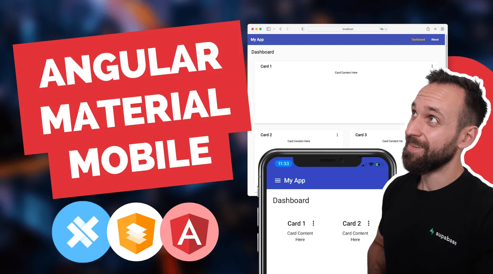
Angular Material is an awesome library of Material Design components for Angular apps, and with its sidenav plus the help of Capacitor we can easily build a native mobile app from one codebase!
Get the Code 🔐
Receive all the files of the tutorial right to your inbox and subscribe to my weekly no BS newsletter!
In this tutorial we will go through all the steps of setting up an Angular project and integrating Angular Material. We will create a responsive navigation which shows a side menu on smaller screen and a regular top navigation bar on desktops screens.
Finally we will install Capacitor to quickly build a native iOS and Android app from our Angular app.
This means we are able to cover 3 different platforms all from one codebase!
Creating an Angular Material Sidenav
Let’s begin with a new Angular project. After creating the project you can use a schematic to add all required packages and changes to our project for using Angular Material.
You can basically select yes for everything during that wizard, and afterwards run another schematic from Angular Material which automatically bootstraps the basic sidenav component for us!
# Start a new app
ng new materialApp --routing --style=scss
cd ./materialApp

# Schematic to add Angular Material
ng add @angular/material

# Generate a component with sidenav
ng generate @angular/material:navigation app-navigation
When we are done, we can change our src/app/app.component.html as we want to display our new component instead of all the dummy code that default app comes with:
<app-app-navigation></app-app-navigation>This will load our component instead, and now it’s a good time to take a look at the general setup of the sidenav:
- The whole code is surrounded by the
mat-sidenav-containercomponent - The actual side menu that we can display is inside
mat-sidenav - Everything inside
mat-sidenav-contentis the actual main area which later shows our different pages
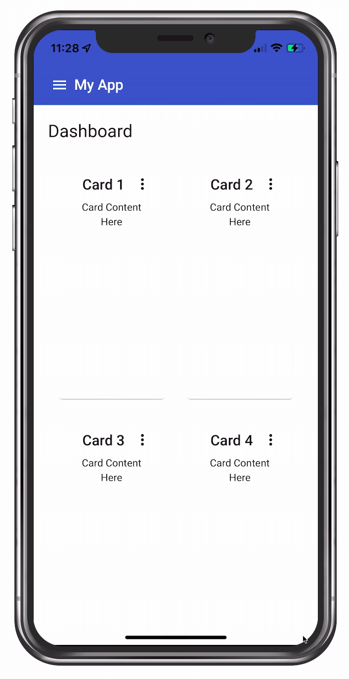
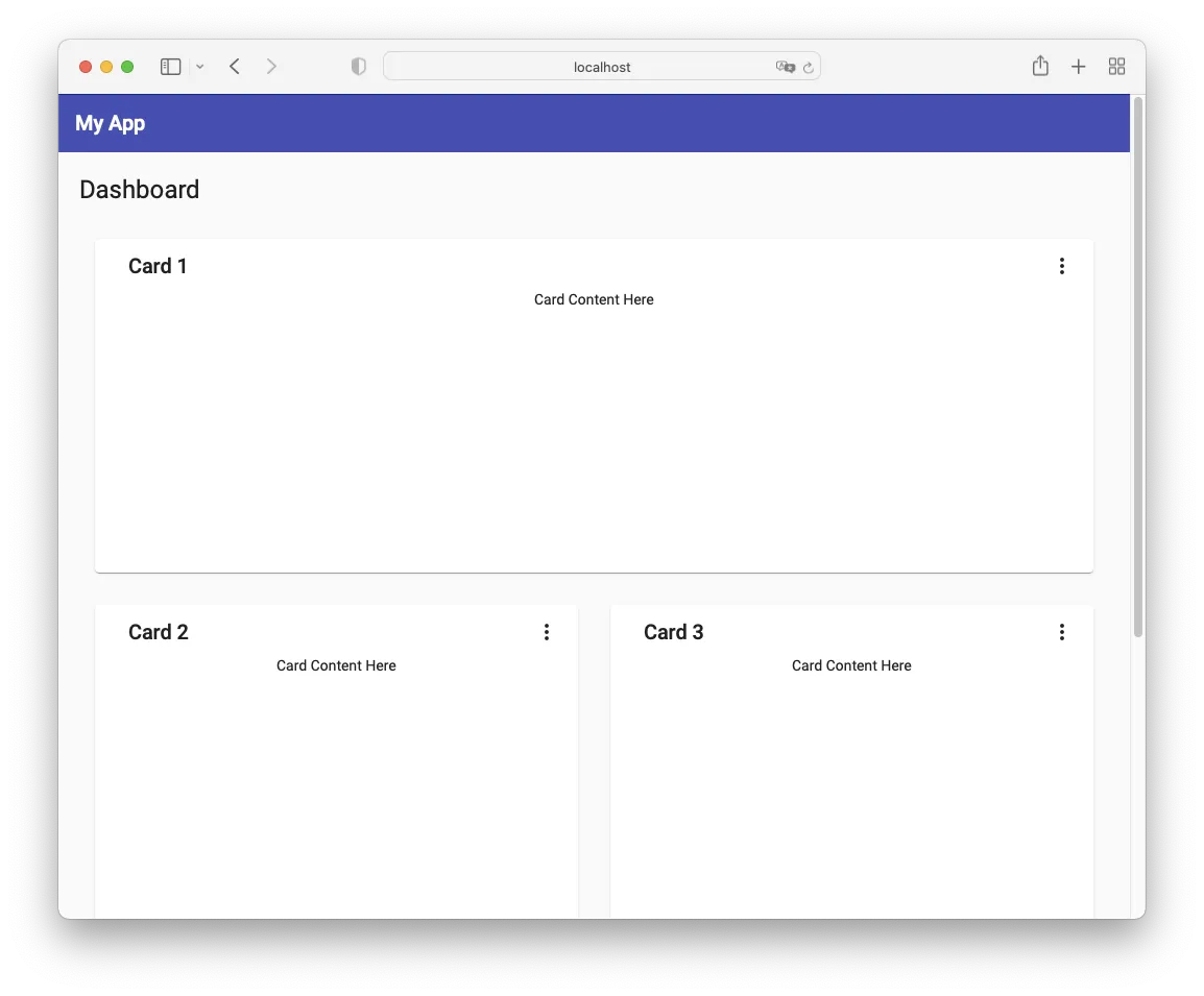
If you run the app right now you will see the side menu even on bigger screens, but usually you will use a top navigation in that case (although some websites also use a side menu).
To achieve this behaviour, we will change the src/app/app-navigation/app-navigation.component.html and remove the opened property from the mat-sidenav:
<mat-sidenav-container class="sidenav-container">
	<mat-sidenav
		#drawer
		class="sidenav"
		[attr.role]="(isHandset$ | async) ? 'dialog' : 'navigation'"
		[mode]="(isHandset$ | async) ? 'over' : 'side'"
	>
		<mat-toolbar>Menu</mat-toolbar>
		<mat-nav-list>
			<a mat-list-item href="#">Link 1</a>
			<a mat-list-item href="#">Link 2</a>
			<a mat-list-item href="#">Link 3</a>
		</mat-nav-list>
	</mat-sidenav>

	<mat-sidenav-content>
		<mat-toolbar color="primary">
			<button
				type="button"
				aria-label="Toggle sidenav"
				mat-icon-button
				(click)="drawer.toggle()"
				*ngIf="isHandset$ | async"
			>
				<mat-icon aria-label="Side nav toggle icon">menu</mat-icon>
			</button>
			<span>My App</span>
		</mat-toolbar>
		<!-- Add Content Here -->
		MY CONTENT HERE
	</mat-sidenav-content>
</mat-sidenav-container>
If you now run the app you should only see the menu icon on smaller screens and otherwise just the toolbar with our app title at the top!
This page automatically comes with an isHandset Observable that you can find inside the src/app/app-navigation/app-navigation.component.ts, and it uses the Angular BreakpointObserver to emit if we have reached a “handset” device size.
Since this is an Observable, all occurrences to the isHandset variable use the Angular async pipe to subscribe to it.
Adding Navigation with different Routes
So far we only have this one page, now it’s time to add more pages and we start by generating some components, one even using another schematic from Angular Material to setup a nice little dashboard:
ng generate @angular/material:dashboard dashboard
ng generate component about
ng generate component error
Now we need to reference the different components and creating the according routing entries so the Angular router can resolve a URL to a specific component.
For this, open the src/app/app-routing.module.ts and change it to:
import { NgModule } from '@angular/core';
import { RouterModule, Routes } from '@angular/router';
import { AboutComponent } from './about/about.component';
import { DashboardComponent } from './dashboard/dashboard.component';
import { ErrorComponent } from './error/error.component';

const routes: Routes = [
	{
		path: '',
		children: [
			{
				path: '',
				component: DashboardComponent
			},
			{
				path: 'about',
				component: AboutComponent
			},
			{
				path: '404',
				component: ErrorComponent
			},
			{
				path: '**',
				redirectTo: '404'
			}
		]
	}
];

@NgModule({
	imports: [RouterModule.forRoot(routes)],
	exports: [RouterModule]
})
export class AppRoutingModule {}
We have now different routes in our app:
- / will open the Dashboard
- /about will open About
- /404 will open the Error page
- Everything else will be redirected to the error page
If you’d like to show something like a login before these pages, take a look at my login app template with Ionic!
Right now the routing doesn’t work because we haven’t added the router-outlet in any place of our app.
The best place for it is actually towards the bottom of our sidenav where we have a comment by default, so bring up the src/app/app-navigation/app-navigation.component.html and insert:
<mat-sidenav-container class="sidenav-container">
	<mat-sidenav
		#drawer
		class="sidenav"
		[attr.role]="(isHandset$ | async) ? 'dialog' : 'navigation'"
		[mode]="(isHandset$ | async) ? 'over' : 'side'"
	>
		<mat-toolbar color="primary">Menu</mat-toolbar>
		<mat-nav-list>
			<!-- TODO -->
		</mat-nav-list>
	</mat-sidenav>

	<mat-sidenav-content>
		<mat-toolbar color="primary">
			<button
				type="button"
				aria-label="Toggle sidenav"
				mat-icon-button
				(click)="drawer.toggle()"
				*ngIf="isHandset$ | async"
			>
				<mat-icon aria-label="Side nav toggle icon">menu</mat-icon>
			</button>
			<span>My App</span>
			<!-- TODO -->
		</mat-toolbar>

		<!-- Add Content Here -->
		<router-outlet></router-outlet>
	</mat-sidenav-content>
</mat-sidenav-container>
Now you should be able to directly navigate to the different routes that we created before!
But of course we need the navigation links in our menu and nav bar as well, so we need to change the file again.
This time we add the routerLink items in two places.
In the mat-sidenav we also add a click handler to directly close the sidenav menu when we select an entry using the drawer template reference.
In the full screen navigation bar we add a space element so we can move the buttons to the right hand side using the flexbox layout later!
Go ahead and change the src/app/app-navigation/app-navigation.component.html again:
<mat-sidenav-container class="sidenav-container">
	<mat-sidenav
		#drawer
		class="sidenav"
		[attr.role]="(isHandset$ | async) ? 'dialog' : 'navigation'"
		[mode]="(isHandset$ | async) ? 'over' : 'side'"
	>
		<mat-toolbar color="primary">Menu</mat-toolbar>
		<mat-nav-list>
			<a
				mat-list-item
				routerLink="/"
				routerLinkActive="active-link"
				[routerLinkActiveOptions]="{ exact: true }"
				(click)="drawer.toggle()"
				>Dashboard</a
			>
			<a mat-list-item routerLink="/about" routerLinkActive="active-link" (click)="drawer.toggle()"
				>About</a
			>
		</mat-nav-list>
	</mat-sidenav>

	<mat-sidenav-content>
		<mat-toolbar color="primary">
			<button
				type="button"
				aria-label="Toggle sidenav"
				mat-icon-button
				(click)="drawer.toggle()"
				*ngIf="isHandset$ | async"
			>
				<mat-icon aria-label="Side nav toggle icon">menu</mat-icon>
			</button>
			<span>My App</span>
			<span class="spacer"></span>
			<div [class.hidden]="isHandset$ | async">
				<a
					mat-button
					routerLink="/"
					routerLinkActive="active-link"
					[routerLinkActiveOptions]="{ exact: true }"
					>Dashboard</a
				>
				<a mat-button routerLink="/about" routerLinkActive="active-link">About</a>
			</div>
		</mat-toolbar>
		<router-outlet></router-outlet>
	</mat-sidenav-content>
</mat-sidenav-container>
Additional all buttons and items for routing will receive the active-link CSS class when the route becomes active, and to make sure our dashboard path isn’t activated for every possible page we apply exact match to the routerLinkActiveOptions!
Finally our top navigation is wrapped inside a div which will be hidden when we reach a the handset device width - at that point we have our burger menu and don’t need those items anyway.
Now we just need to add the missing classes and comment out one initial class since this would overwrite the stylig of the toolbar inside the menu. Therefore bring up the src/app/app-navigation/app-navigation.component.scss and change it to:
.sidenav-container {
	height: 100%;
}

.sidenav {
	width: 200px;
}

// .sidenav .mat-toolbar {
//   background: inherit;
// }

.mat-toolbar.mat-primary {
	position: sticky;
	top: 0;
	z-index: 1;
}

.hidden {
	display: none;
}

.spacer {
	flex: 1 1 auto;
}

.active-link {
	color: #ffc000;
}
In order to show some more content and make it easier to route, let’s put in some dummy content into our src/app/about/about.component.html:
<div class="grid-container">
	<h1 class="mat-h1">About</h1>
	This is my epic project!
	<button mat-button routerLink="/asd" color="primary">Broken link</button>
</div>
Let’s also do the same for the src/app/error/error.component.html:
<div class="grid-container">
	<h1 class="mat-h1">Error</h1>
	This page doesn't exist -
	<button mat-button routerLink="/" color="primary">Back home</button>
</div>
And finally add a global styling for both pages inside the src/styles.scss:
.grid-container {
	margin: 20px;
}
With all of that in place we have a decent responsive web application with different routes and a super clean UI - this could be your template for your next web app!
But we won’t stop here…
Adding Capacitor to our Angular Project
With Capacitor we are able to easily build a native application from our web app code - without any actual changes to the code itself!
To setup Capacitor we install the CLI as a local dependency and call the init command. Simply hit enter for every question for now!
Additionally you need to install a few packages for the core and the native platforms iOS/Android that you want to use and add them in the end one time:
# Install the Capacitor CLI locally
npm install @capacitor/cli --save-dev

# Initialize Capacitor in your Angular project
npx cap init

# Install the required packages
npm install @capacitor/core @capacitor/ios @capacitor/android

# Add the native platforms
npx cap add ios
npx cap add android
At this point you should see an error because Capacitor is looking in the wrong place for the build of your Angular app, so let’s open the capacitor.config.ts and change it to:
import { CapacitorConfig } from '@capacitor/cli';

const config: CapacitorConfig = {
	appId: 'com.example.app',
	appName: 'material-app',
	webDir: 'dist/material-app',
	bundledWebRuntime: false
};

export default config;
Now we are pointing to the right build folder, and we can create a new build and sync those files into our native platforms:
# Build the Angular project
ng build

# Sync our files to the native projects
npx cap sync
Now you just need to deploy the app to your device!
Build and Deploy native apps
You now need Xcode for iOS and Android Studio for Android apps on your machine. Additionally you need to be enrolled in the Apple Developer Program if you want to build and distribute apps on the app store, and same for the Google Play Store.
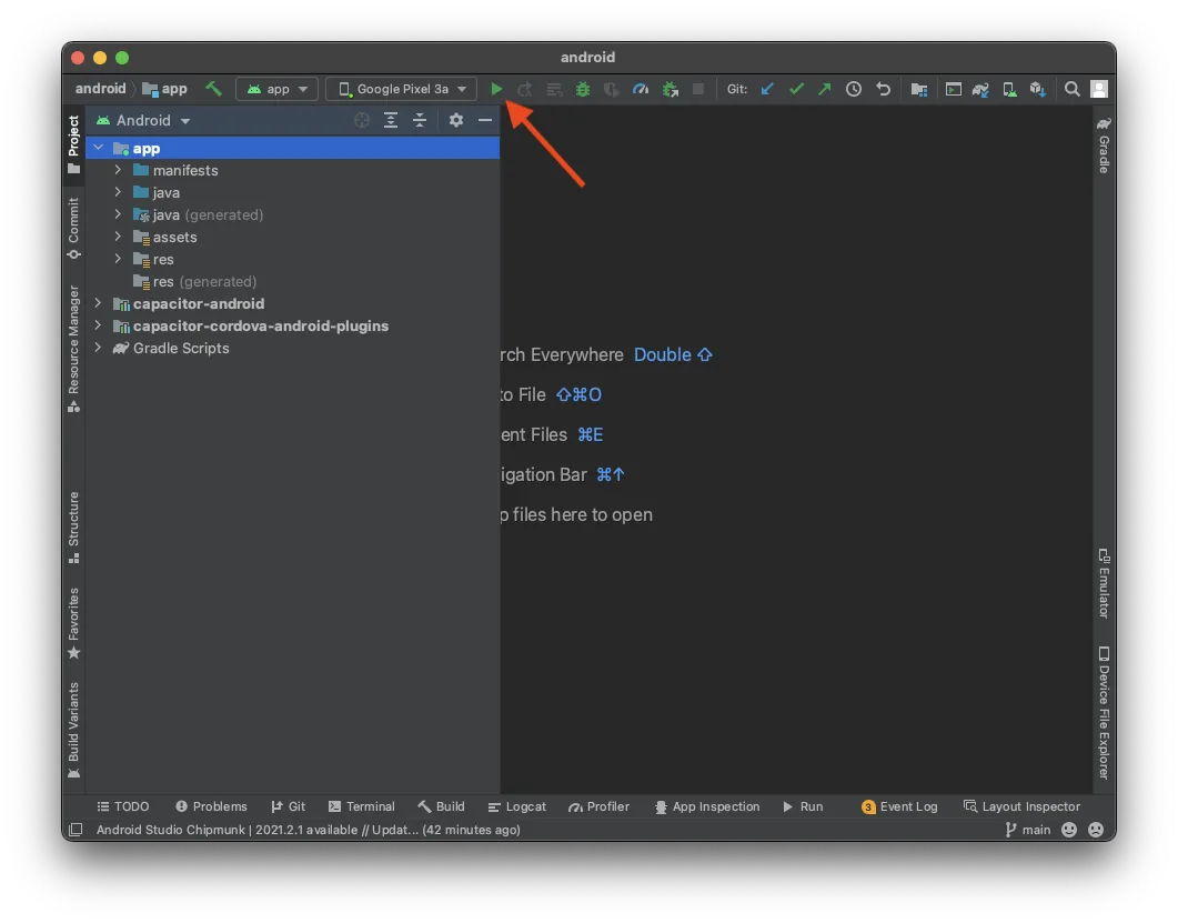
If you never touched a native mobile project, you can easily open both native projects by running:
npx cap open ios
npx cap open android
Inside Android Studio you now just need to wait until everything is ready, and you can deploy your app to a connected device without changing any of the settings!
Inside Xcode it’s almost the same, but you need to setup your signing account if you wan to deploy your app to a real device and not just the simulator. Xcode guides you through this if you’ve never done it (but again, you need to be enrolled in the Developer Program).
After that it’s as easy as hitting play and run the app on your connected device which you can select at the top! 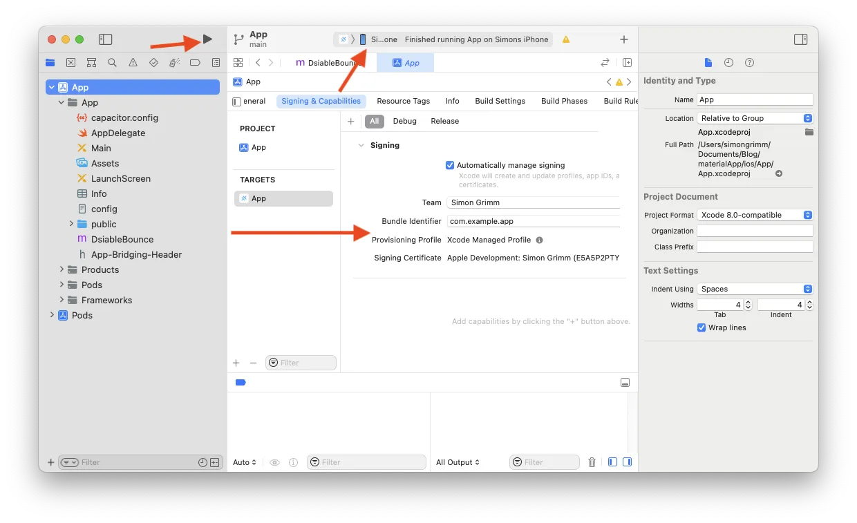
Congratulations, you have just deployed your Angular web app to a mobile device!
But there are still some challenges ahead, especially on iOS the UI doesn’t look good yet. Before we fix that, let’s make our debugging process faster.
Capacitor Live Reload
By now you are used to have live reload with all modern frameworks, and we can have the same functionality even on a mobile device with minimum effort!
The idea is to make your locally served app with live reload available on your network, and the Capacitor app will simply load the content from that URL.
First step is figuring out your local IP, which you can get on a Mac by running:
ipconfig getifaddr en0On Windows, run ipconfig and look for the IPv4 address.
With that information you can now tell Angular to use it directly as a host (instead of the keyword localhost) or you can simply use 0.0.0.0 which did the same in my test:
ng serve -o --host 0.0.0.0

# Alternative
ng serve -o --host 192.168.x.xx
Now we only need to tell Capacitor to load the app directly from this server, which we can do right in our capacitor.config.ts with another entry:
import { CapacitorConfig } from '@capacitor/cli';

const config: CapacitorConfig = {
	appId: 'com.example.app',
	appName: 'material-app',
	webDir: 'dist/material-app',
	bundledWebRuntime: false,
	server: {
		url: 'http://192.168.x.xx:4200',
		cleartext: true
	}
};

export default config;
Make sure you use the right IP and port, I’ve simply used the default Angular port in here.
To apply those changes we can now copy over the changes to our native project:
npx cap copyCopy is mostly like sync, but will only copy over the changes of the web folder and config, not update the native project.
Now you can deploy your app one more time through Android Studio or Xcode and then change something in your Angular app - the app will automatically reload and show the changes!
Caution: If you install new plugins like the camera, this still requires a rebuild of your native project because native files are changed which can’t be done on the fly.
Fixing the Mobile UI of Angular Material
Now we can tackle the open issues of our mobile app more easily.
To begin with, we need to change a meta tag inside our src/index.html and also include viewport-fit:
    <meta
      name="viewport"
      content="width=device-width, initial-scale=1.0, viewport-fit=cover"
    />
By doing this we can now access an environment variable that gives us information about the iOS notch area at the top which you usually need to keep empty.
The easiest way to correctly apply this in our case is to open the src/app/app-navigation/app-navigation.component.scss and adding a new rule:
mat-toolbar {
  padding-top: env(safe-area-inset-top);
  height: calc(56px + env(safe-area-inset-top));
}
Because we change the top padding, we also need to calculate a new height of the toolbar. But with this in place, you have a very native UI! 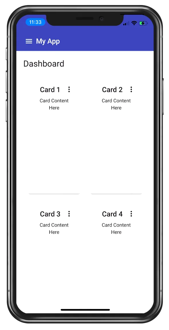
An additional “bug” can be seen when you drag the view down on iOS, something know as over-scroll:
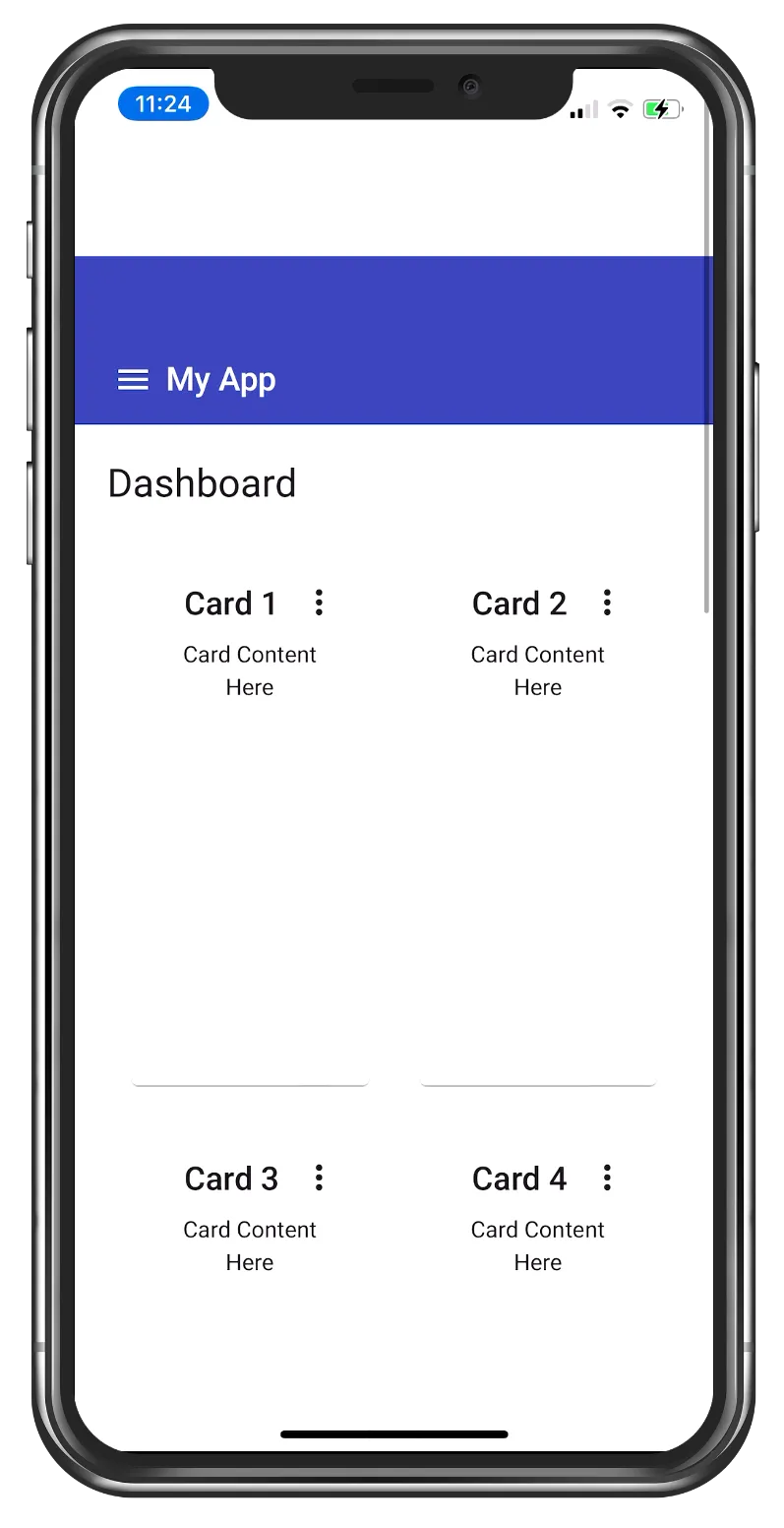
There seems to be no easy solution for this that works in all scenarios, but I found a pretty decent one in this Github issue.
We can disable the behaviour directly inside Xcode - Capacitor allows us to change the native projects however we want, and the changes won’t be overwritten by some magical script!
Therefore, generate a new DisableBounce.m file inside Xcode and insert this (select yes for generating a bridging header): ios/App/App/DisableBounce.m
#import <Foundation/Foundation.h>
#import <UIKit/UIKit.h>

@implementation UIScrollView (NoBounce)
- (void)didMoveToWindow {
    [super didMoveToWindow];
    self.bounces = NO;
}
@end
And with that fix in place, no more over-scroll on iOS! This means, people won’t really notice they are actually using a web app - which most of us have already done without noticing most likely!
Recap
Angular Material is a great library of components to build beautiful Angular apps, and we haven’t even touched all the other amazing components that you could now use!
By using a sidenav we can also make our page responsive quite easily, and later add in Capacitor to the mix to get the benefit of building a mobile app from our existing codebase.
If you got any questions just let me know, and you can also check out a video version of this tutorial below!